Amplifon
A packaging experience to elevate shopability and retail engagement
Design Group Italia has teamed up with Amplifon to simplify their entire visual global strategy, which in just two years has allowed the company to redefine the best practices and application guidelines of their ATL/BTL visual, retail and digital identity.
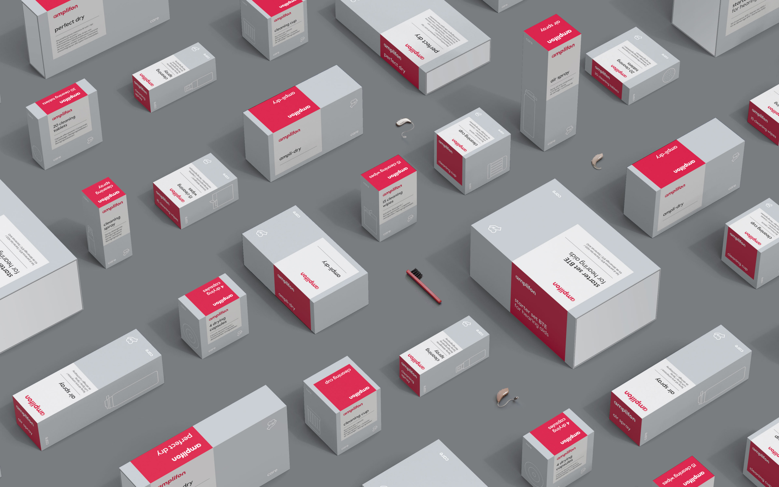
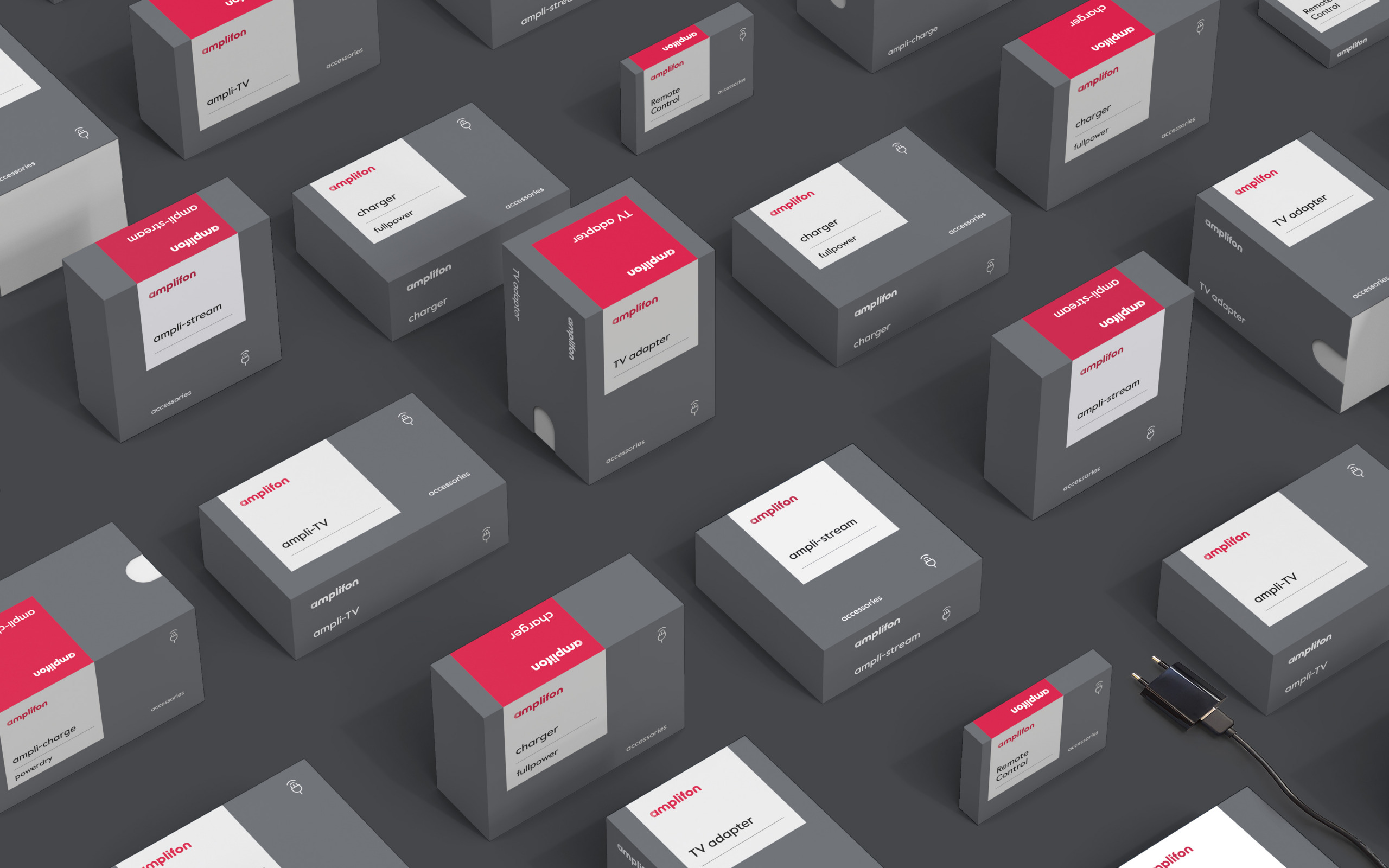
Complementing the strategic revamp – and in accordance with its guidelines – our team redesigned Amplifon’s Cube, an iconic item on the hearing aid market that perfectly expresses the brand’s values, reformulates the selling ceremony, and explores a new expanded and cohesive packaging system, which also includes new supporting items like accessories and care products.
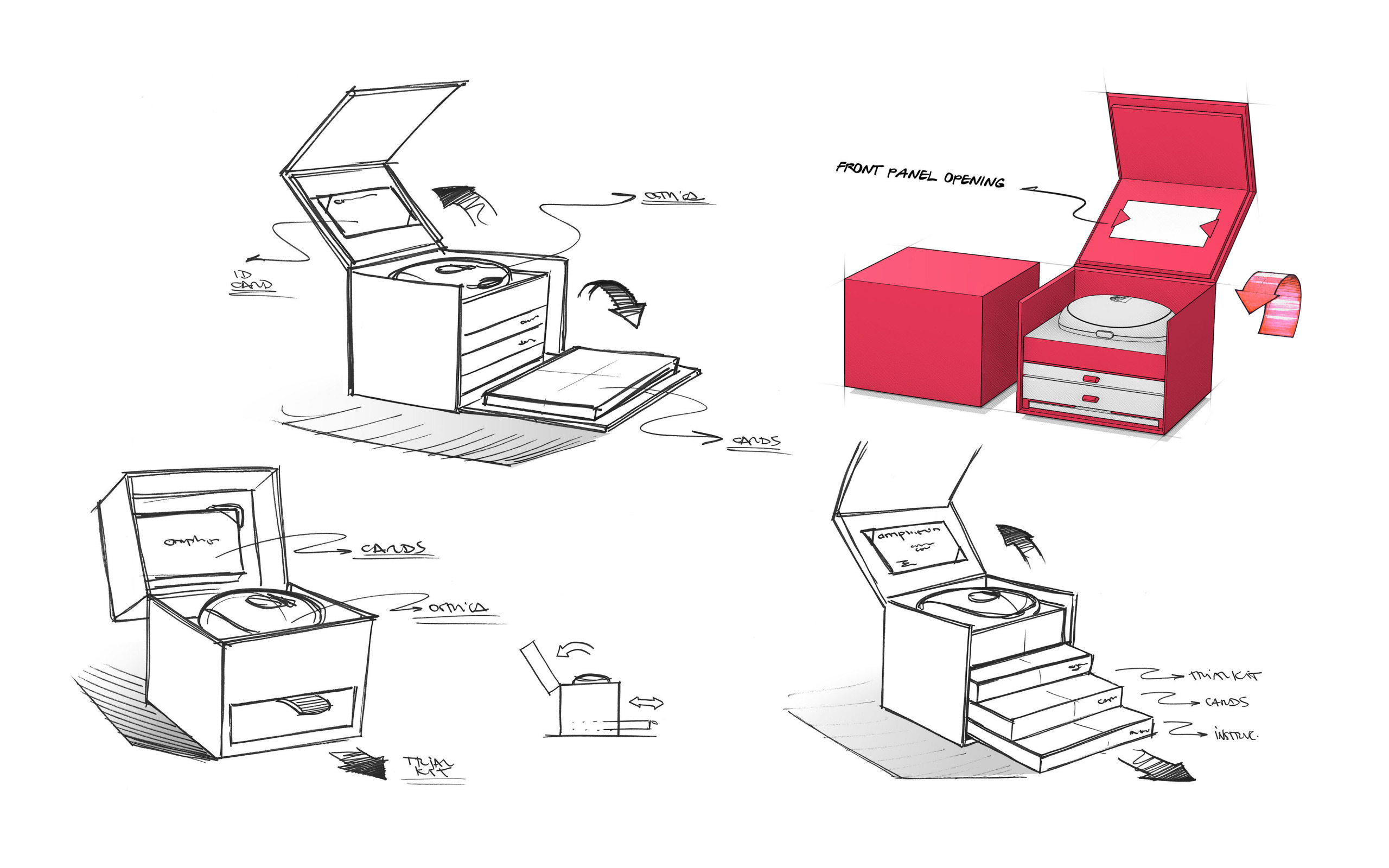
To enhance the hearing aid and its accessories at the upmost, our team designed the new All in One structural and technical packaging from scratch.
Each detail, function and CMF choice is the result of a synergic and tailored design project aimed at creating an unprecedented experience.
The Cube was developed to convey the product’s unique identity and premium quality, which is also reinforced by the refinement of production materials, including gummed paper, varnishes and watermark textures.
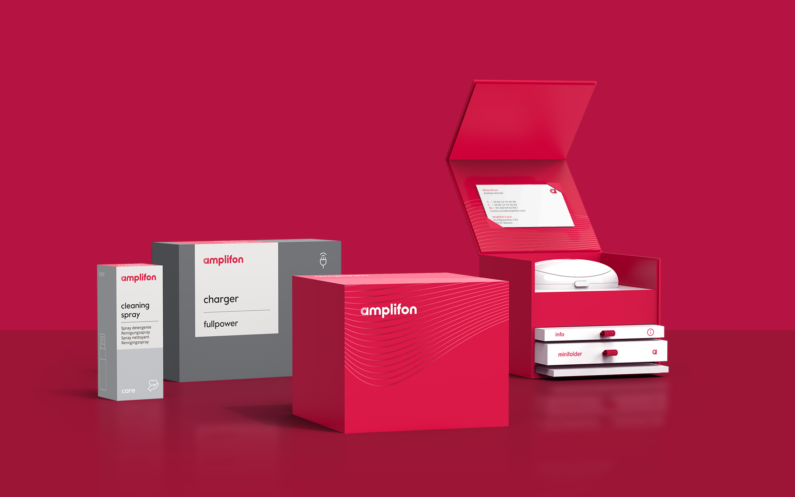
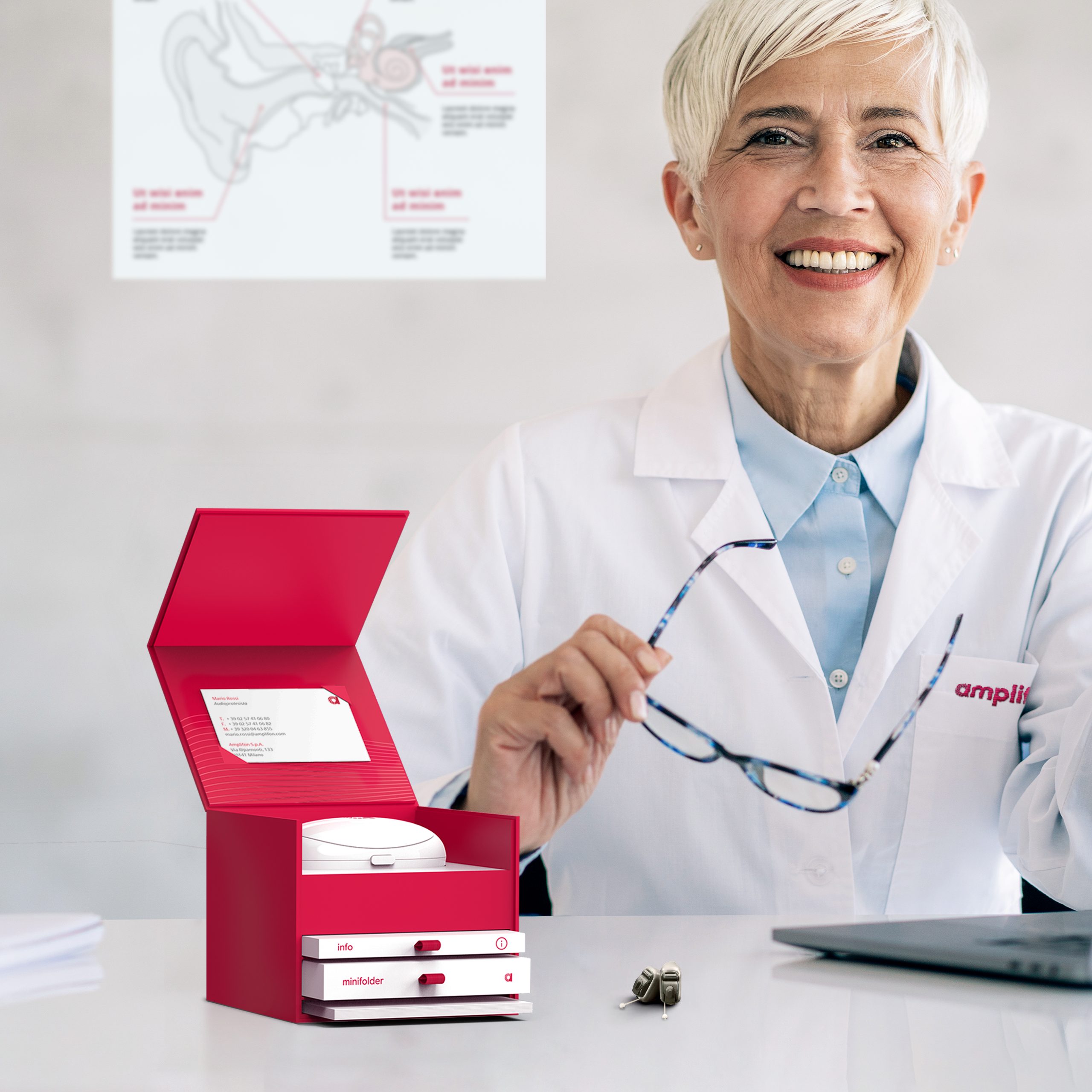
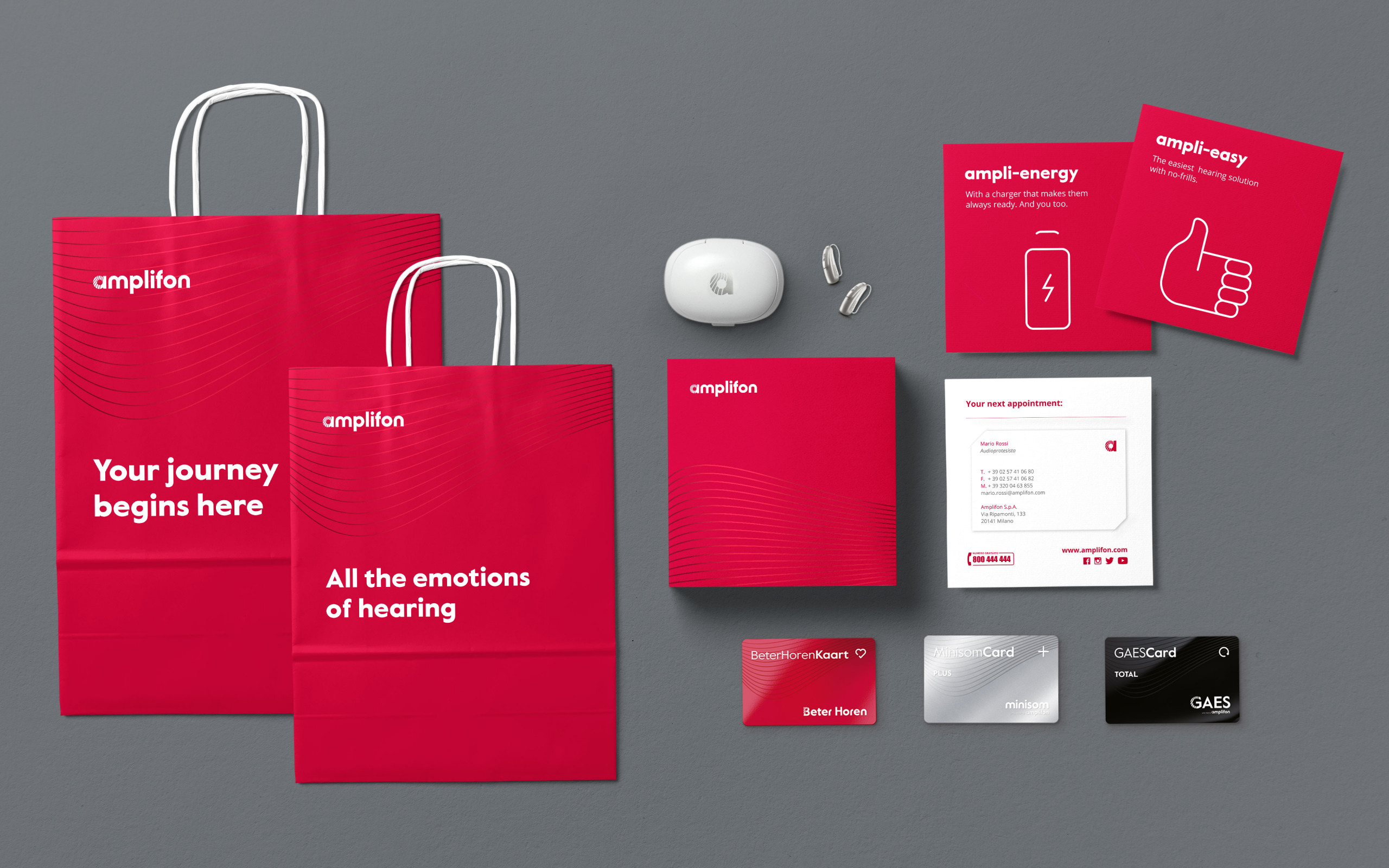
Unboxing is also a key element of APE (Amplifon’s Packaging Experience), a moment that has been enhanced and embellished through a new magnetic box opening conveying the WOW effect while conjuring the idea of a jewel of innovation. Internally, each shelf of the Cube has been designed to house all the marketing assets in special removable drawers containing:
- The Amplifon Oyster with hearing aids (primary pack/portable case also designed by Design Group Italia) or, alternatively, the branded pouch containing the hearing aid pocket charger when delivered separately at the time of sale;
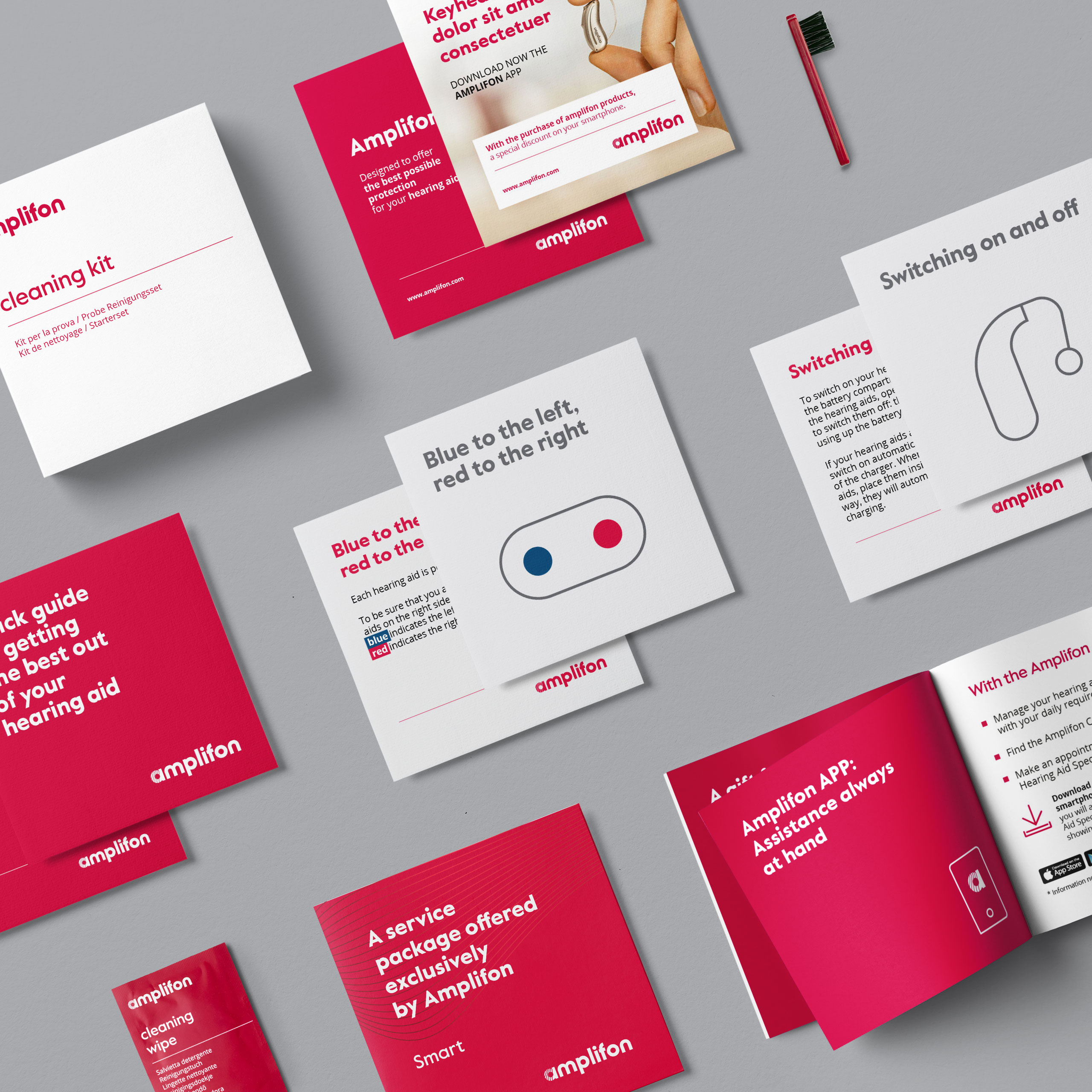
- An info folder containing: quick guide, service leaflet, ad hoc cards, Midas leaflet;
- A user-guide detailing the kit’s various functions;
- A cleaning kit.
The storage capacity and multi-purpose promise of the piece has led Amplifon to label it as an icon of the selling ceremony, taking the official name of All-in-one-Cube.
On a structural level, the cubic shape is closely connected to the red cube present throughout the visual system
and packaging of products and communication materials, bridging the two in terms of brand consistency.
Improving on the ergonomics and functionality of the previous model was another key objective
in the All-in-one-Cube’s development, expanding on insights from consumers, audiologists
and the company’s internal stakeholders.
About the project
Client
Amplifon
Year
2022
Expertise
Industry