Amplifon
Protecting and empowering
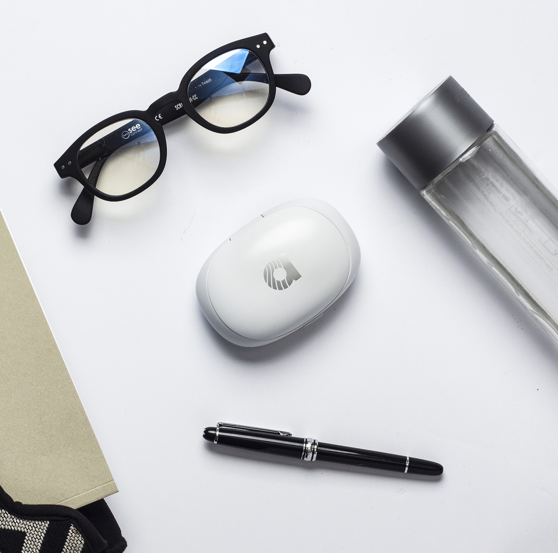
Amplifon, the world’s largest hearing aid retailer, tasked us with the design of the branded case for their hearing aid products.
Developing a new product specific and unique to the Amplifon brand, we set out to craft a proprietary element reinforcing the brand’s leadership in the market with a design based on ergonomics, portability and usability.
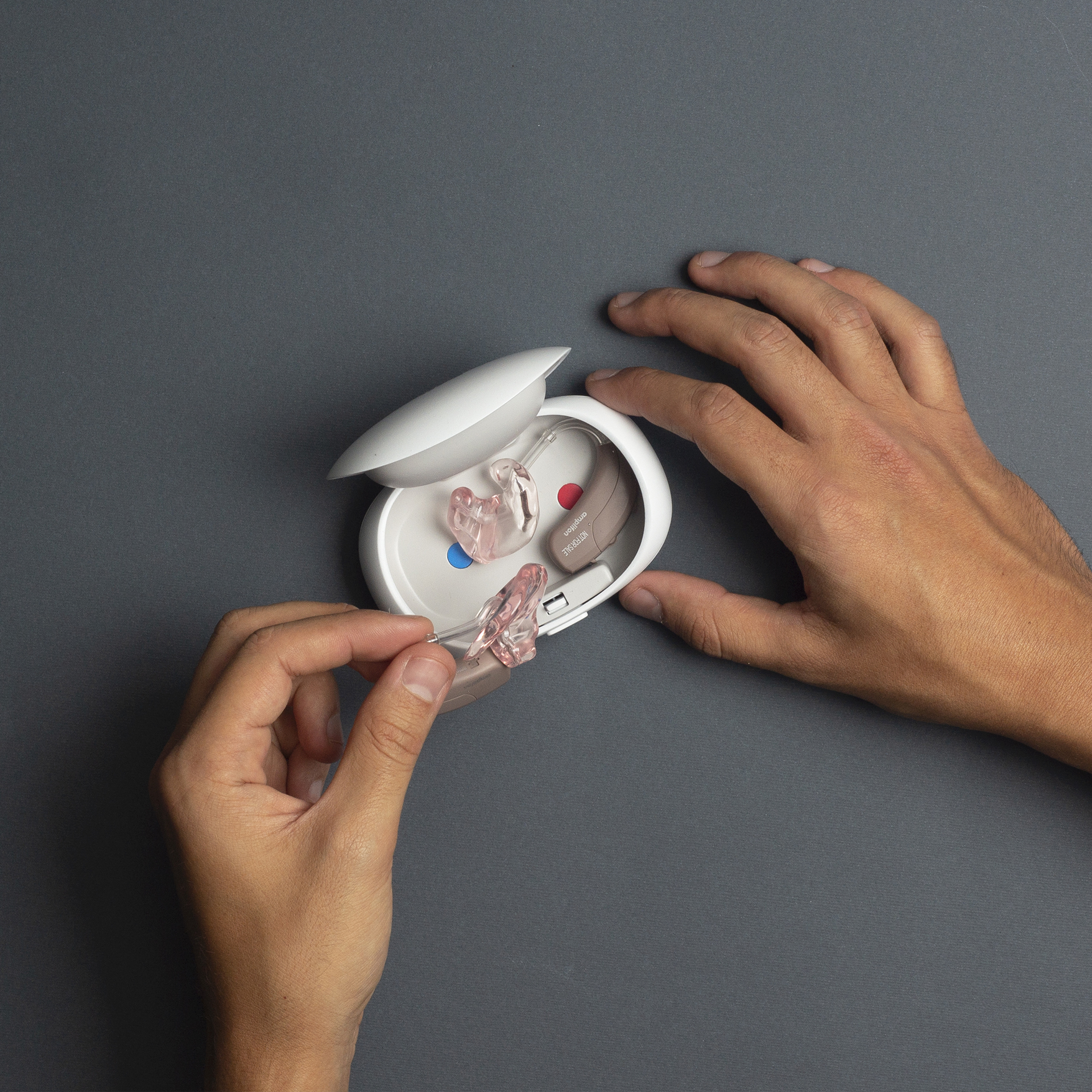
The result is a case that encourages users to proudly showcase the product in public rather than hide it away.
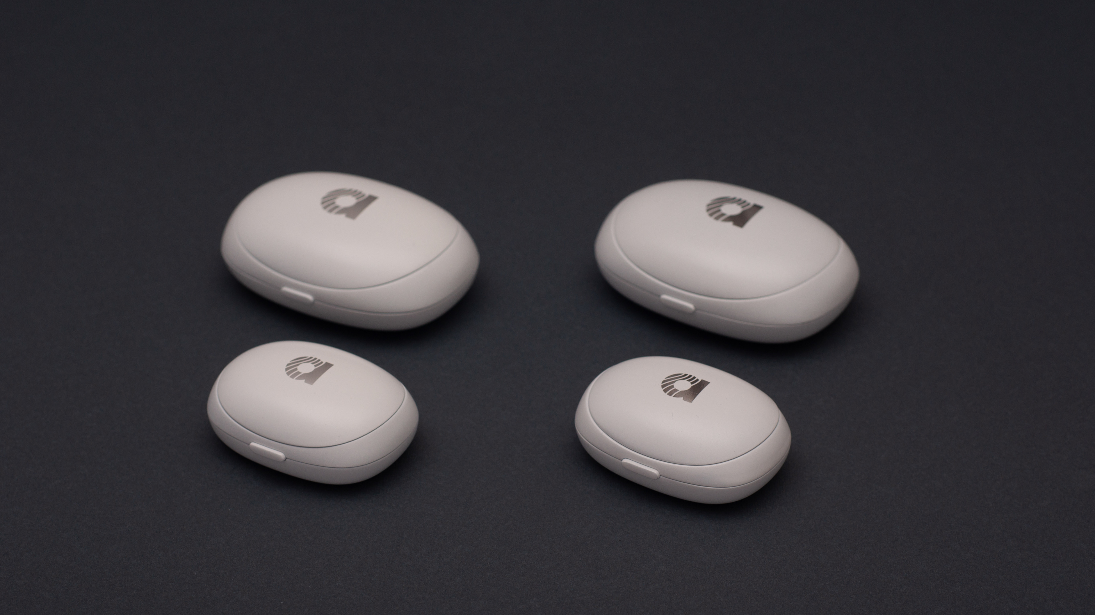
To protect a valuable hearing aid product, we created a case with an appealing, soft and rounded shape in two sizes to indicate something important and valuable is held inside.
The shape of the case provides a sense of safety. Even when opened without caution, the product inside won’t fall out thanks to the high, curved brim.
In co-creation with the client, we designed and engineered the complete Amplifon primary packaging system, moving away from the hearing aid perceived as a medical product, encouraging its use and reducing the stigma often attached to hearing devices.
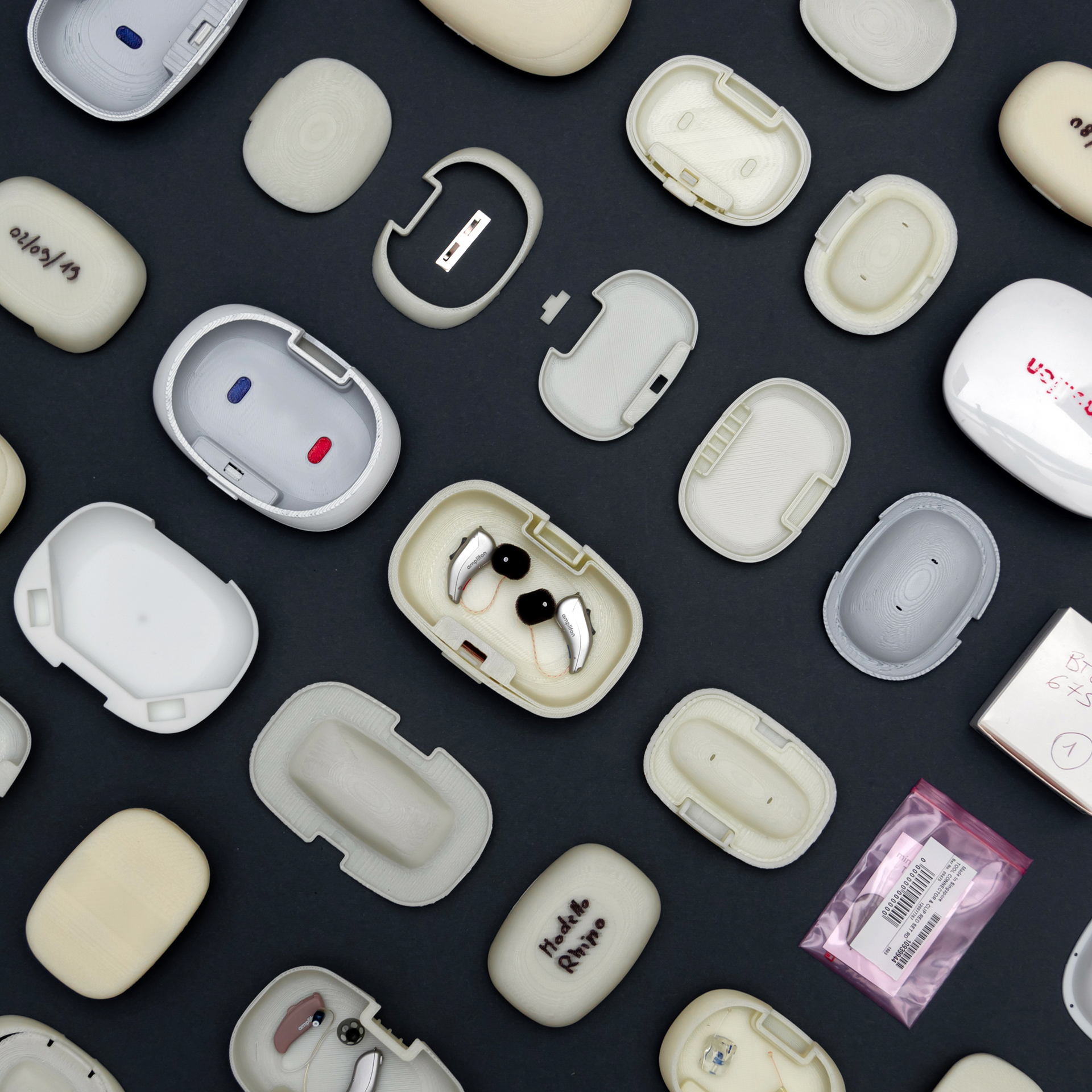
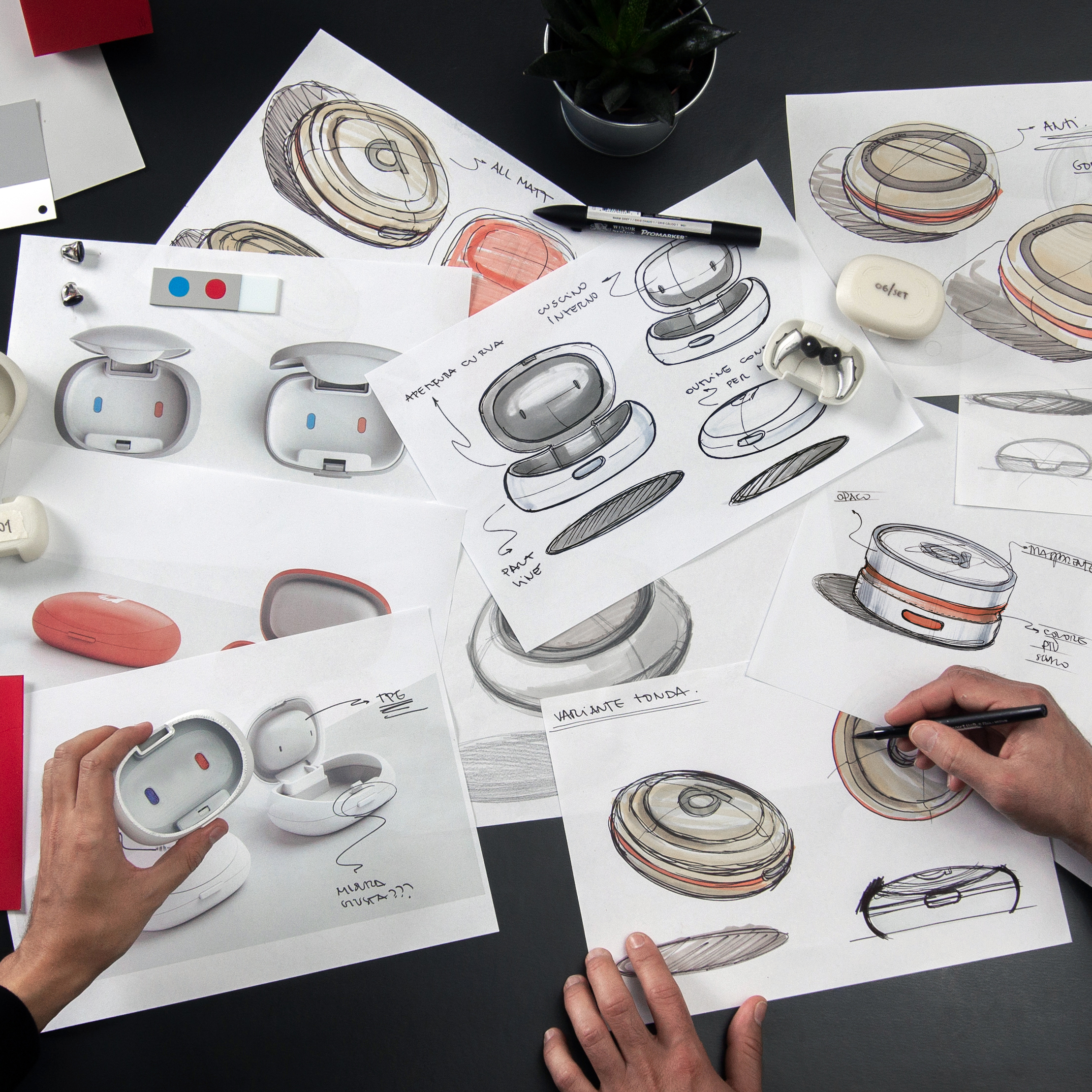
During the developmental phase, we created numerous prototypes and tests to evaluate potential shapes and ensure the best possible solution.
Prototyping was incredibly useful for the client to better envision the final result as well, and helped us to define various details together, such as the “click” sound feedback when closing the case.
The physical object, rather than a mere render on a screen, helped us to make the case less intrusive, more ergonomic and to feel good in your hand or chest pocket.
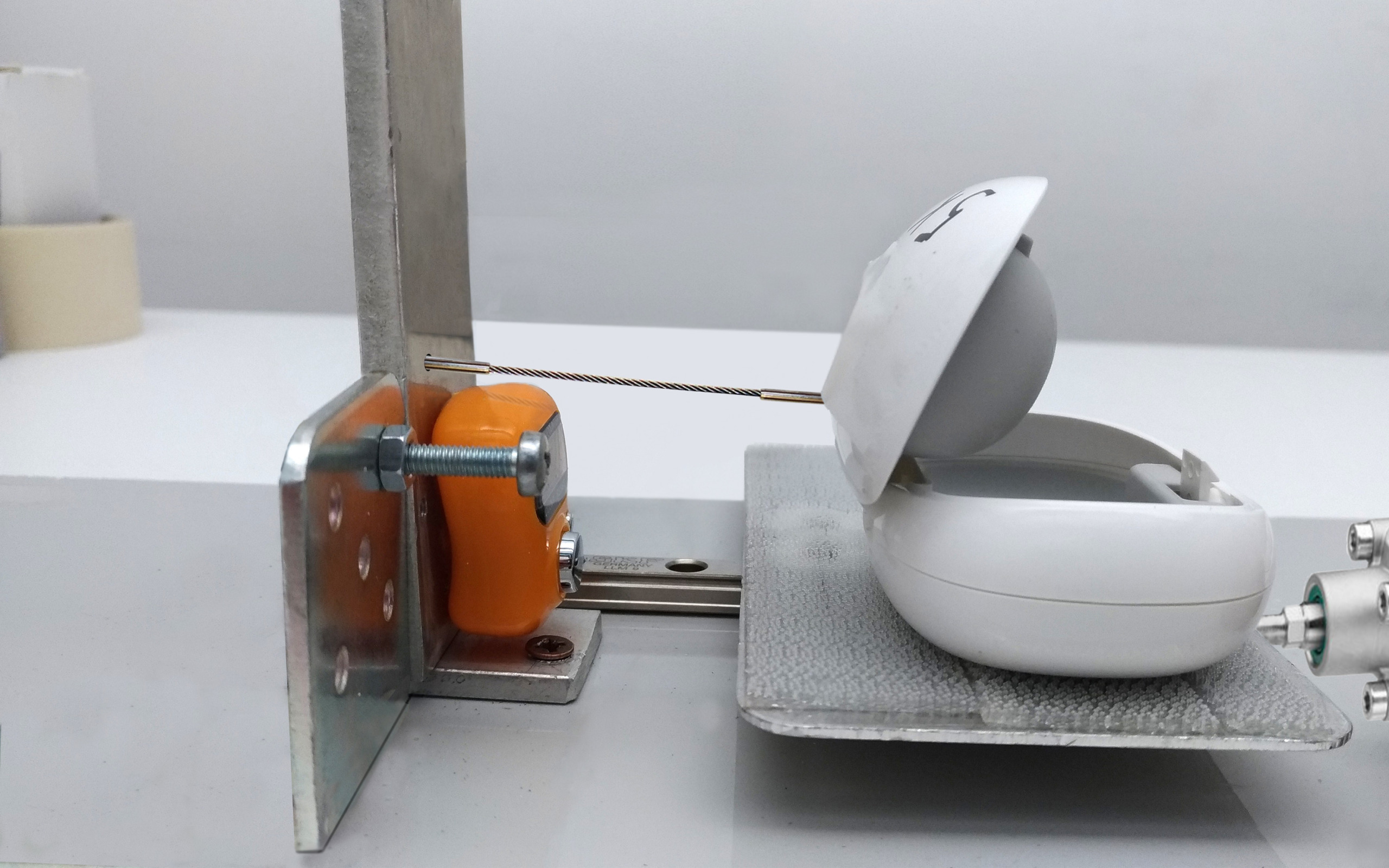
In the process of engineering development and optimization
we performed numerous
drop and stress tests.
“At DGI, we have extensive experience with taking an idea from conception to final product.
This was fundamental to guide our client on the right path both in terms of identifying the right problems and needs
as well as being able to offer all the expertise required, from product design to engineering, CMF design and brand strategy, all for a coherent final solution”
Martin Franzen
Product Design Director
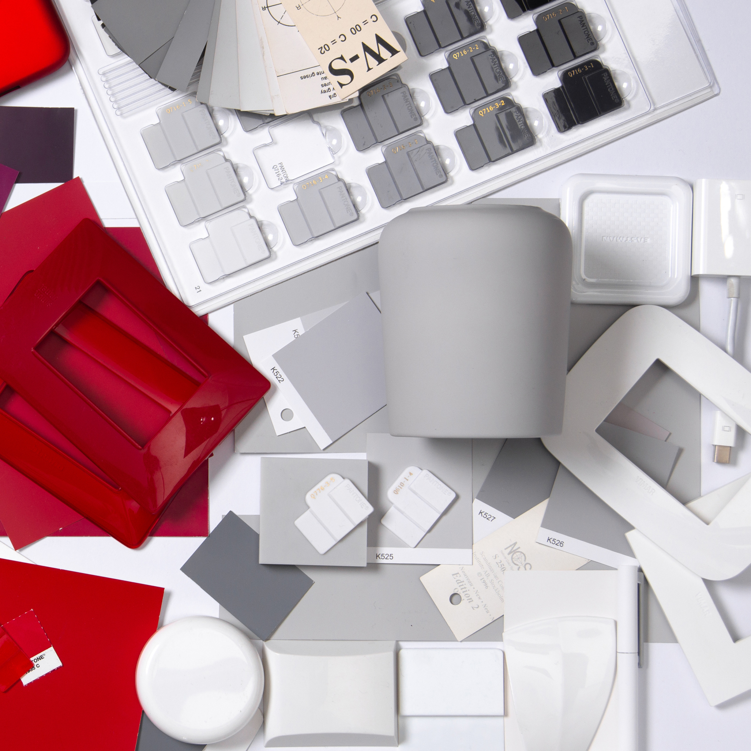
Our CMF team worked in close collaboration with the producer of the injection batch in order to capture a particular shade of white that could lend a feeling of cleanliness and technicality to the product.
We defined a distinctly personalized CMF to guarantee a premium image of the brand that’s modern, unisex and non-medical.
About the project
Client
Amplifon
Year
2022
Expertise
Industry