Plasmon
Nourishing tomorrow, today

Plasmon, the iconic baby food brand with 120 years of history, needed a new look to match their unparalleled range of products.
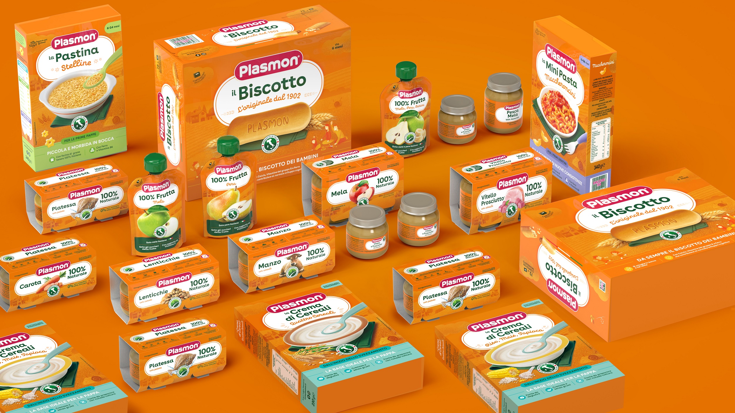
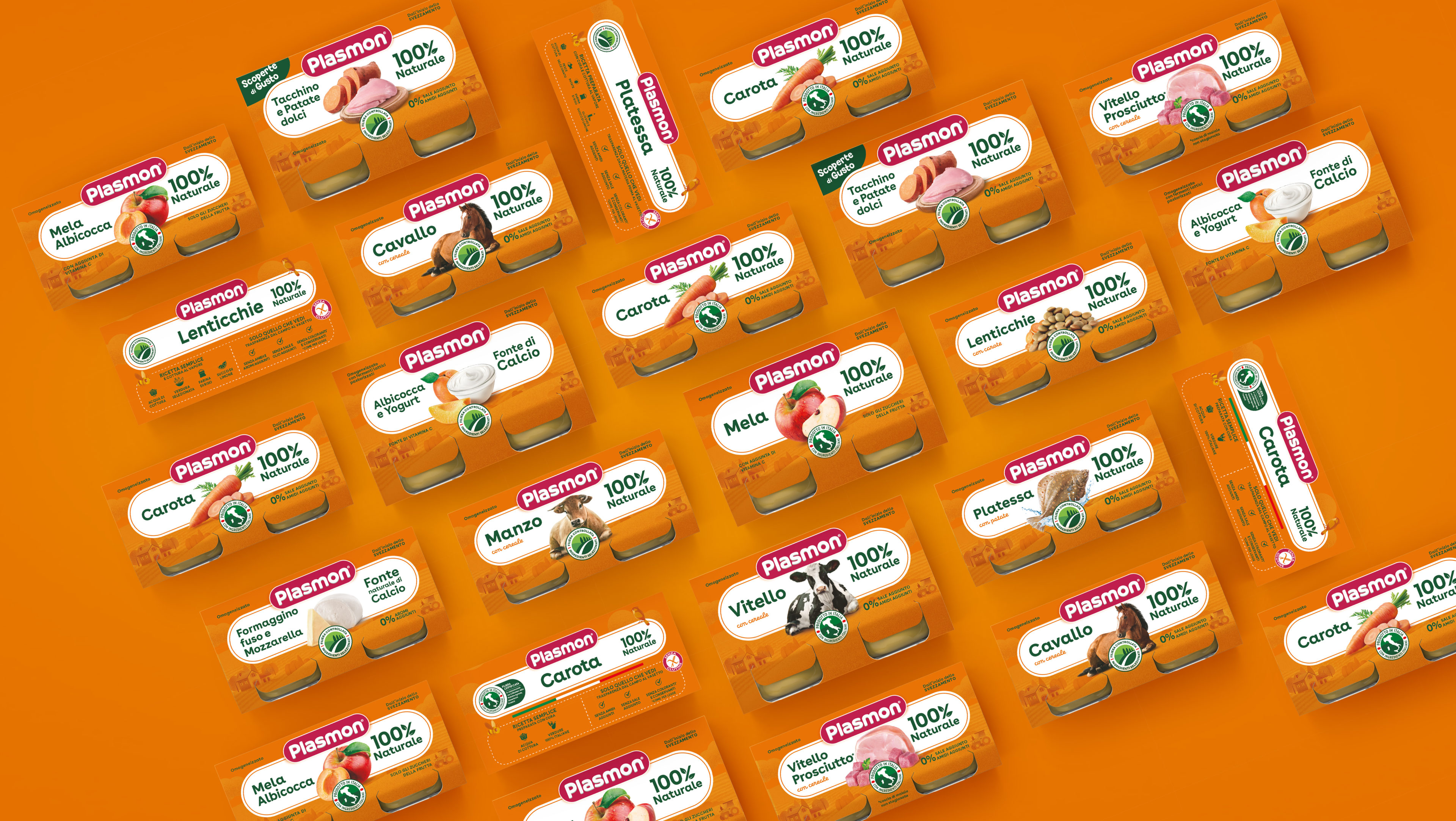
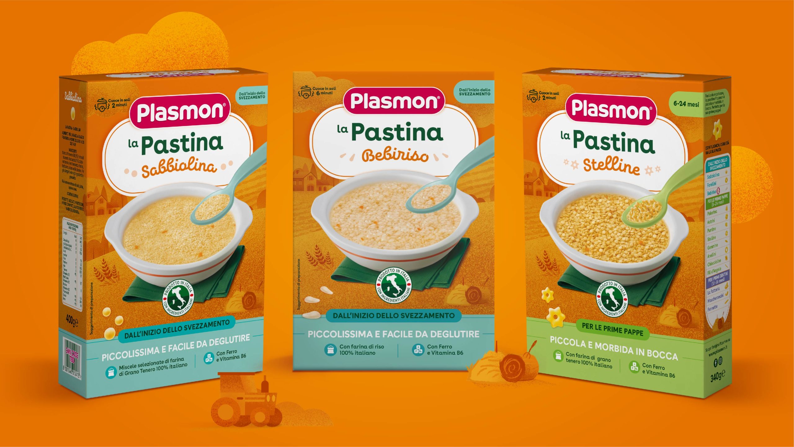
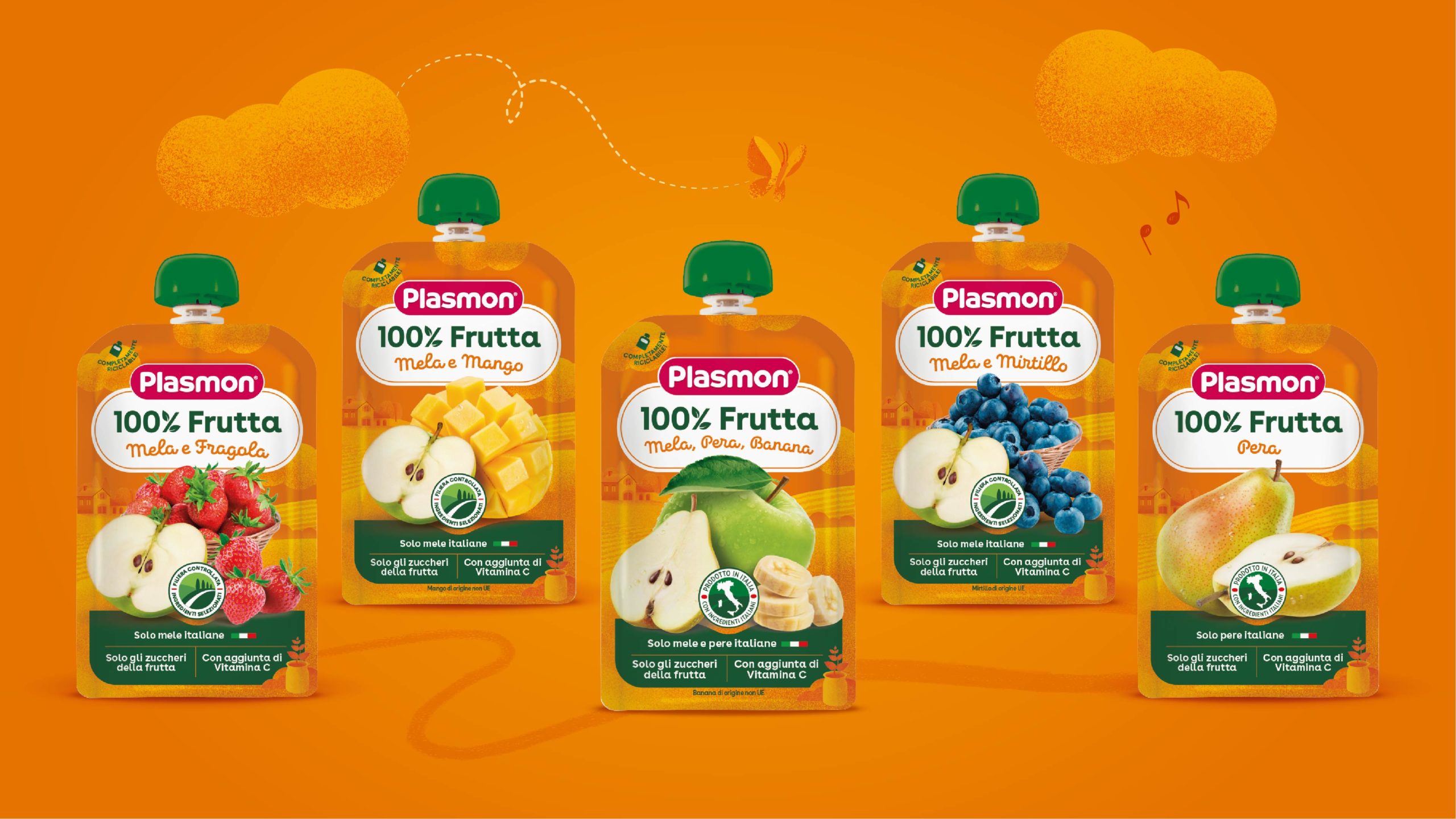
As part of the Kraft Heinz family, the goal was to usher the brand into the 21st century, outlining a strategy for the brand to reach a new generation of consumers with a well-organized, easy-to-understand product portfolio with a powerful shelf impact.
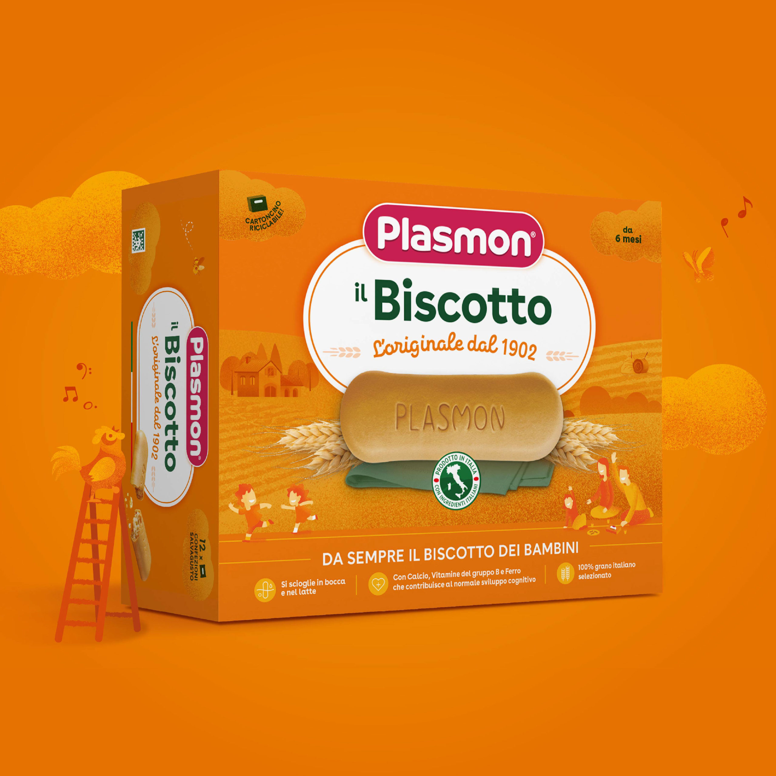
Refreshing the packaging design to reinforce and reaffirm the brand’s position as an industry leader, the new visual identity is modern, clear and powerful. In addition, we extended the brand to reach entirely new markets to fuel further growth.
Envisioning a new brand strategy to push Plasmon’s portfolio
to the fore as an icon in the FMCG market.
Rooted in heritage for
a healthy future
The new offering builds on Plasmon’s long-standing values of high quality, natural ingredients, Italian heritage, traceability and togetherness. Rooted in history, the brand now faces the future with a modern look.
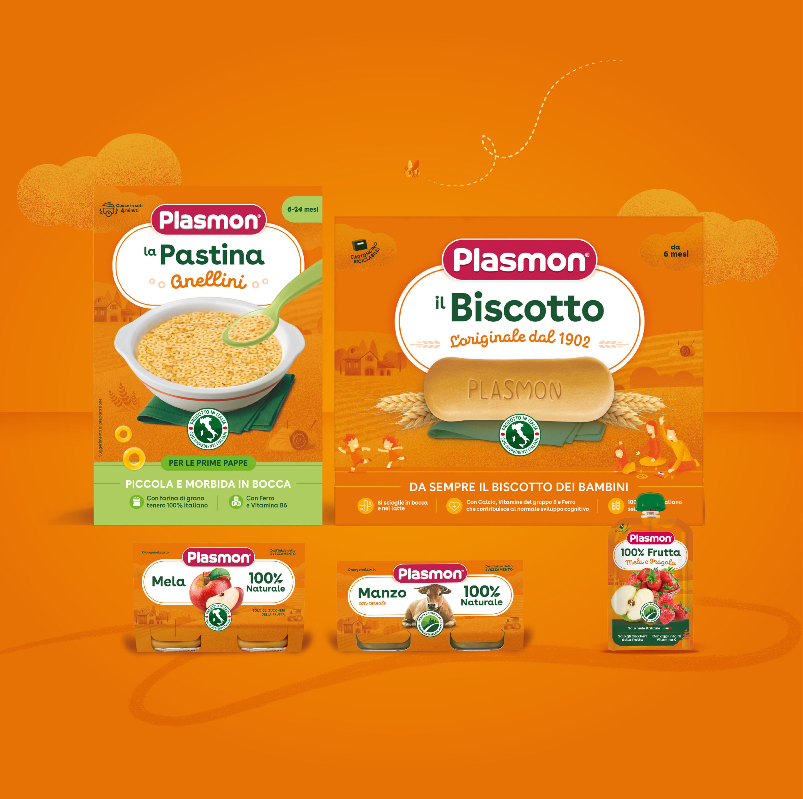
Clear contents in the packaging design underscore the Plasmon brand, the company’s key USP.
“Working for the Italian category leader in baby food meant balancing vision for tomorrow and brand heritage, mixing key brand equity and new design cues, to drive engagement for the next generations of consumers. We collaborated closely with Plasmon on a very important mission: establishing Plasmon as the FMCG brand icon of certified and uncompromised quality, great taste, and natural ingredients.”
Michele Favaretto
Brand Design Director

About the project
Client
Kraft Heinz
Year
2022