Plasmon BIO
A new launch strategy, a new packaging identity to go organic!
Design Group Italia and Kraft Heinz have defined a new strategy to help the Plasmon Brand enter and establish relevance in the organic market.
The strategic objectives that guided the brand’s entry into this market segment, unexplored for Plasmon, are:
#1 Affirming Plasmon’s leadership and trust, improving its recognizability and differentiation.
#2 Strengthening the brand’s association with sustainability, responsibility, and the use of genuine, natural, and high-quality ingredients, further enhancing the brand perception.
#3 Integrating the product offering and brand portfolio with a product range with a specific and complementary proposition to the mother brand.
The range, in line with the increasing demand for high-quality, healthy, and responsible organic products ,
includes various categories for a wide portfolio,
guaranteed by the iconic baby-food brand in Italy.

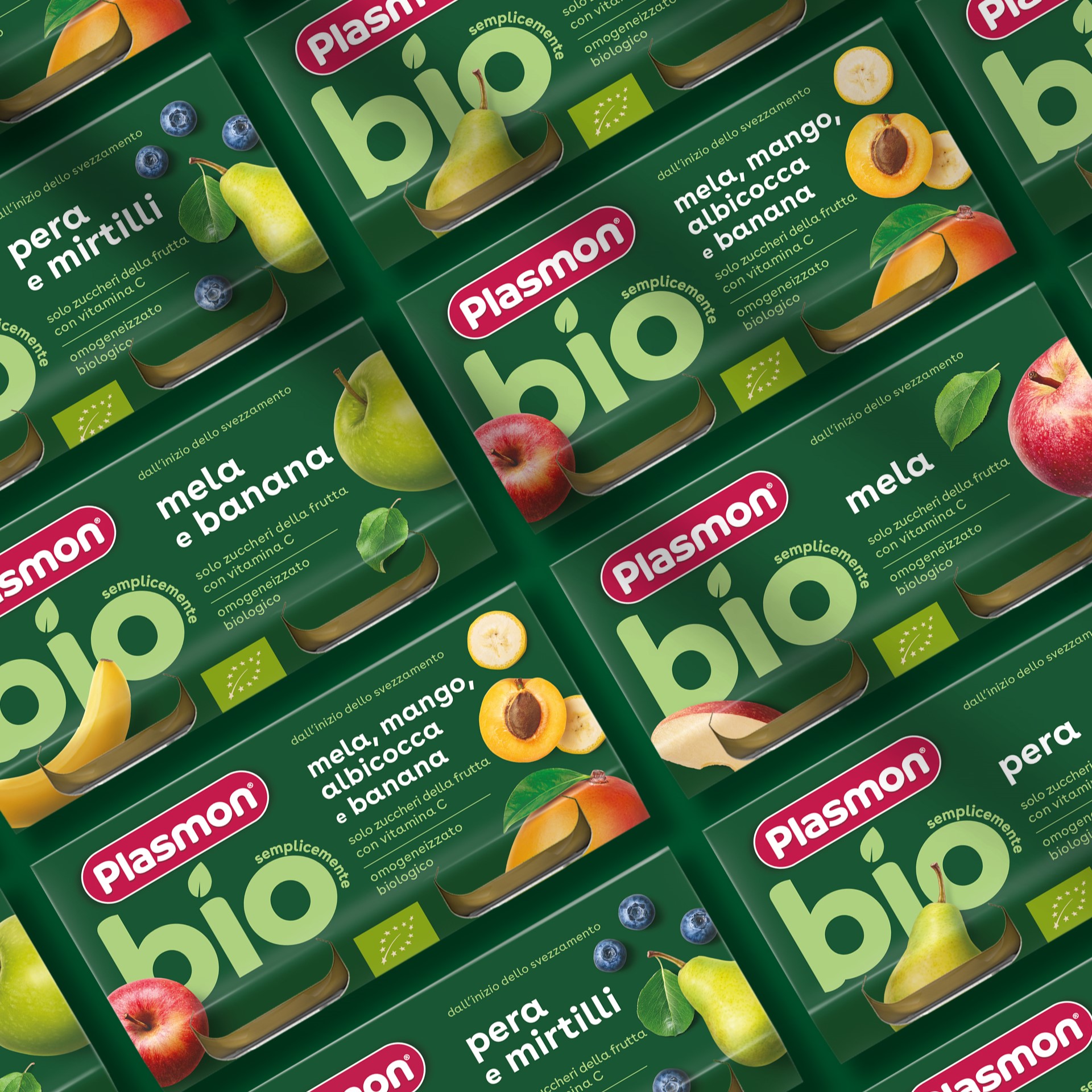
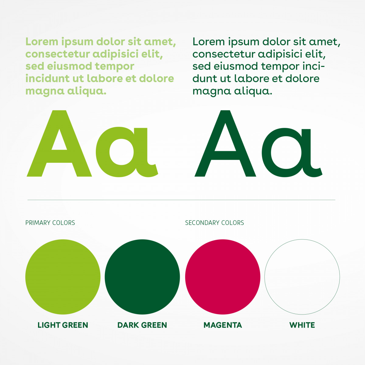
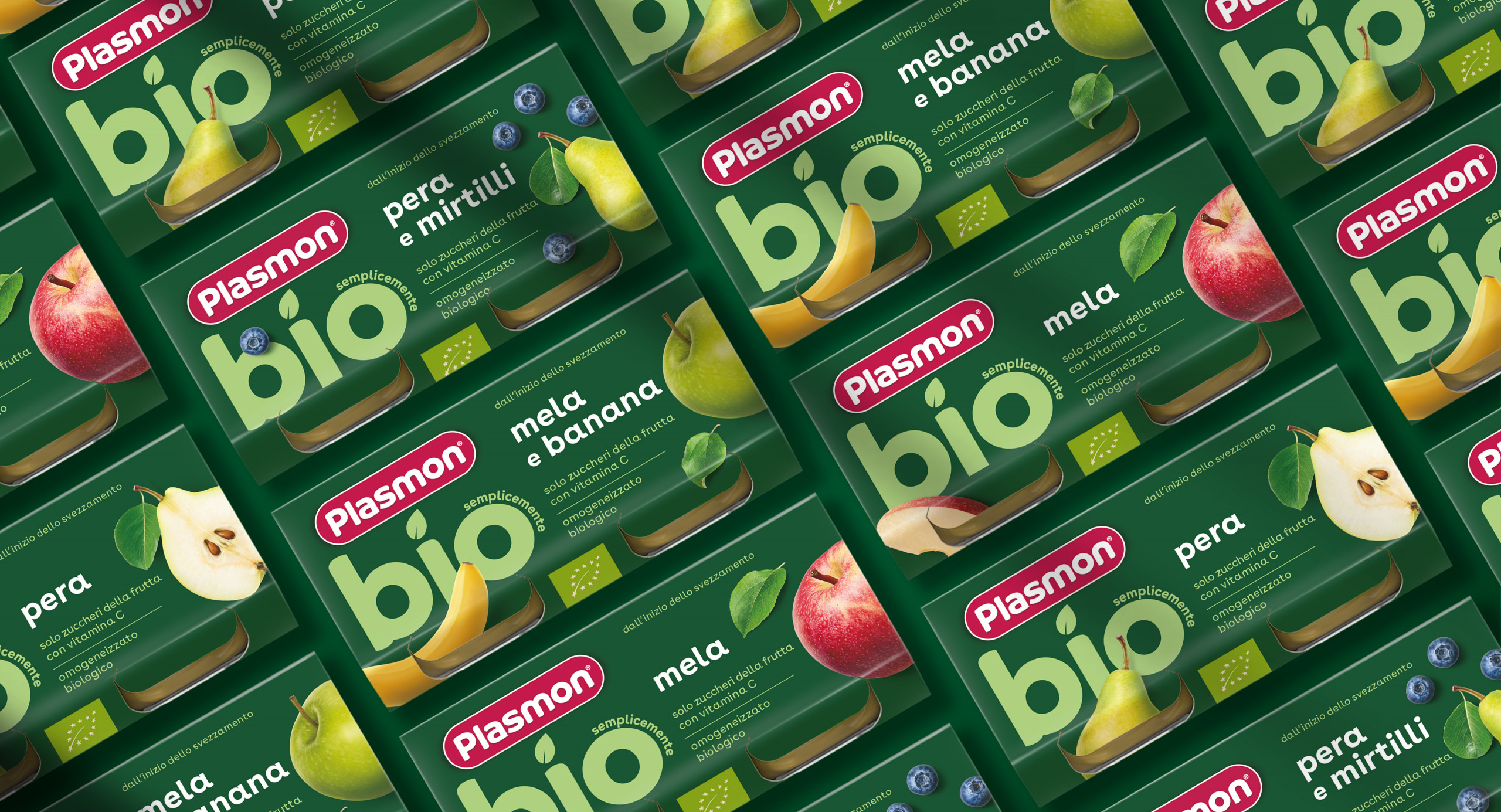
Design Group Italia has designed a minimalist and essential packaging identity, capitalizing on top-down views of the whole ingredients
and a deep green color – derived from the Plasmon mother brand’s palette – as elements of recognizability and differentiation from the core Plasmon range.
The BIO declaration stands out at the center of the front-of-the-pack as a bold key-promise,
with high visibility and a significant impact on the shelf.
The key visual emphasizes the integrity and the high quality of raw materials, guiding consumers toward a world of authentic nature,
simultaneously, premium and refined.
![]()
About the project
Client
Kraft Heinz
Year
2023