Chicco
A longlasting collaboration for the early years of life

The journey began in 2004, when Chicco reached out to Design Group Italia to revamp its range of baby monitors, characterized by a playful image that was appealing for babies and their families, but lacked the sense of reliability expected from a leading baby brand.
In 2006, building on the success of the new baby monitor, Chicco decided to develop an updated and cohesive visual identity encompassing their entire product range.
Our team responded with a design approach expressing the technological character of the products and harmonizing it with the maternal nature of the brand.
“Chicco’s new identity had to convey the nurturing essence of the brand while firmly positioning it against its primary competitors. Our approach strategically mobilized our multidisciplinary design team, beginning with benchmarking and sector analyses conducted in close and continuous contact with the client’s marketing team. From there, we focused on the sales objectives, developing a diverse range of innovative products and collaborating seamlessly with the internal R&D experts.”
Edgardo Angelini
Managing Director
Our primary objectives were to differentiate Chicco from its main competitors, crafting a proprietary identity, refining the product design language, and meeting the diverse expectations of various buyer personas and usage contexts. To achieve this, we conducted a comprehensive analysis of baby care products on the market, their main design language, their selling points and their perceived values.
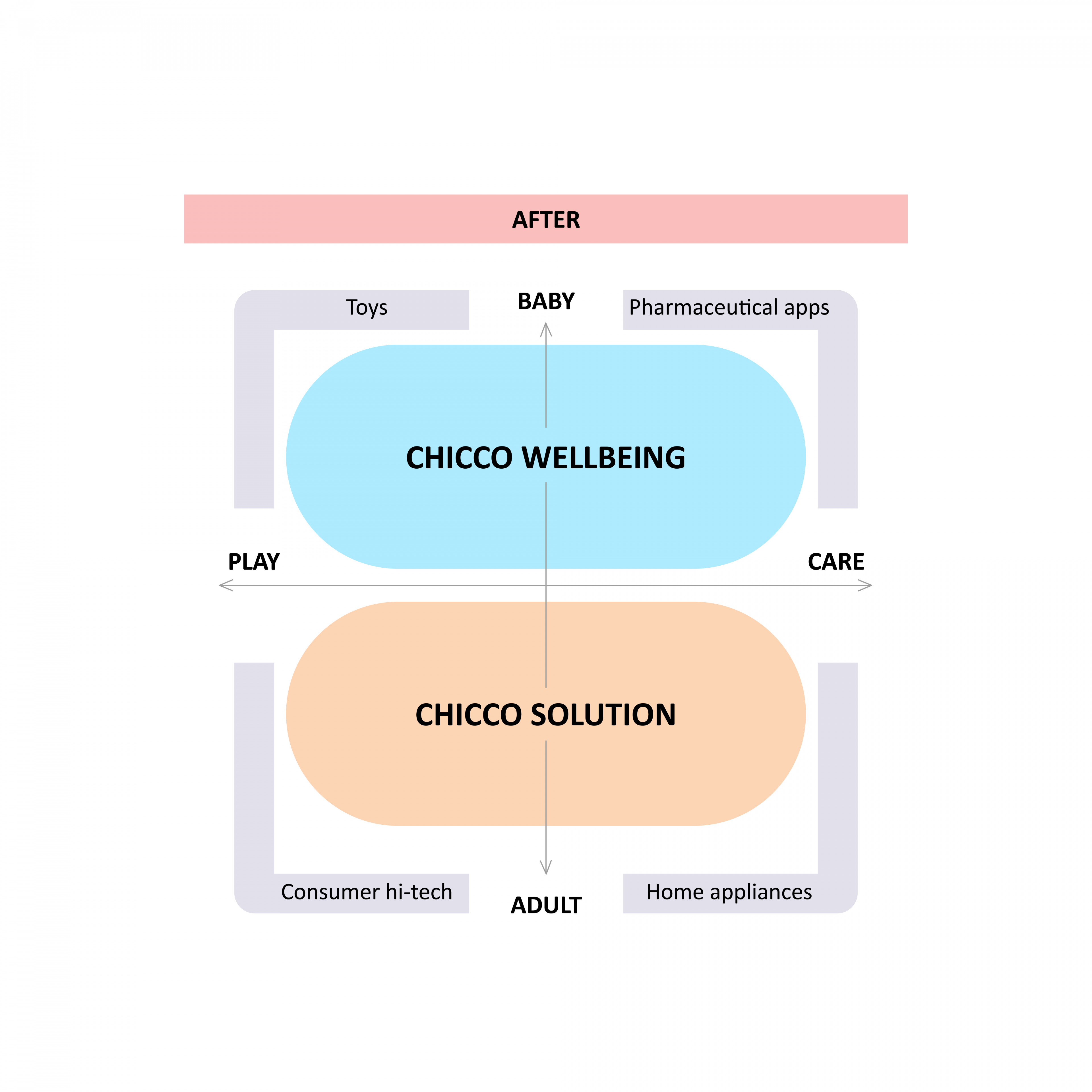
Taking into account the brand’s historical values, we recognized the need for innovation and evolution in order to keep up with market changes in terms of product value and brand positioning. Both the “pharmaceutic” reliability of the product lineup and its practicality were enhanced and expressed to provide Chicco with detailed guidelines, setting a clear direction for the company’s offer: the concepts of “Solution” and “Wellbeing” became cornerstones for a new design language.
Chicco Wellbeing
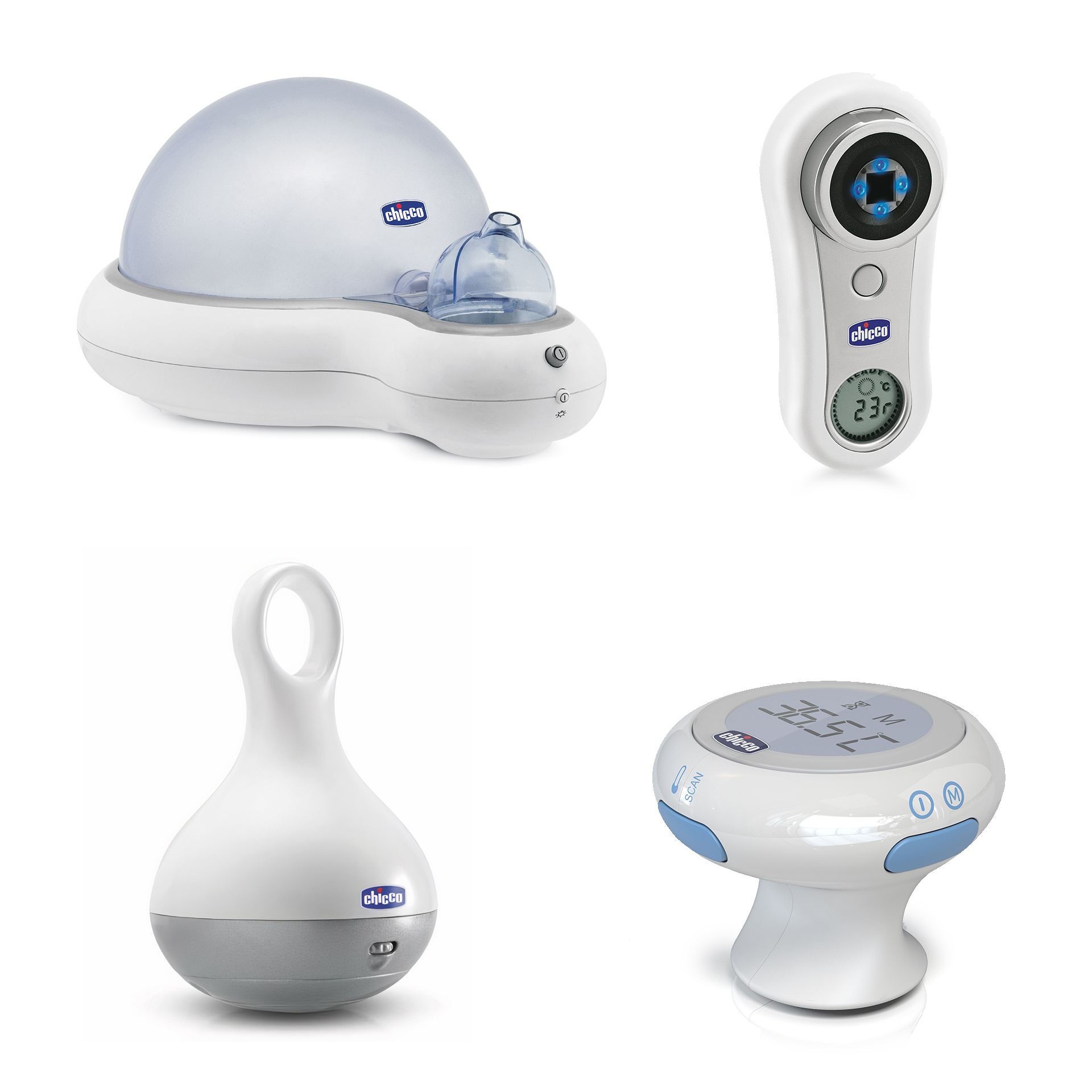
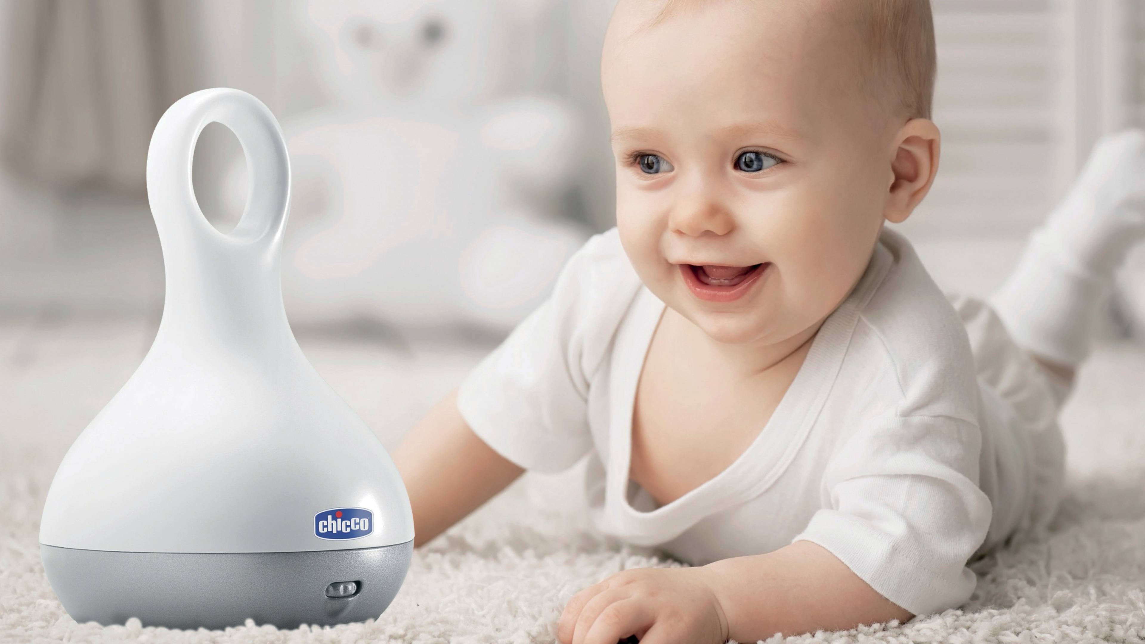
This series of baby appliances, including the best-selling Magic Lantern lamp and the Thermo Hygrometer room humidifier, were designed to provide maximum support to various baby care activities at home.
Each product’s design was a result of the close collaboration with infant experts and a commitment to natural, organic, and simple design style, aimed at creating a friendly and confident relationship between parents and these daily helpers. Ergonomic shapes, soft yet clearly visible light effects, and a sense of clarity, tenderness and reliability pervaded each solution.
Chicco Solution
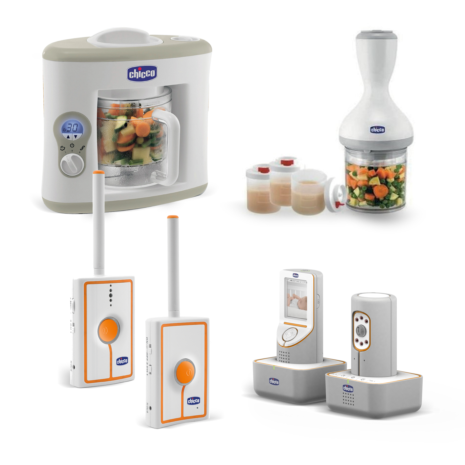
Chicco Solution was launched on the market as a complete range of technological baby care solutions.
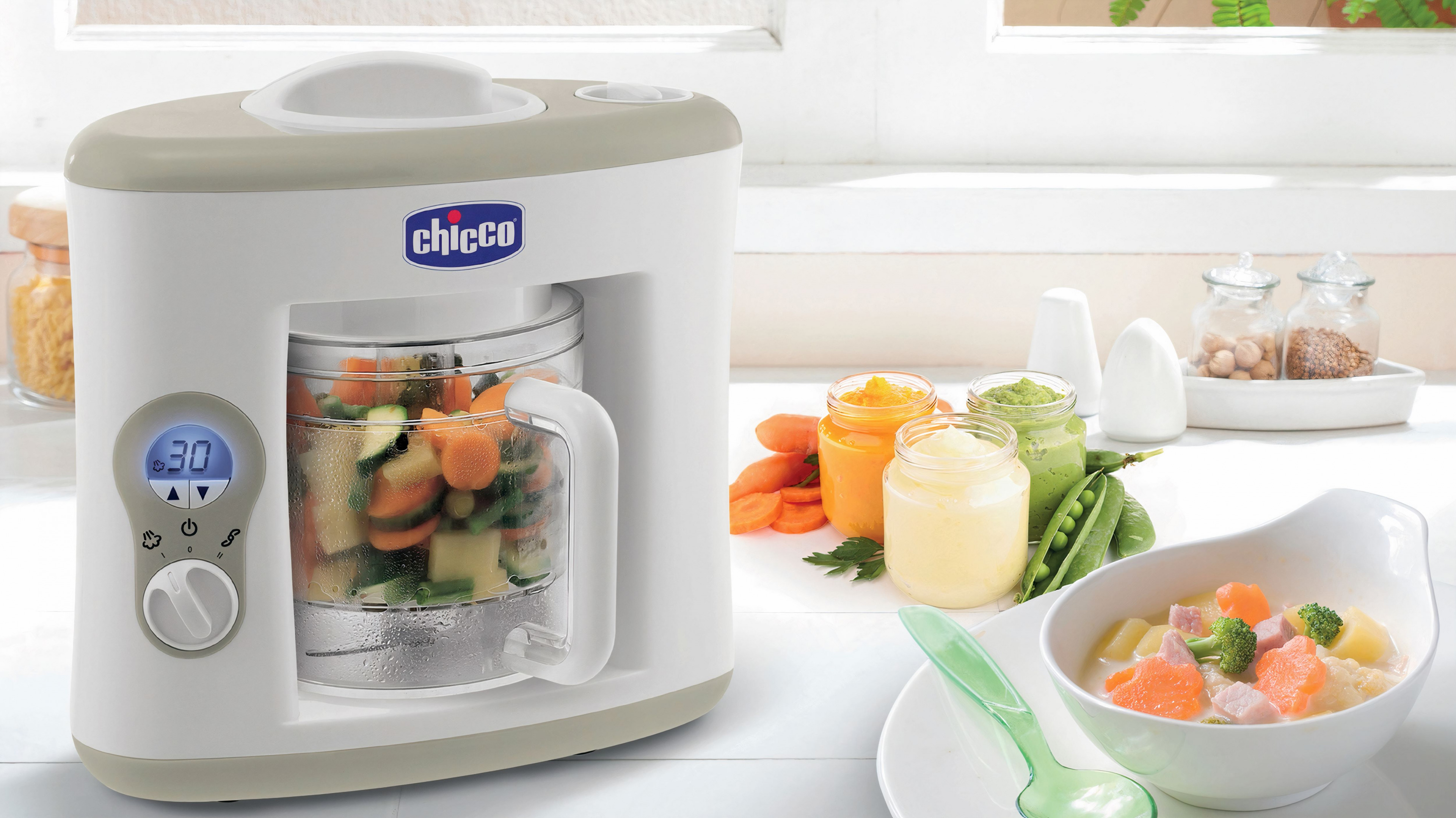
The new and cohesive design language offered parents and caregivers easy and reliable products, like the Baby Monitor range or the innovative food processor.
Made reliable, robust and discreet to fit with any interior, the products were designed to support children’s growth by empowering families to respond to their safety, protection, and health necessities. Each new product became part of a world of functionality and great care addressing the delicate and ever-changing needs of growing kids.
When designing products for baby care, it’s crucial to truly understand the user and everyone that will come into contact with the product. Once the main design language guidelines were set, each new product was defined by a specific user-centric approach, starting from real problems, needs and real-life situations.
Whether it was a product belonging to the Wellbeing or the Solution segment, it was an imperative to offer families and kids functions and designs that could convey and communicate:
- Technology
- Practicality
- Authority
- Simplicity
- Harmony
- Protection
Materials, shapes, functions, colors and finishings were meticulously crafted starting from early concept exploration up until the definition of each new design mirroring the company’s values and expertise, underlining their usefulness within the vast world of baby care.
This longstanding collaboration resulted in well distinguishable families of products
and a refreshed overall identity that effectively conveyed the technological essence of Chicco’s products.
Chicco Physio
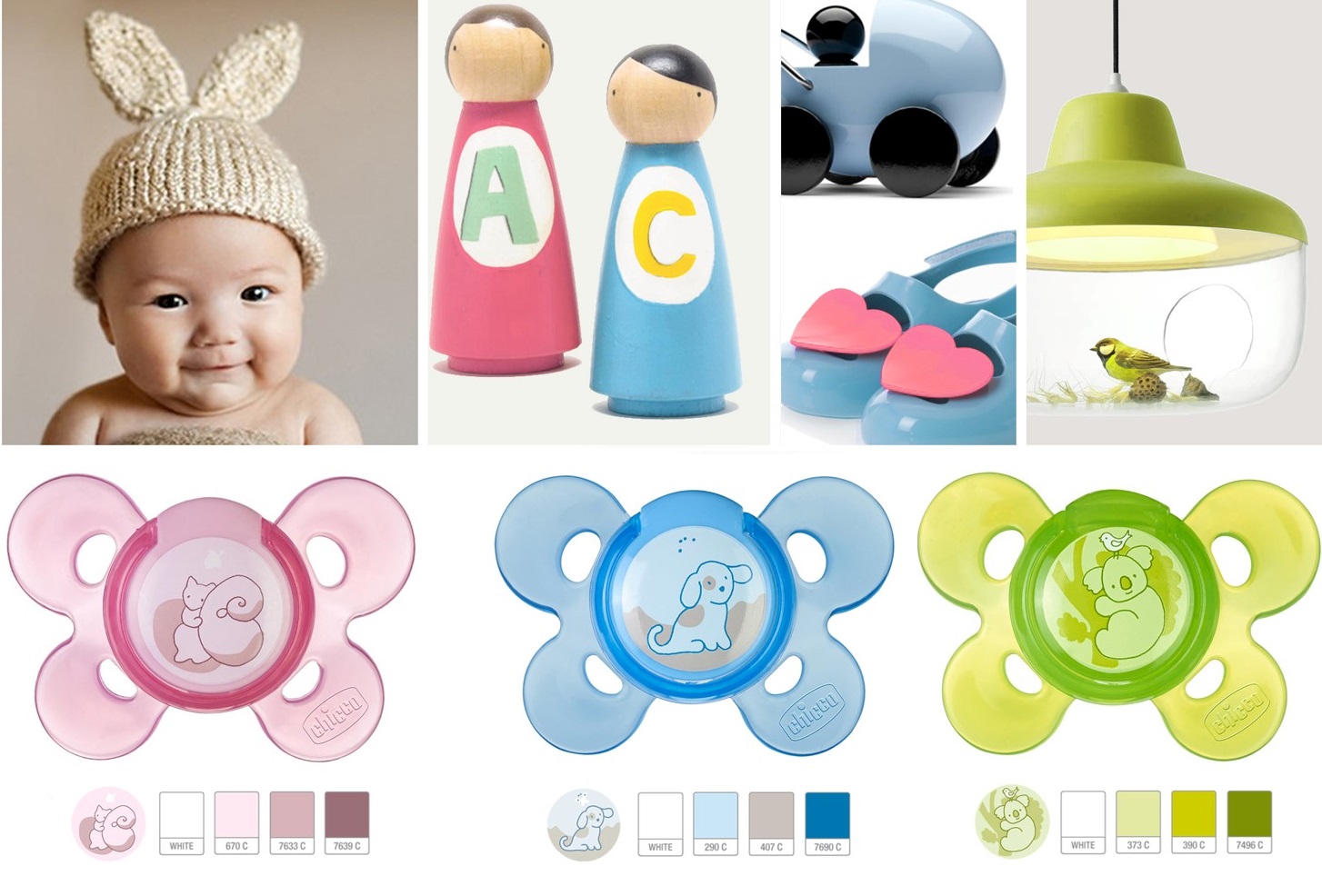
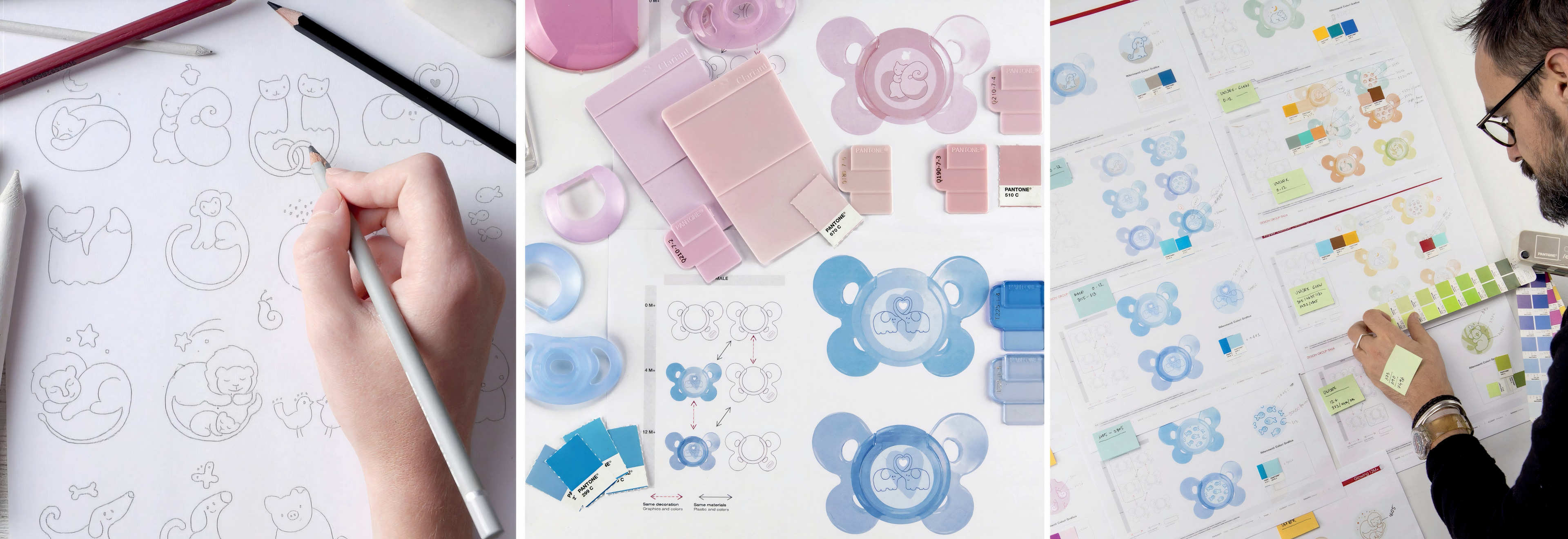
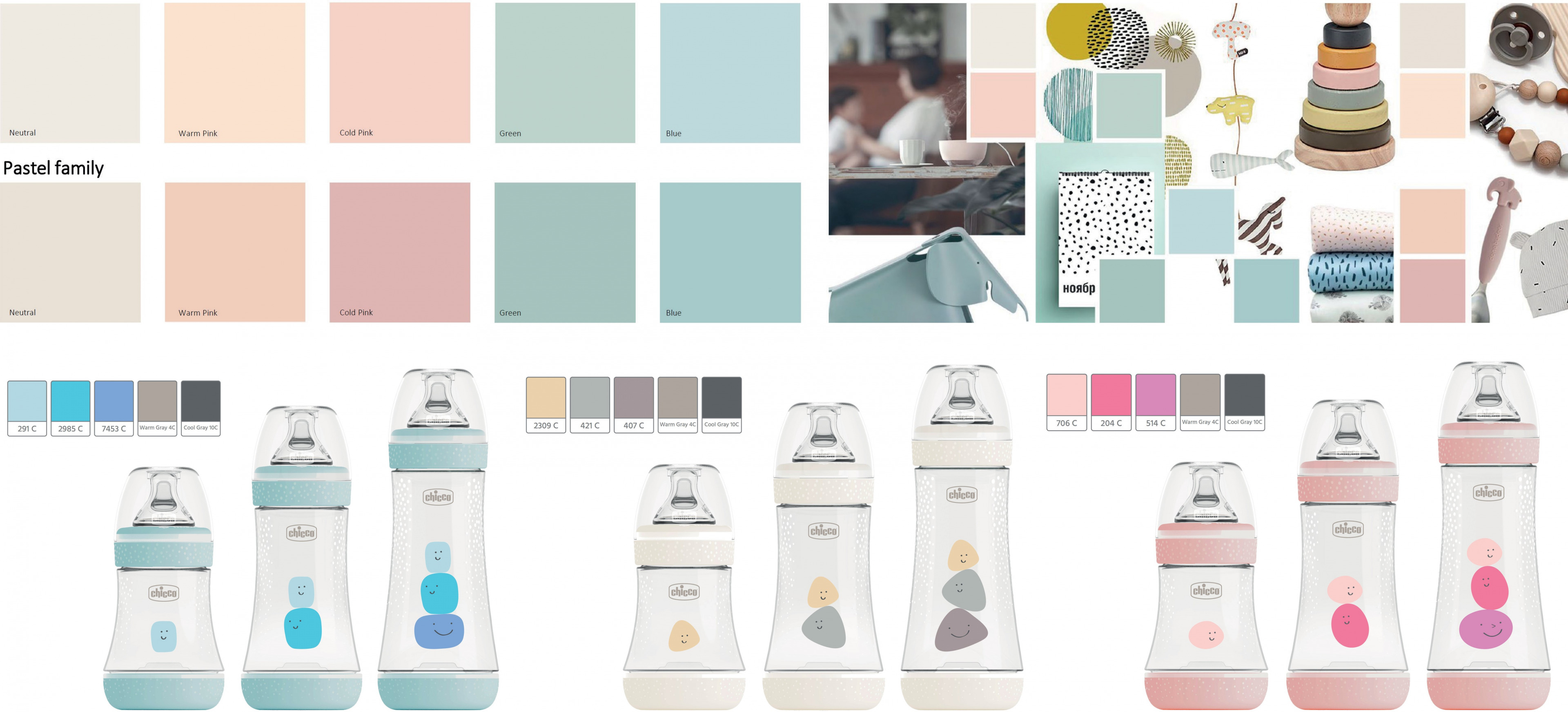
When it comes to Chicco’s pacifier product portfolio, our research into the brand’s target customers and the world of early childhood has helped build a broad cross-segment vision. Our consultancy on the individual projects has contributed to a wider, integrated strategy to provide consumers with a cohesive, decorative and colorful panorama.
Our CMF team coordinated the chromatic and decorative elements while restyling the Physio product line. Contributing to the choices of materials and graphics, we perfectly matched the expressive language with the identity of the line.
The choices of Colors, Materials and Finishings elevated both the value and perception of the product.
Chicco Perfect 5
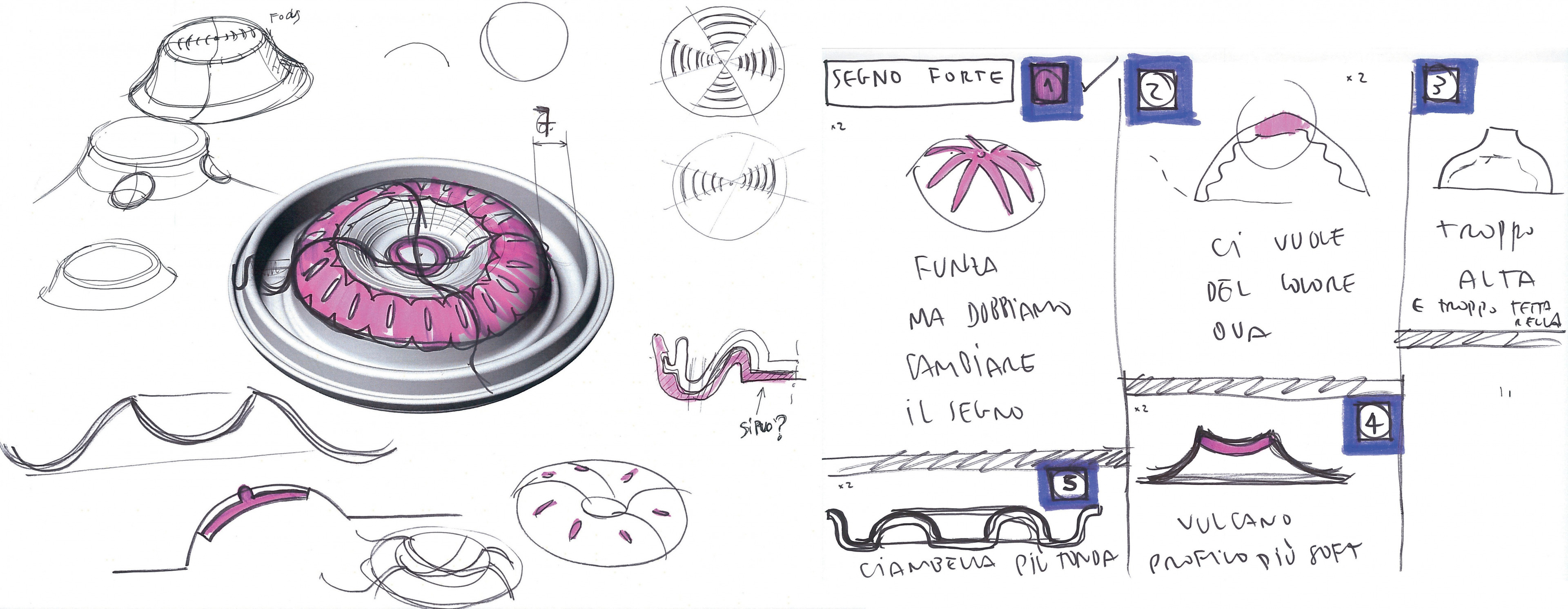
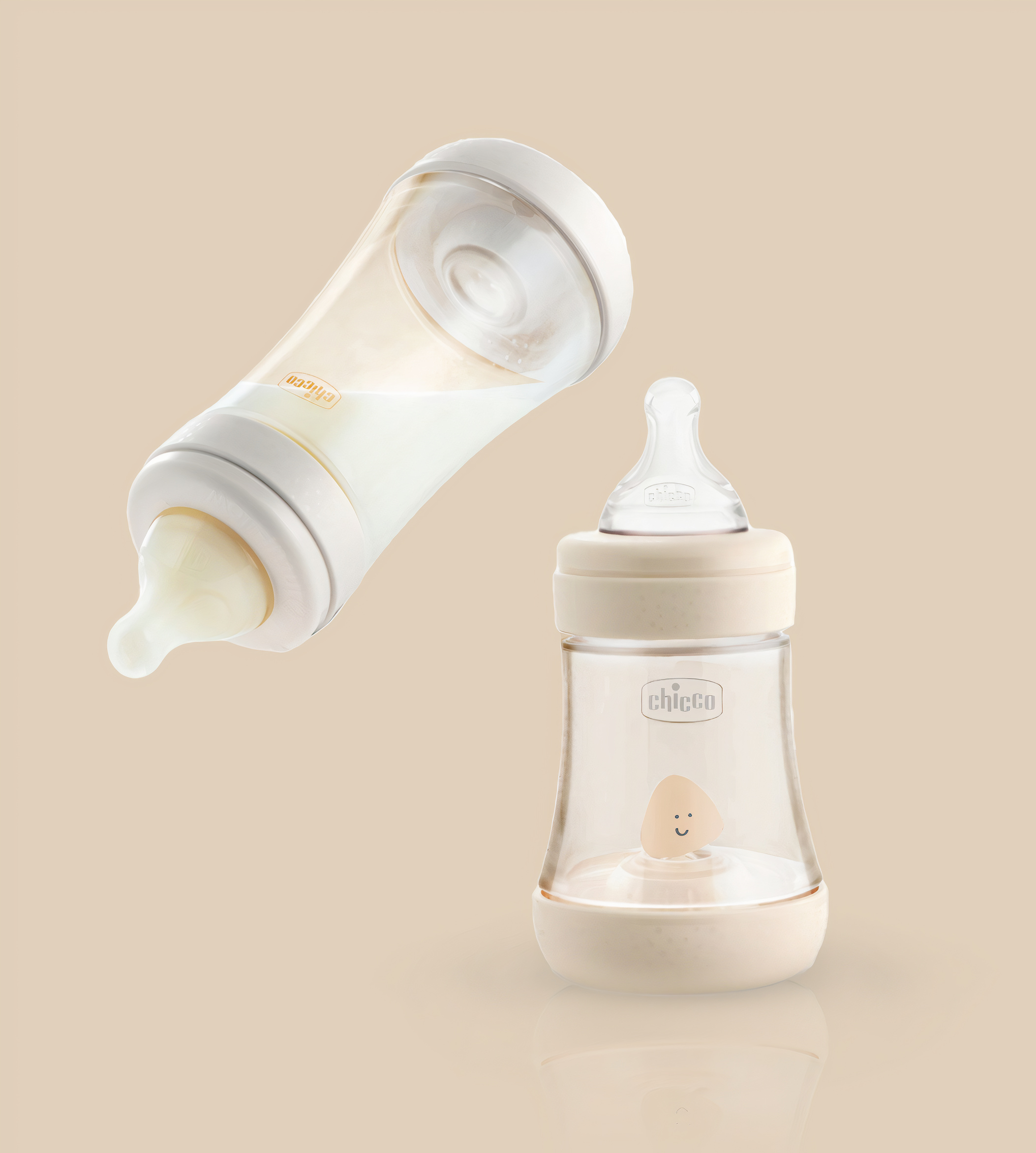
The range was then expanded with Chicco Perfect 5. This playful and minimalistic bottle series features the innovative Physio teat and an Equilibrium Membrane to prevent air ingestion, thereby preventing colic while also adapting to the individual sucking rhythm of each child.
This baby bottle was characterized by 5 elements offering maximum comfort and ergonomics to babies while drinking their milk.
The mission of our CMF experts was to enhance these elements and make them visible in order to turn the product’s promise into a reality. In doing so, the new design clearly and gently communicates the extreme functionality of the baby bottle range.
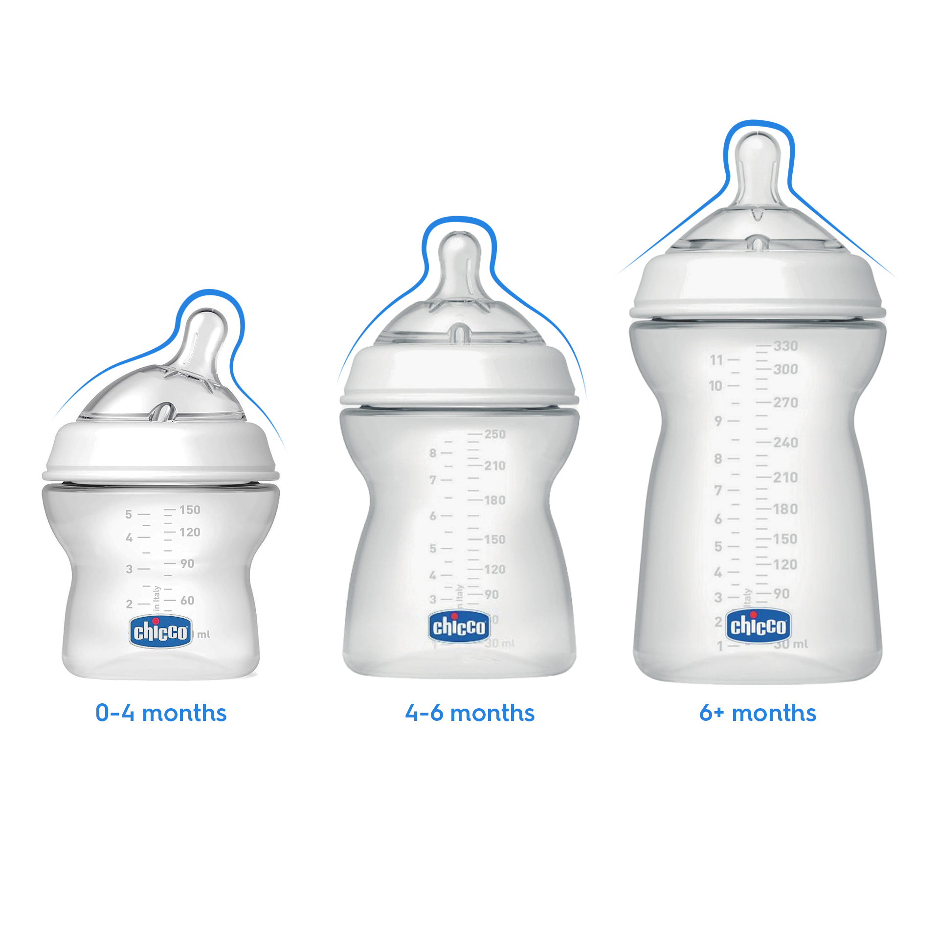
Chicco Natural Feeling
As babies grow, so do their feeding habits. Taking these changes into account and observing the growth of children informed the main design references for the Natural Feeling baby bottle range , adapting to these various changes with three different teats.
The inclined and rounded teat, mimicking a mother’s breast, is designed specifically for infants, facilitating the correct neck position for peaceful breastfeeding while ensuring the bottle remains full of milk to prevent air ingestion.
The introduction of an inclined teat marked a significant change for the market and, even today, distinguishes the brand and the user-centric approach embodied by this product.
About the project
Client
Artsana S.p.A.
Year
2004 and on
Expertise
Industry