Nipiol
More than simple packaging, a fairy-tale story

The solid strategic partnership between DGI and Kraft Heinz – aimed at repositioning the main brands of the Group’s portfolio – continues with the complete relaunch and rebranding of Nipiol: a historic icon and reference in the baby-food segment within the Italian market.
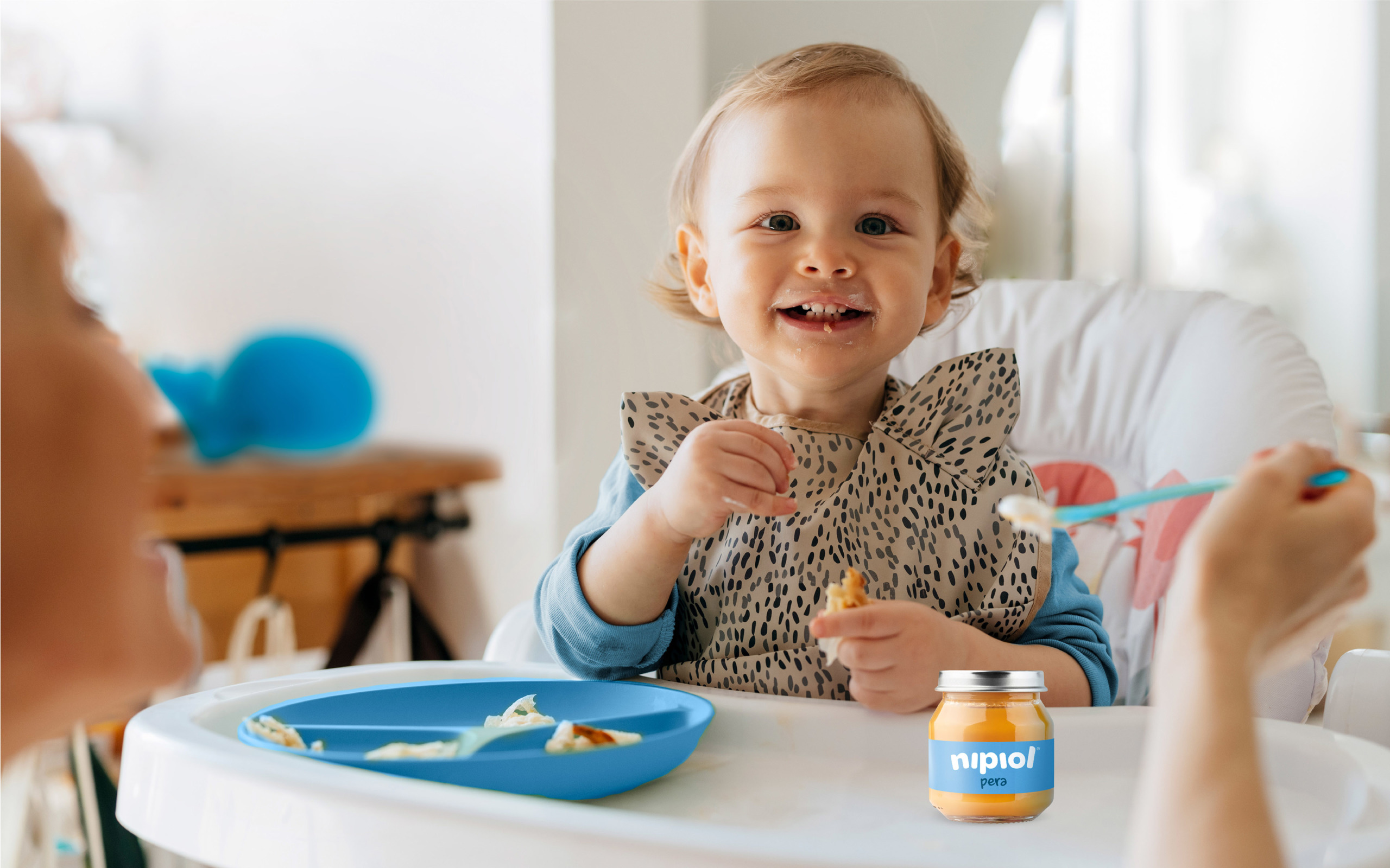
Nipiol proposes value-for-money food solutions to parents looking for simple, direct and smart products.
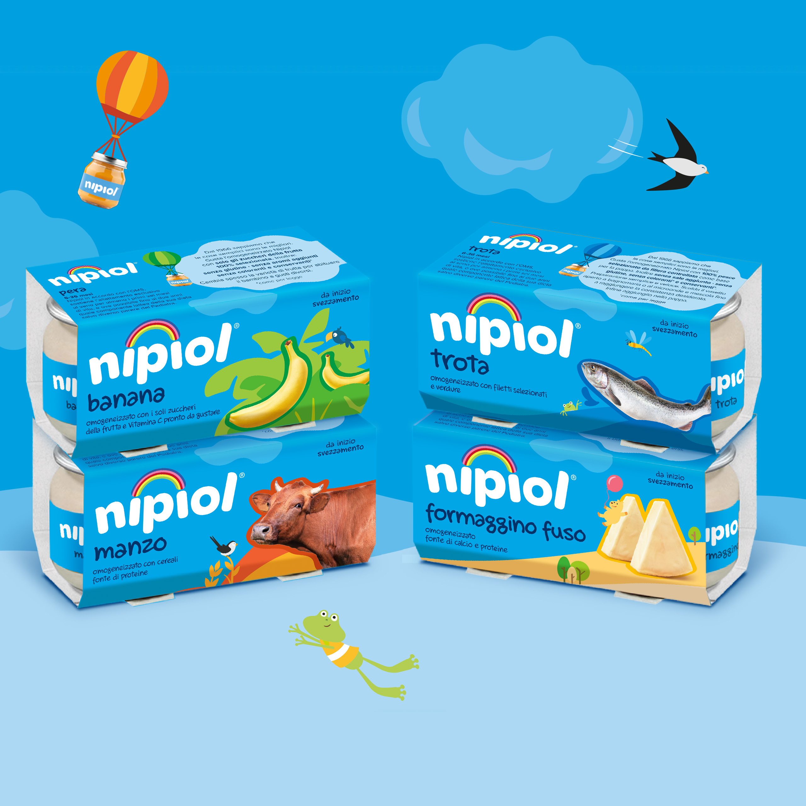
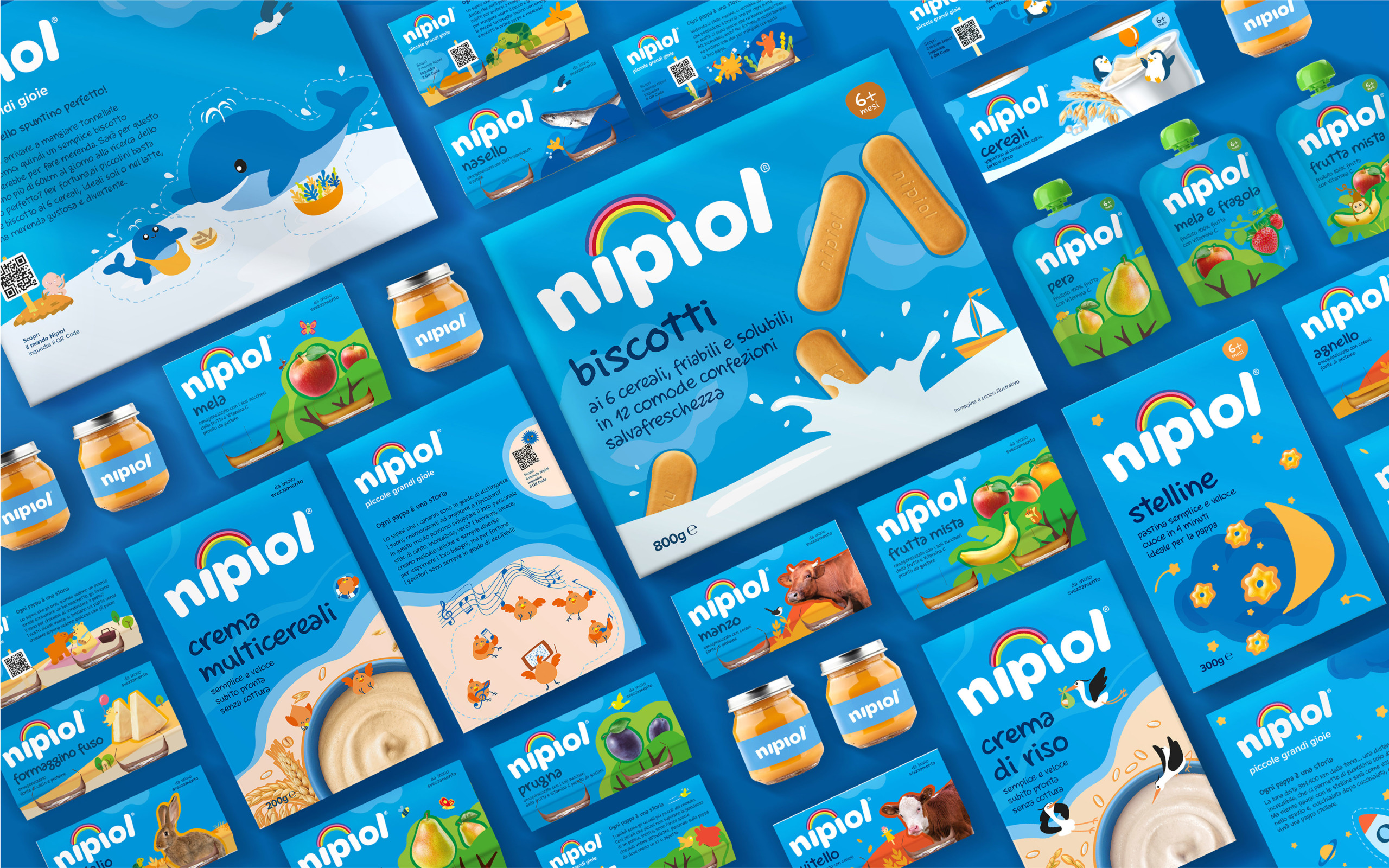
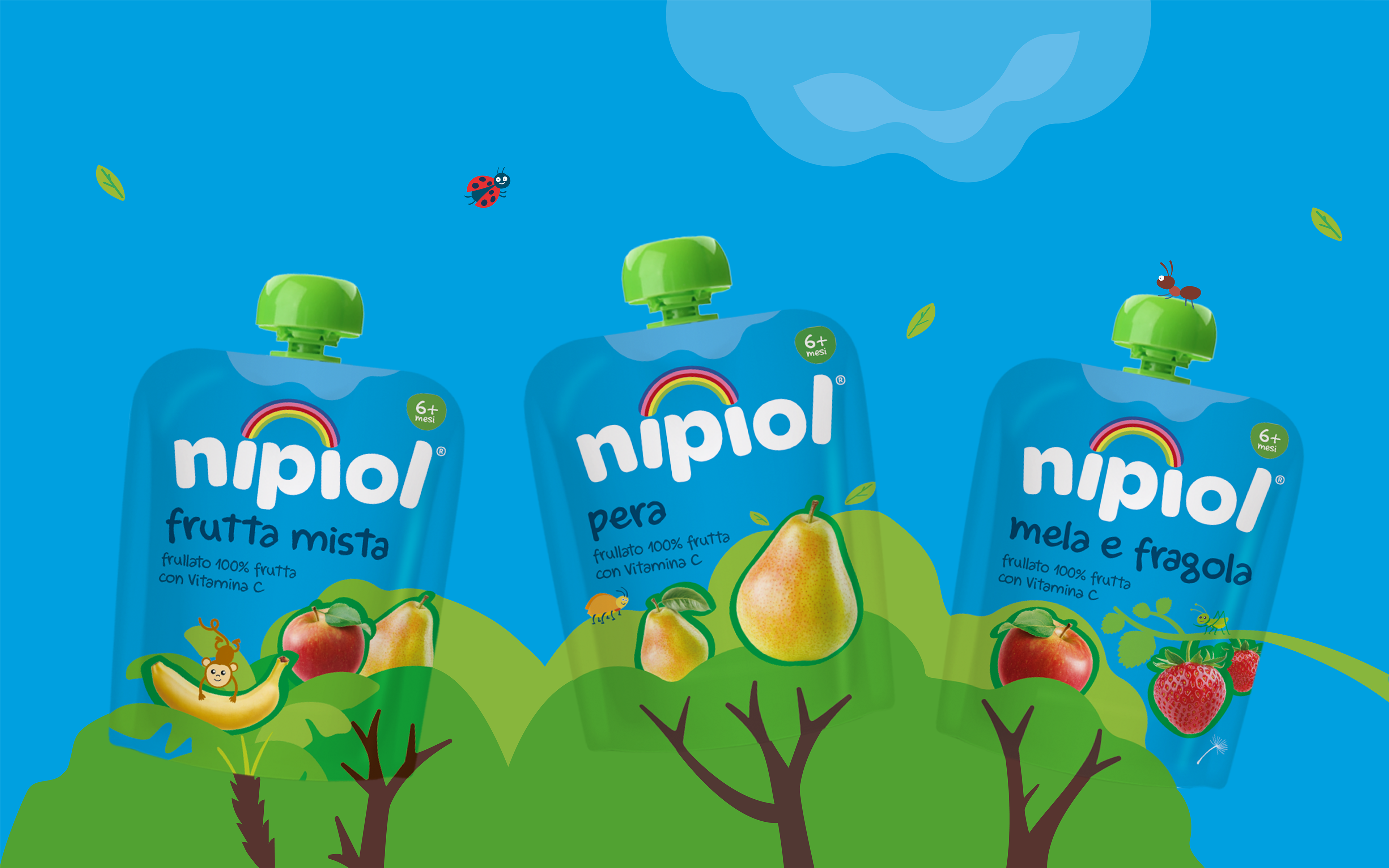
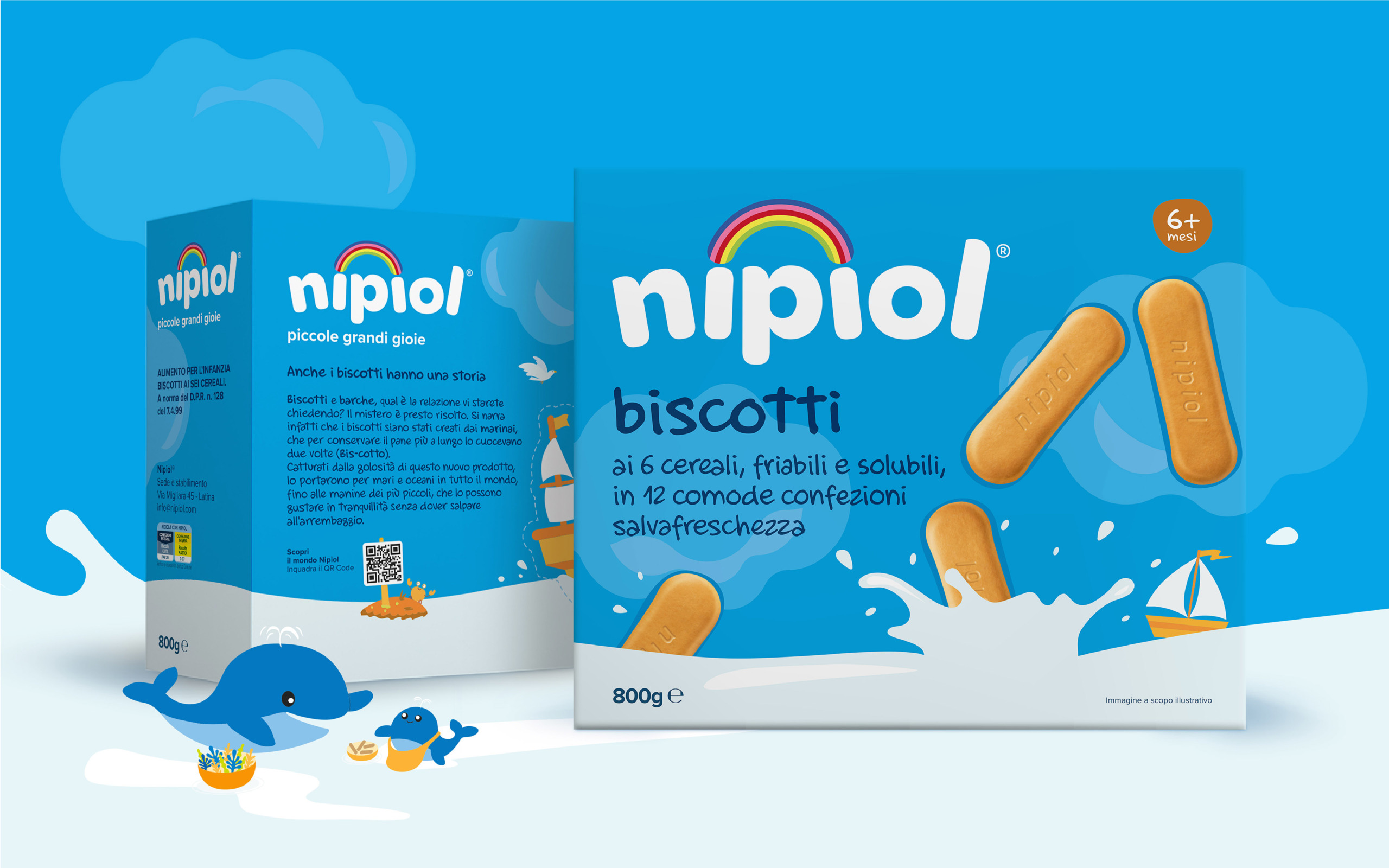
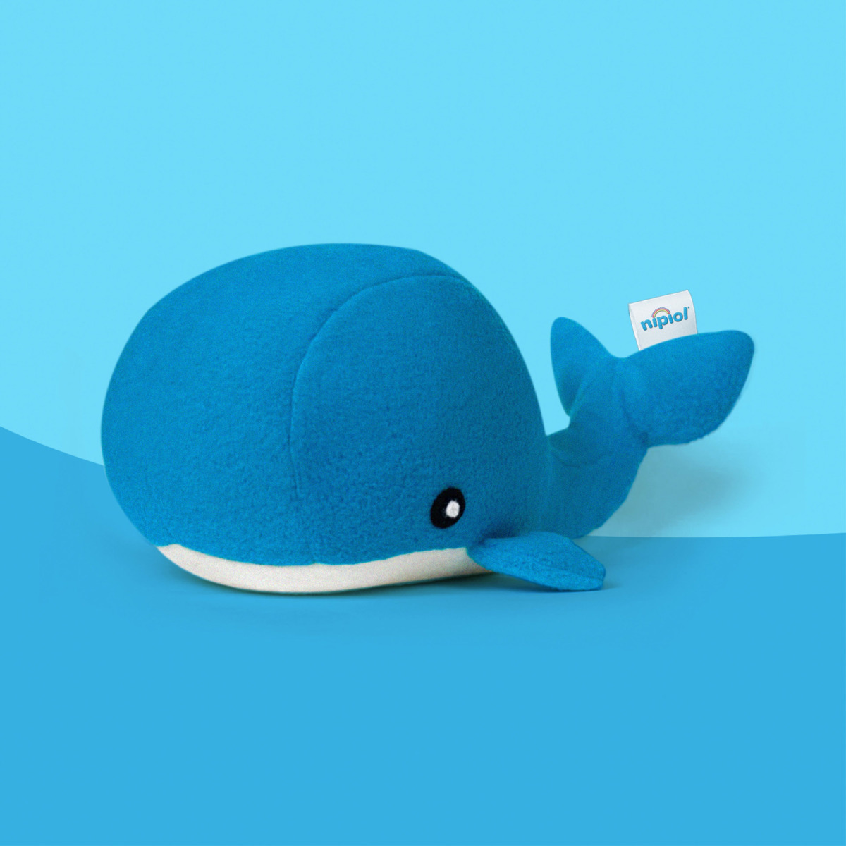
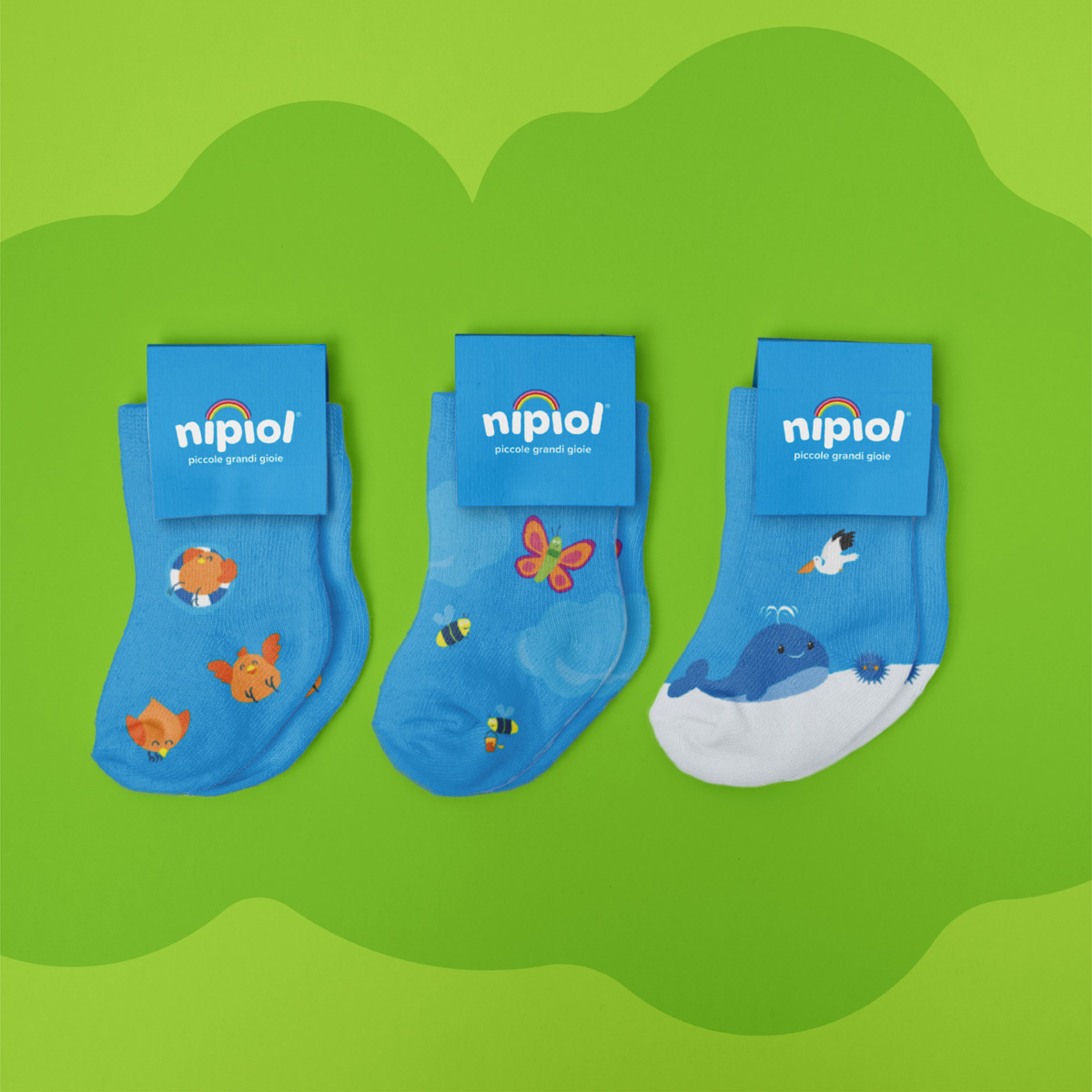
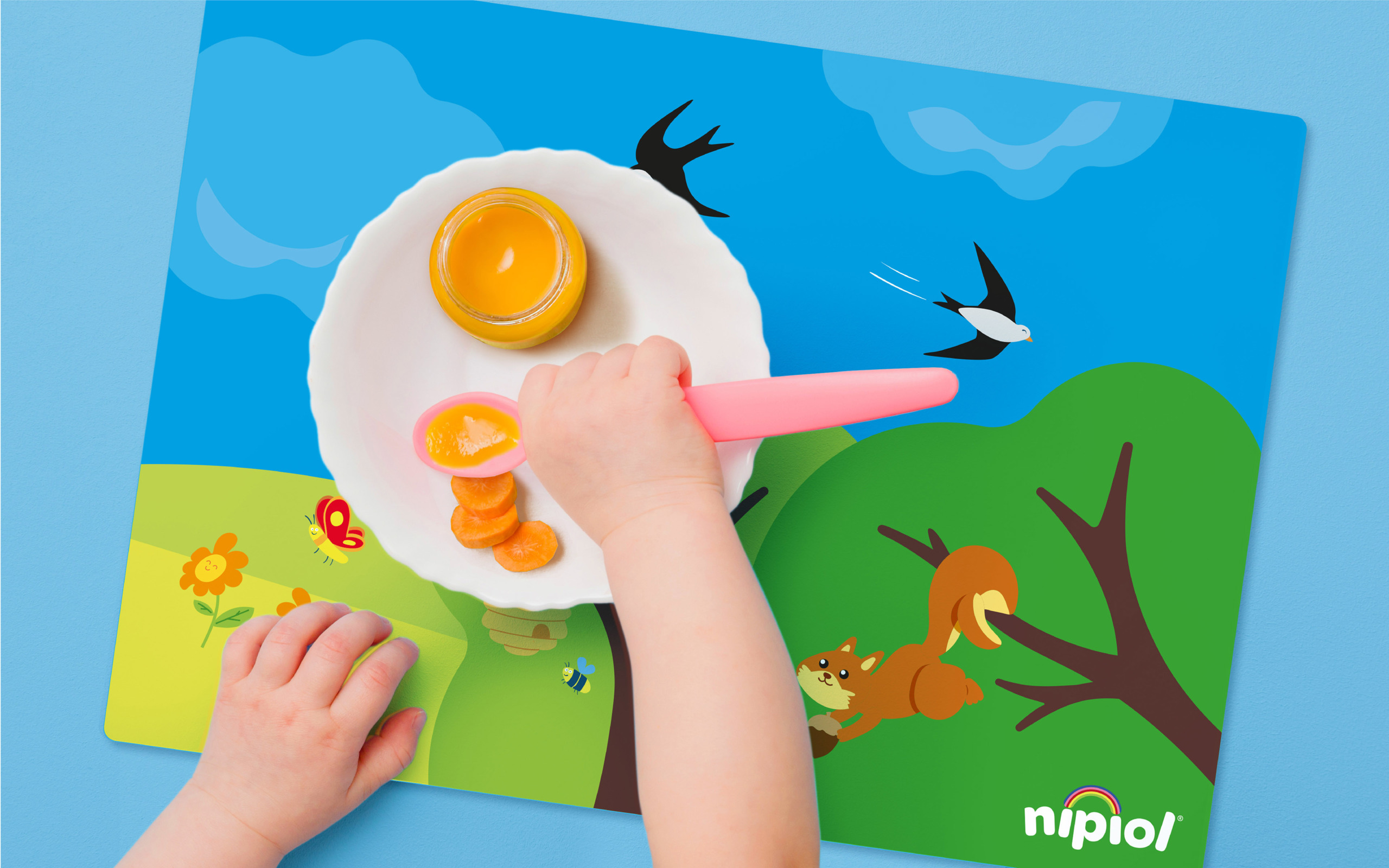
DGI redesigned the packaging and visual identity of the brand from scratch, making each pack a new episode of a fairy tale in which the brand, the ingredients and the characters coexist in a playful, natural way through a tailored, new illustration style.
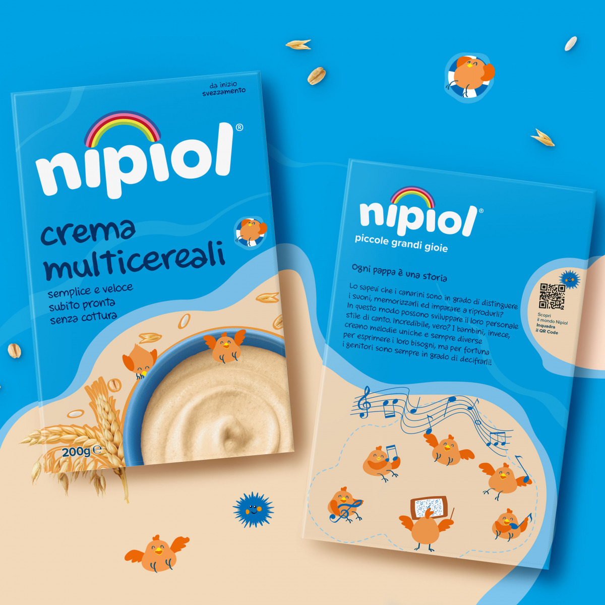
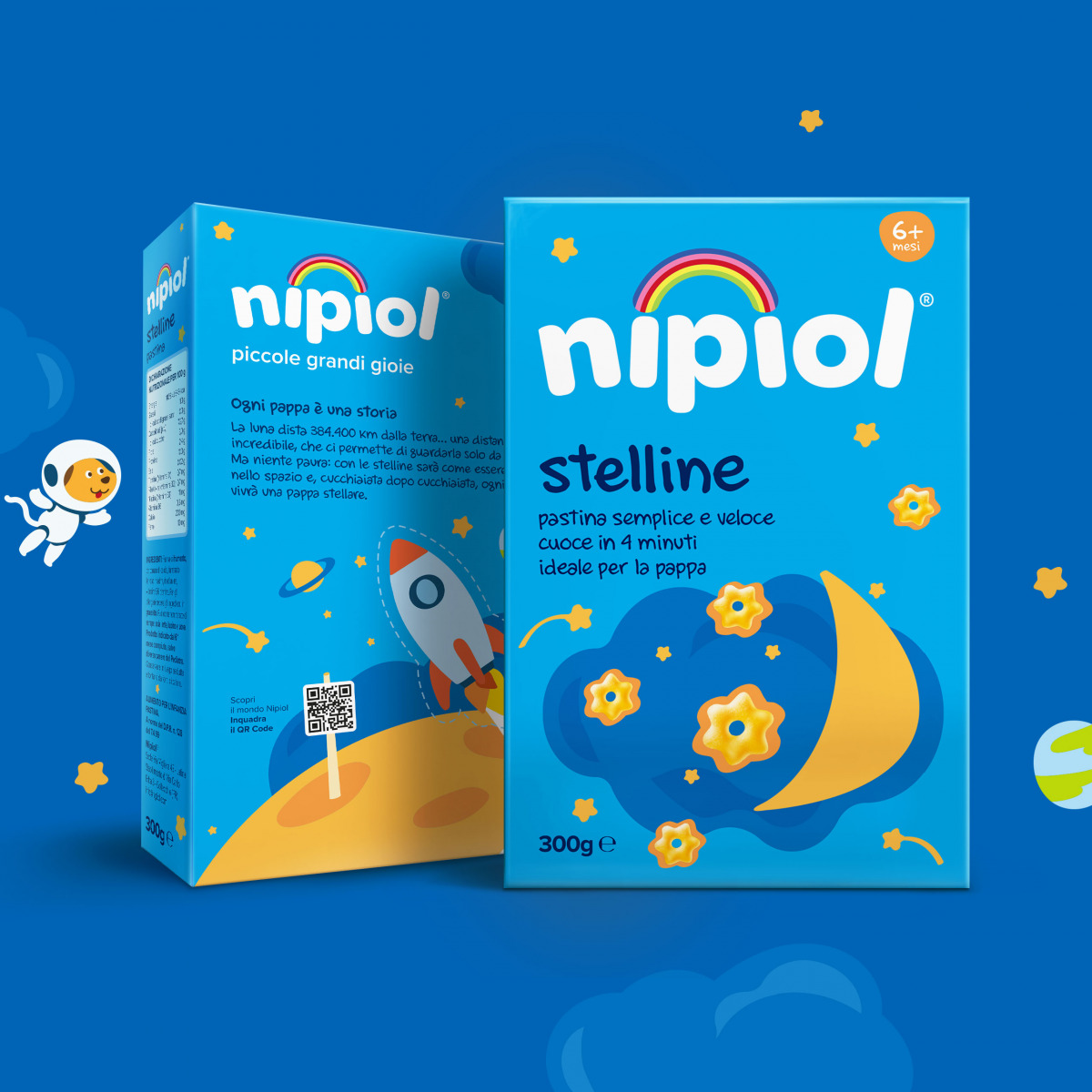
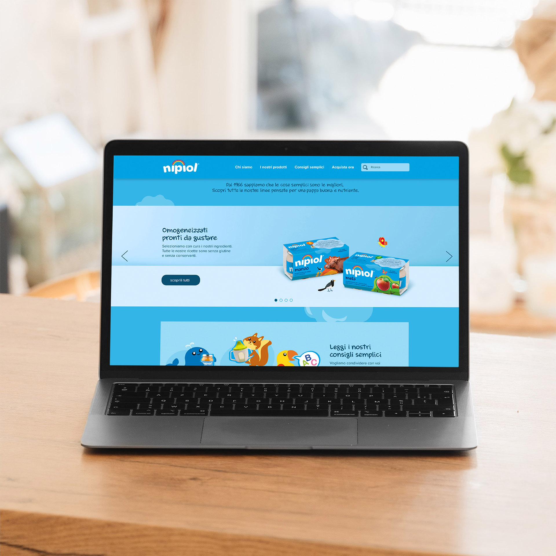
With a broad brand-ecosystem vision, even the back-of-pack for each product becomes a place to set the episodes of Nipiol’s story, continuing towards digital channels and physical POS touchpoints to reach the most surprising merchandising applications.
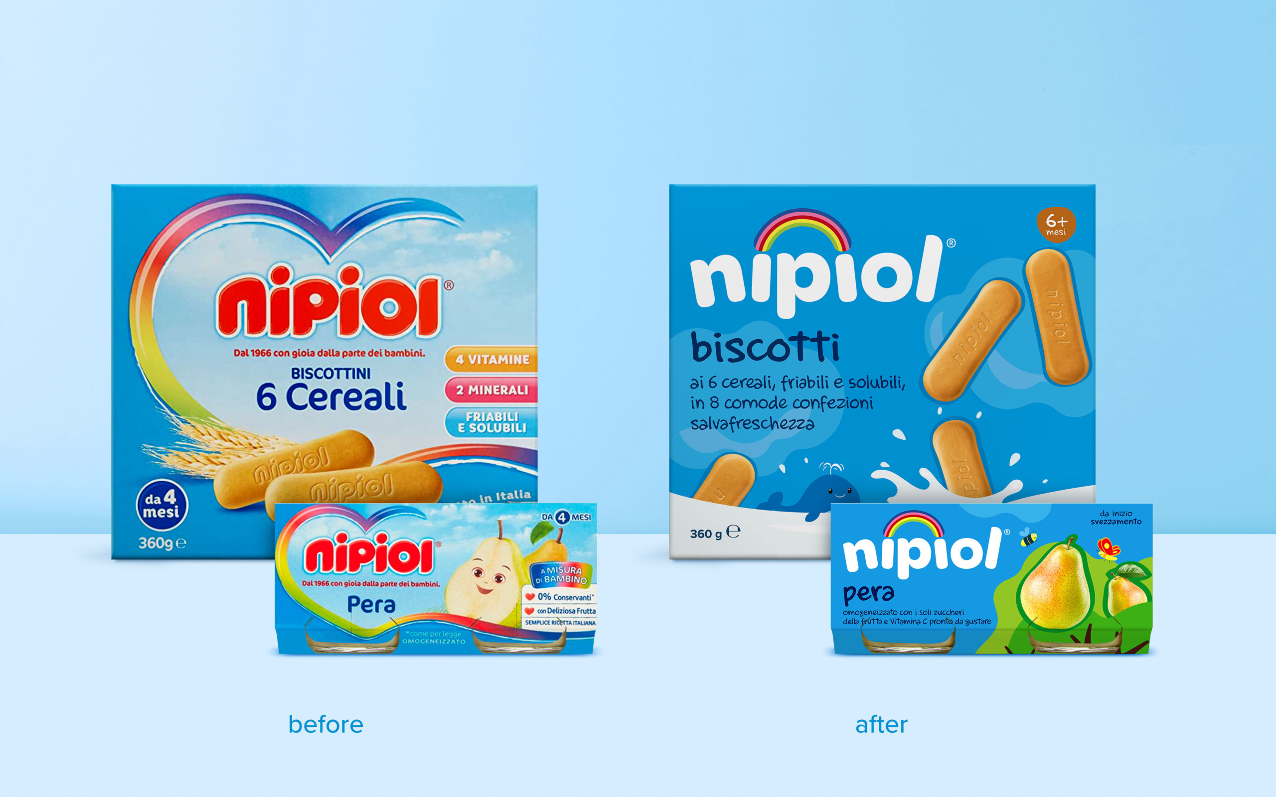
This approach pursues the key objective of restructuring the brand for transversal geographic contexts. The goal was to make Nipiol attractive for different and wider target areas: reinforcing and improving its performance in Southern Italy — where Nipiol stands out for its awareness — and relaunching the brand in the north, through its new impactful, engaging and contemporary style.
Nipiol has been transformed into one of the most creative concepts of the Italian GDO.
A careful study of the logo’s typography -capitalizing on the distinctive blue element with a strong impact on the shelf and a rainbow as a pictogram – a natural depiction of the subjects and the choice of a simple and warm illustrative style, openly inspired by children’s storybooks led the revamp.
Last but not least, an extremely simplified packaging system with synthetic messages is aimed at facilitating the consumer’s navigation.
About the project
Client
Kraft Heinz
Year
2022