Sperlari Candies
Bringing joy to every day
As part of a complete relaunch and evolution of the Brand, our team cooperated with Sperlari to develop a dedicated and complementary strategy for the two key ranges in Sperlari’s product portfolio (seasonal vs. continuous). The rebranding brought greater clarity to the distinct, authentic identities of the two ranges—highlighting their unique values and look & feel, and making their differences more immediately recognizable.
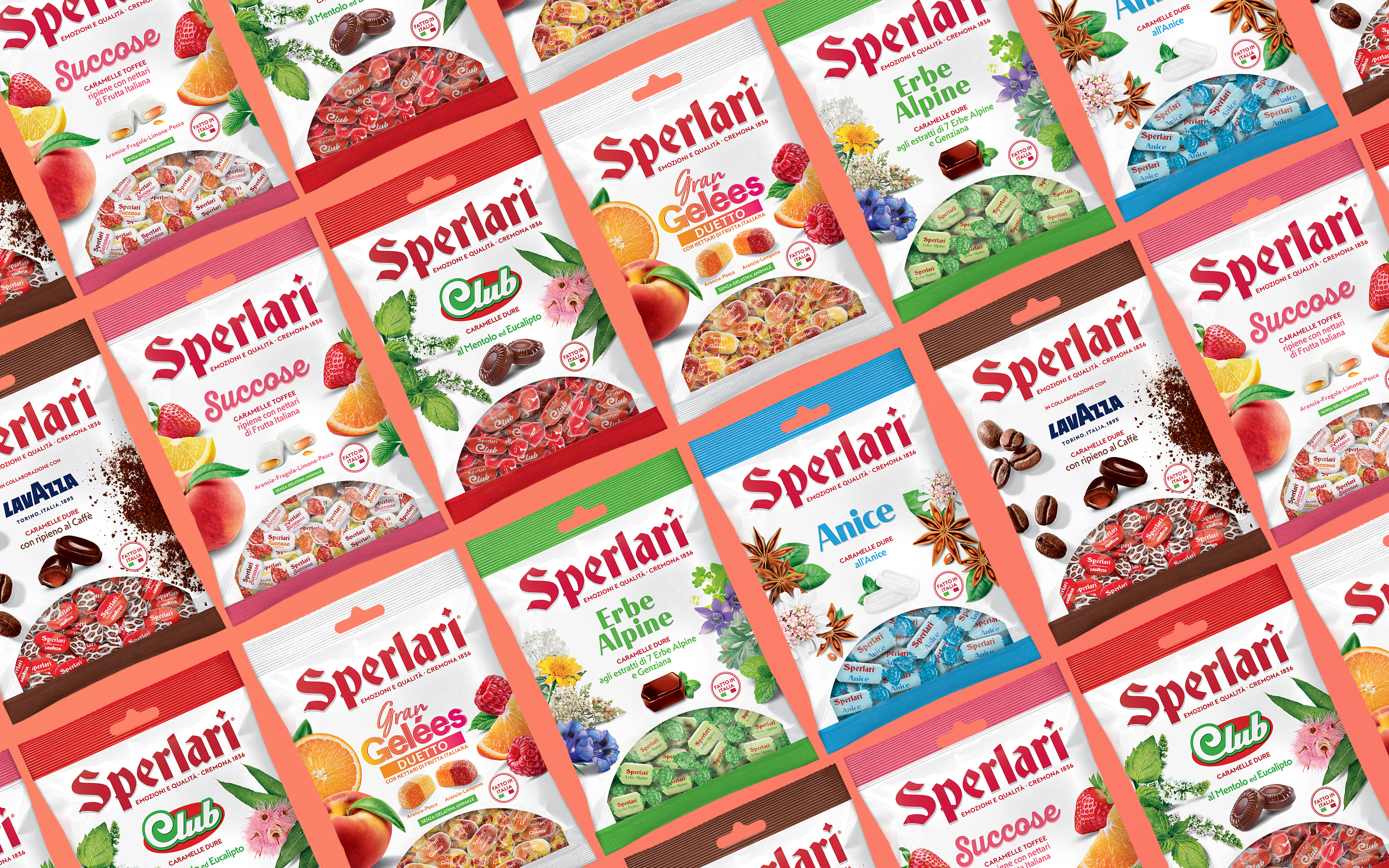
The continuous range of candies is based on:
- A refined naturalness
- Delicious taste and premium quality
- Well-balanced flavors
- Expert craftmanship according to Italian taste, tradition, and style
- Appealing to everyone, perfect for any moment
- Designed to evoke timeless emotions
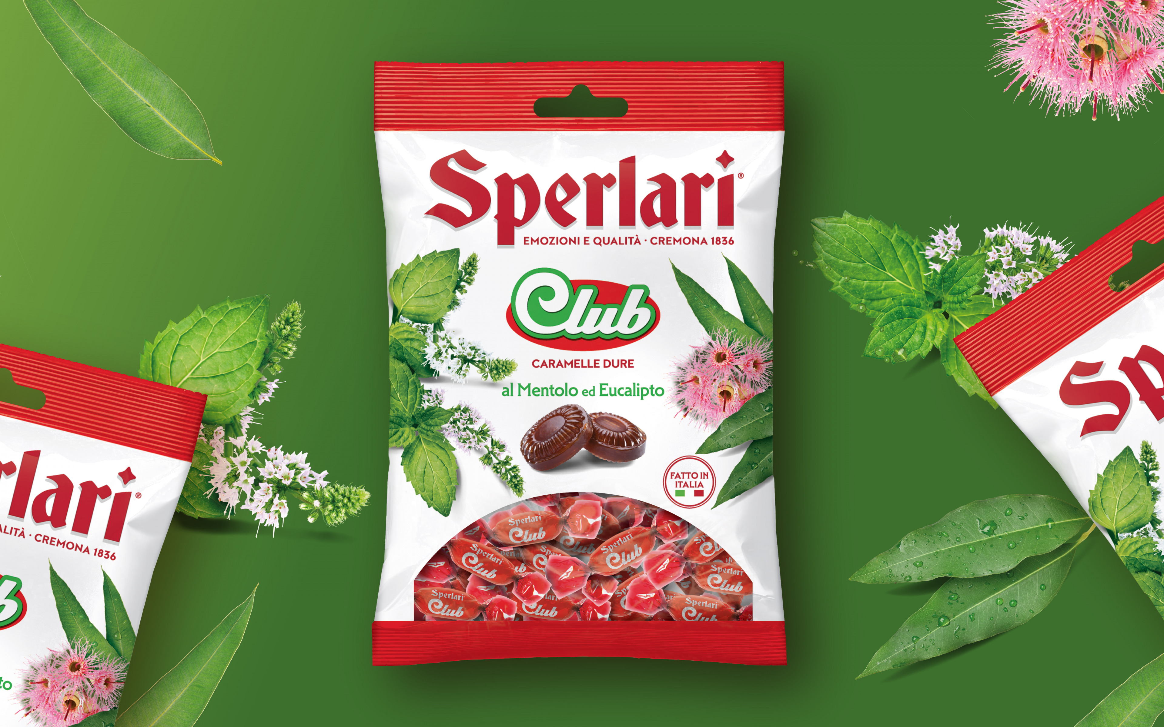
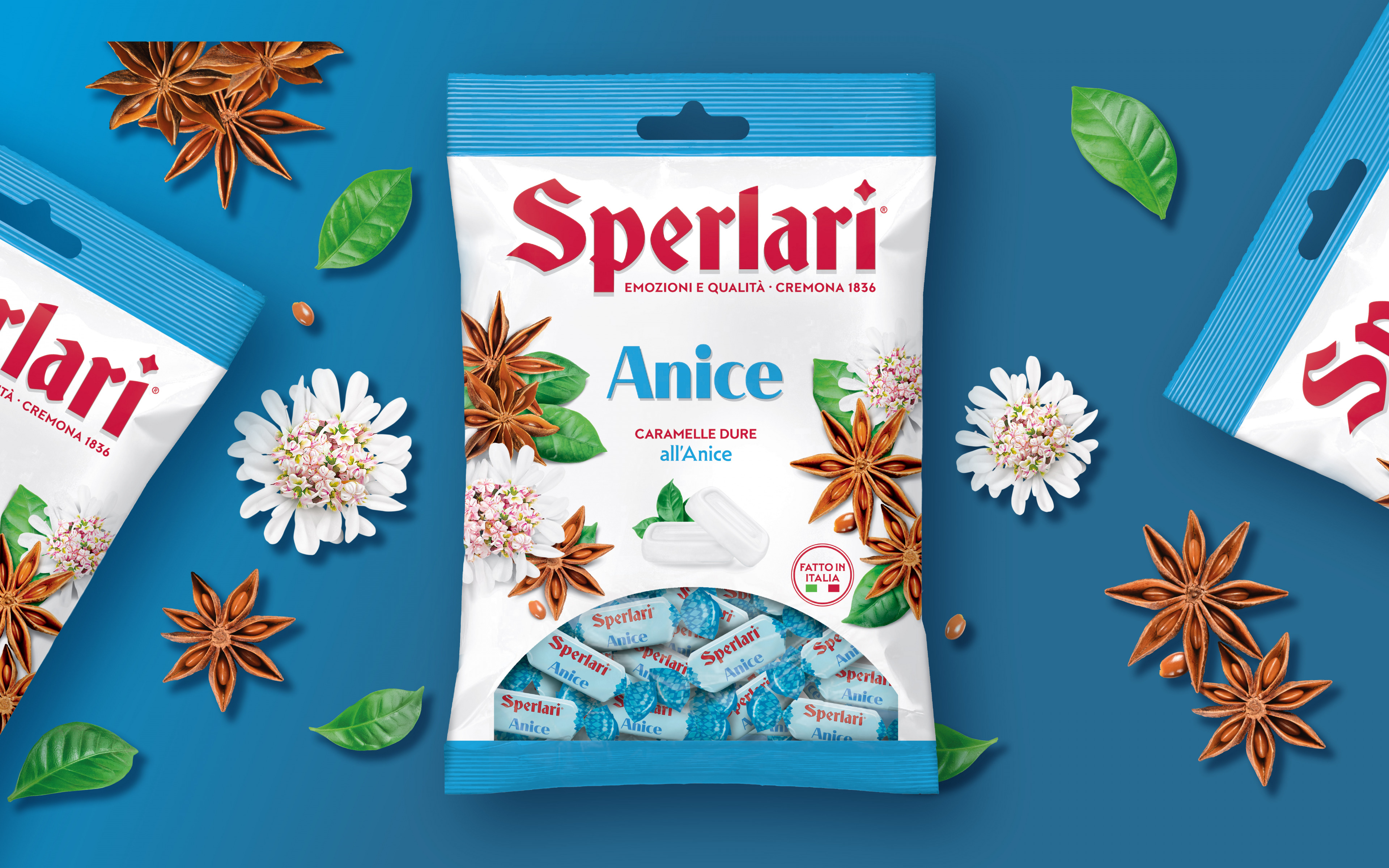
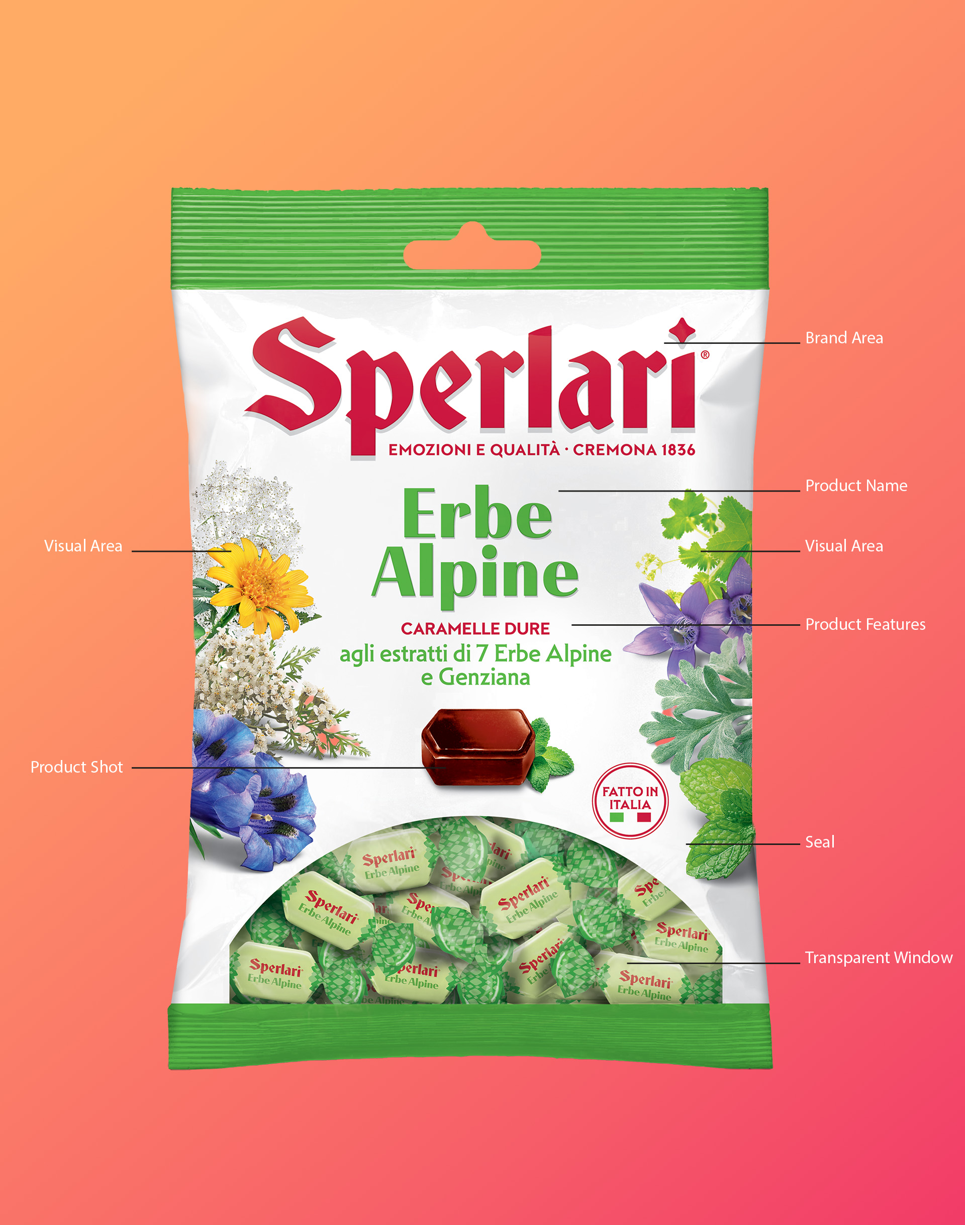
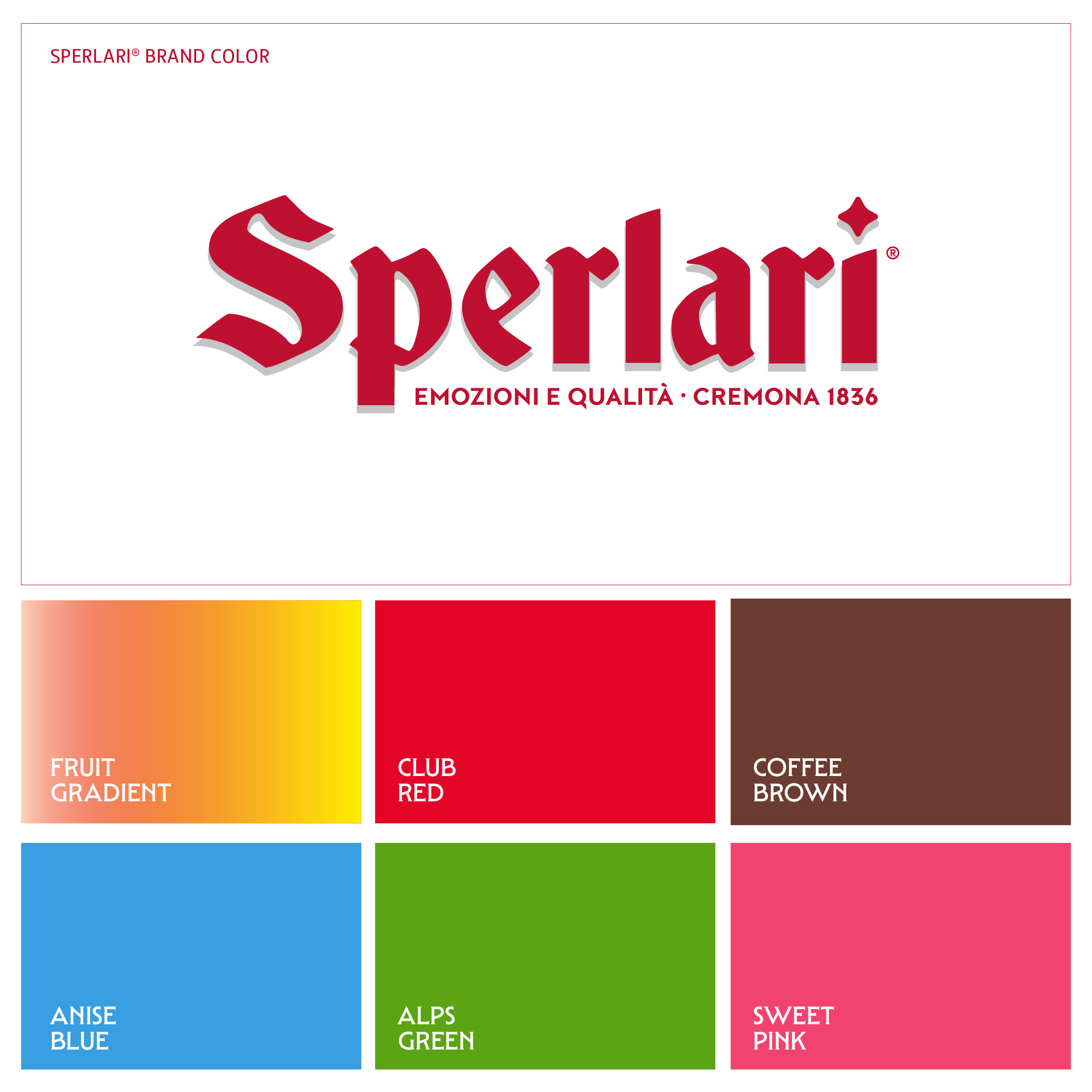
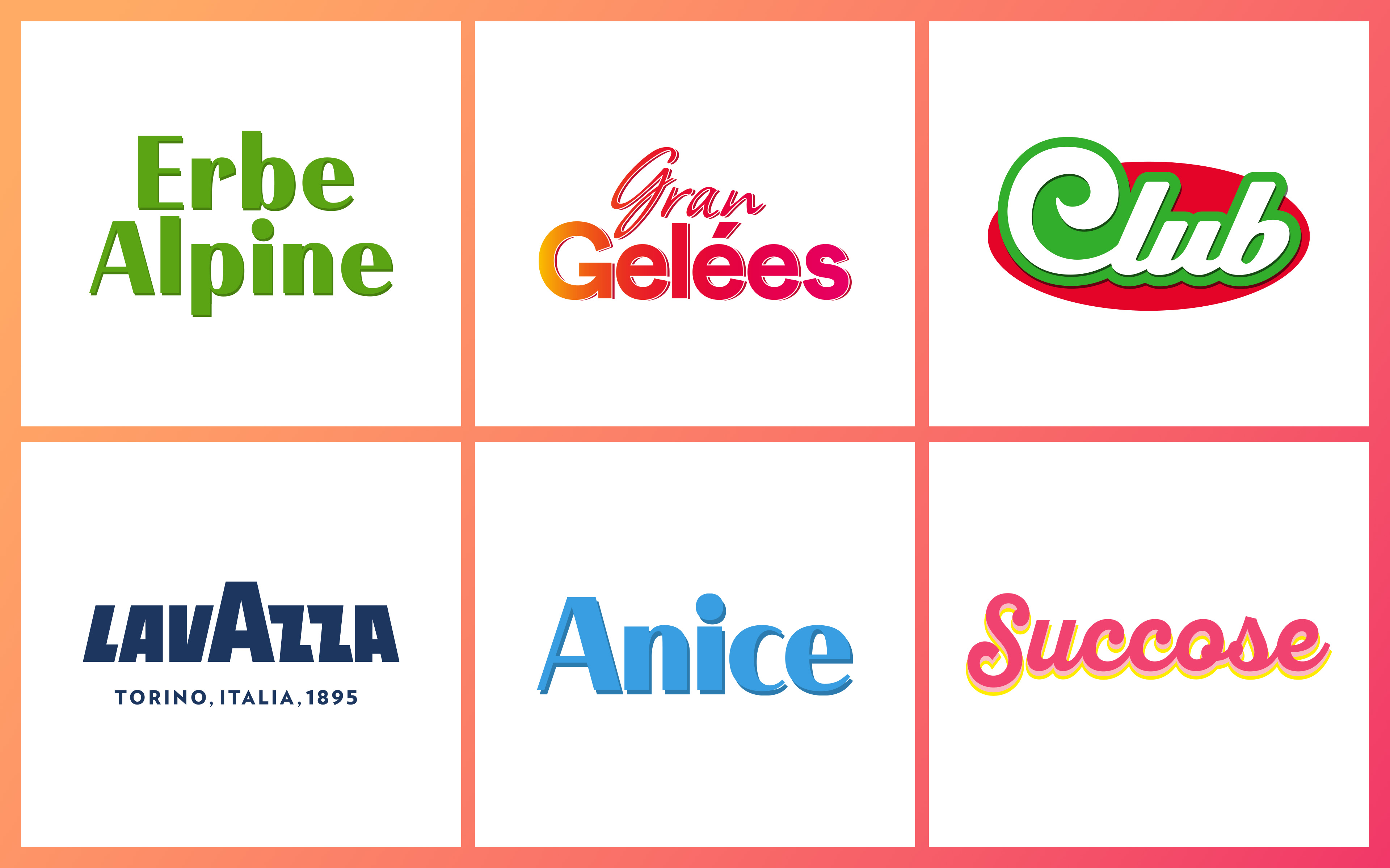
The renewed packaging system showcases the Sperlari logo prominently, edge-to-edge across the top, with the central area dedicated to the product name or sub-range, using a dedicated logotype style.
Around the product name and candy visual, vibrant bursts of fruit, herbs, and natural ingredients:
1.Highlight the integrity and quality of raw materials through distinct colors and recipe cues
2.Enhance differentiation among SKUs., ensuring a clear range navigation
The white background is the result of a strategic choice aimed at:
- Emphasizing the brand’s iconic Sperlari red
- Accommodating a wide variety of flavors within a single cohesive brand system, creating a strong visual shelf impact.
- Differentiating from all competitors, as white has historically been owned and associated with the Sperlari brand.
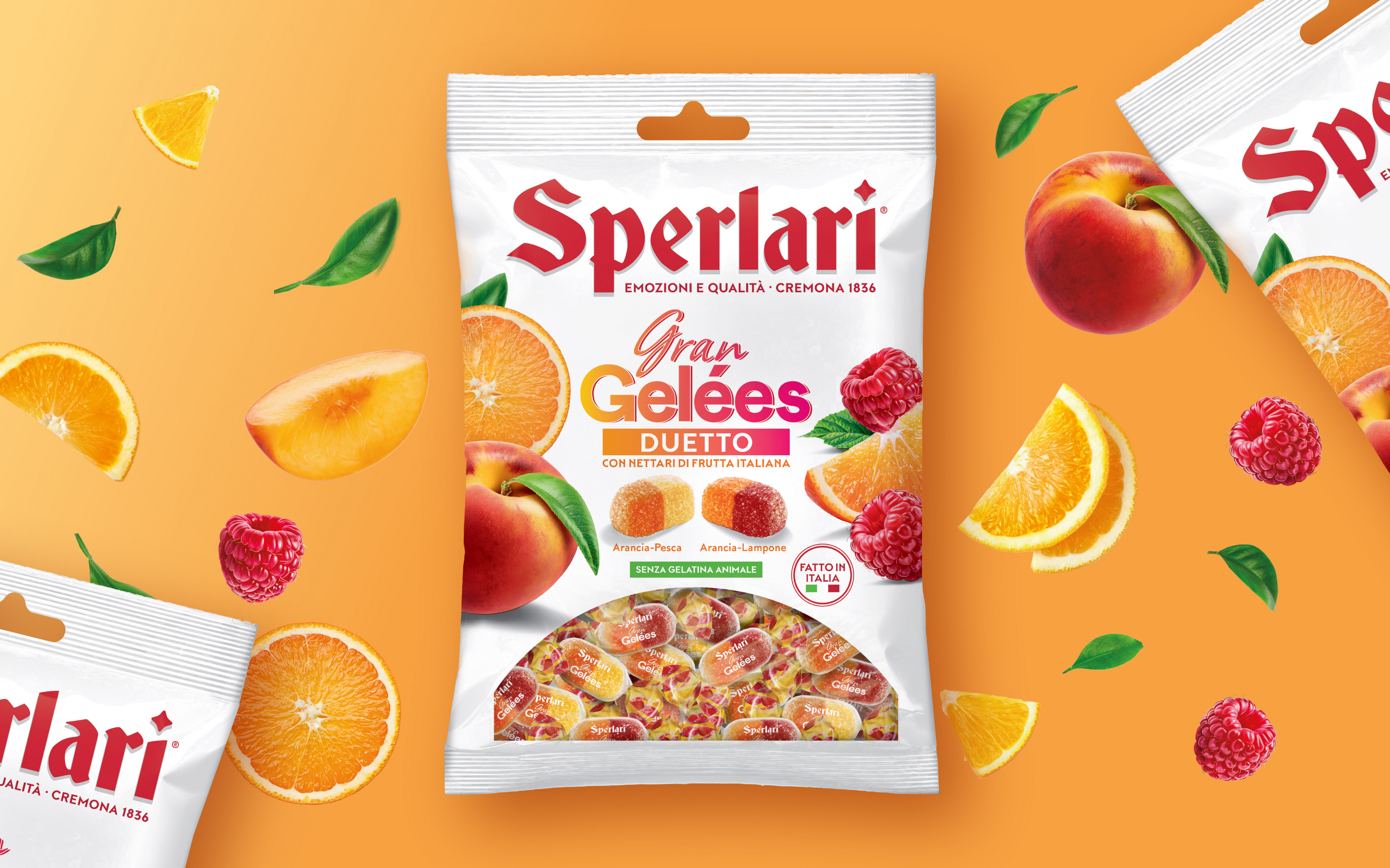
Colorful, bright, and clearly tasty: the new candy packaging system updates the offering and shelf presence with a contemporary approach.
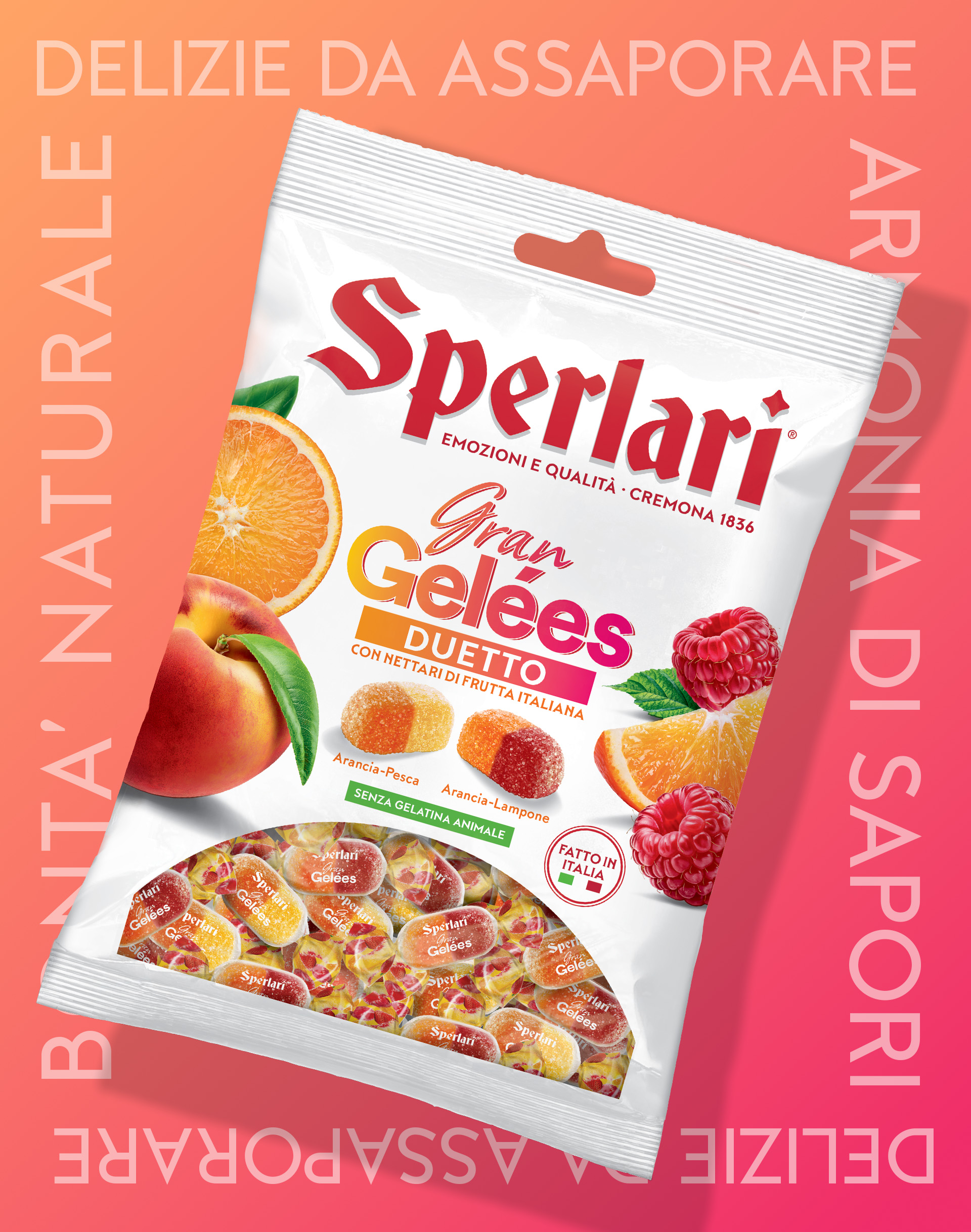
Among all flavors, the Gran Gelées stand out as a true example of Italian confectionery excellence and tradition, combining a refined quality with the natural taste of fruit.
Masterfully crafted by Sperlari, the Gran Gelées are the flagship and top-performing products within the continuous range, driving the entire lineup forward in their category.
About the project
Client
Sperlari S.p.A.
Year
2025
Expertise