GocciaBlu
Thirst to stand out, style in drinking

We cooperated with the mineral water company Togni to relaunch the historical brand “GocciaBlu” to stand out in every channel and communicate a renovated, contemporary story.
This evolutionary path passes through a new positioning, driven by a set of key strategic objectives:
- Re-build the awareness and the recognition of the Brand, leveraging on its heritage of decades
- Elevate the premiumness and the high perception of the offer, nationally and internationally, in the HORECA channel (today), as a qualitative and trust driver for the GDO channel (tomorrow)
- Differentiate the ranges accordingly with each channel and their different perception of value (Premium vs. Super-premium)
- Renew the design equities of GocciaBlu in terms of Structural packaging, Label and packaging identity, through a cross-disciplinary and consistent design approach.
ANALYSIS AND AUDIT
The first part of the project involved a careful study of the key competitive B2C scenario including also some benchmarks – aimed at identifying offering segmentations and communication hierarchy trends, as well as design and packaging design equities. The goal was aimed at understanding how to reinforce and differentiate GocciaBlu in terms of story-telling and brand equities, avoiding similar branding approaches of the other players.
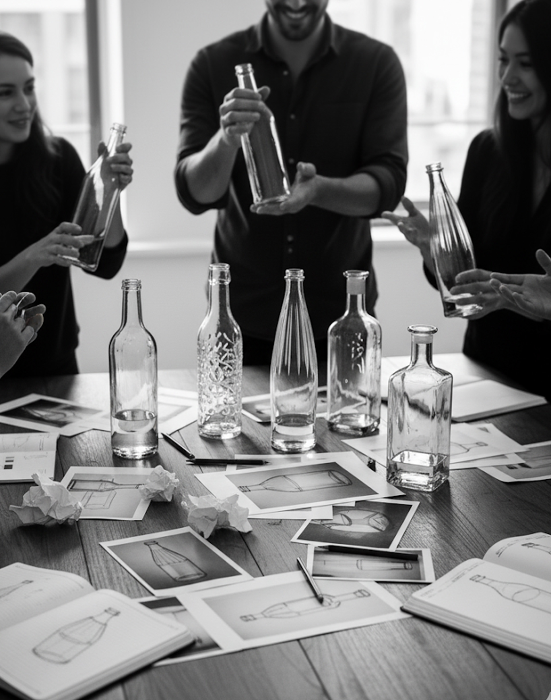
INTERVIEWS AND CO-CREATIVE WORKSHOP
As per our strategists’ methodology, strongly based on co-creation and cross-contamination, the total relaunch project engaging all key Togni’s stakeholders in:
- a session of qualitative 1to1 interviews to collect insights, learnings, expectations and have a deep understanding of the brand and the portfolio challenges.
- a full day co-creative workshop that hosted all the key stakeholders involved in the project, ensuring alignment towards finalizing the brand strategy – working in-synch on today and tomorrow directions for the brand.
NEW BRAND STRATEGY
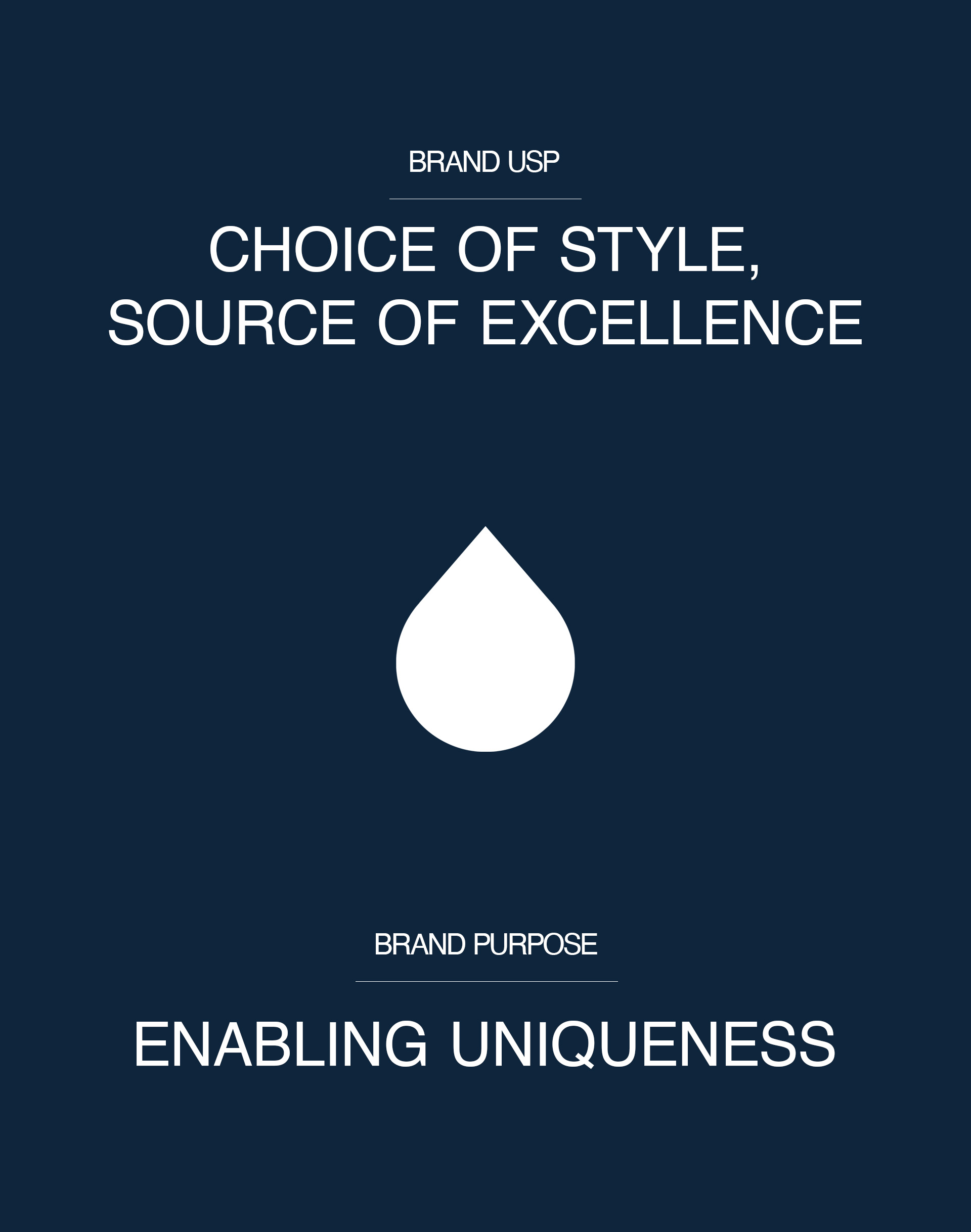
The Brand’s ambition for today and tomorrow was making Gocciablu a cross-target and cross-channel icon of lifestyle and design, recognized both nationally and internationally.
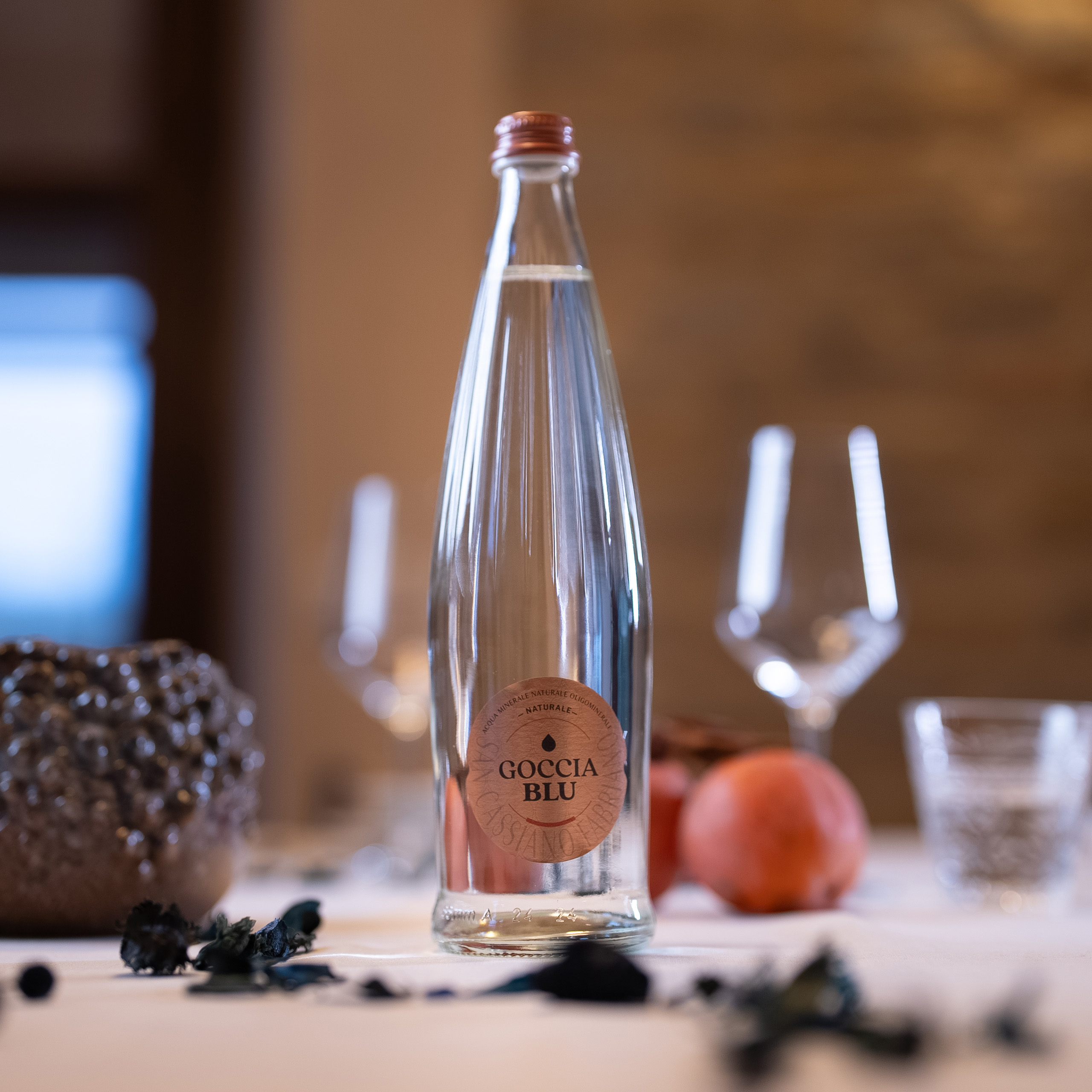
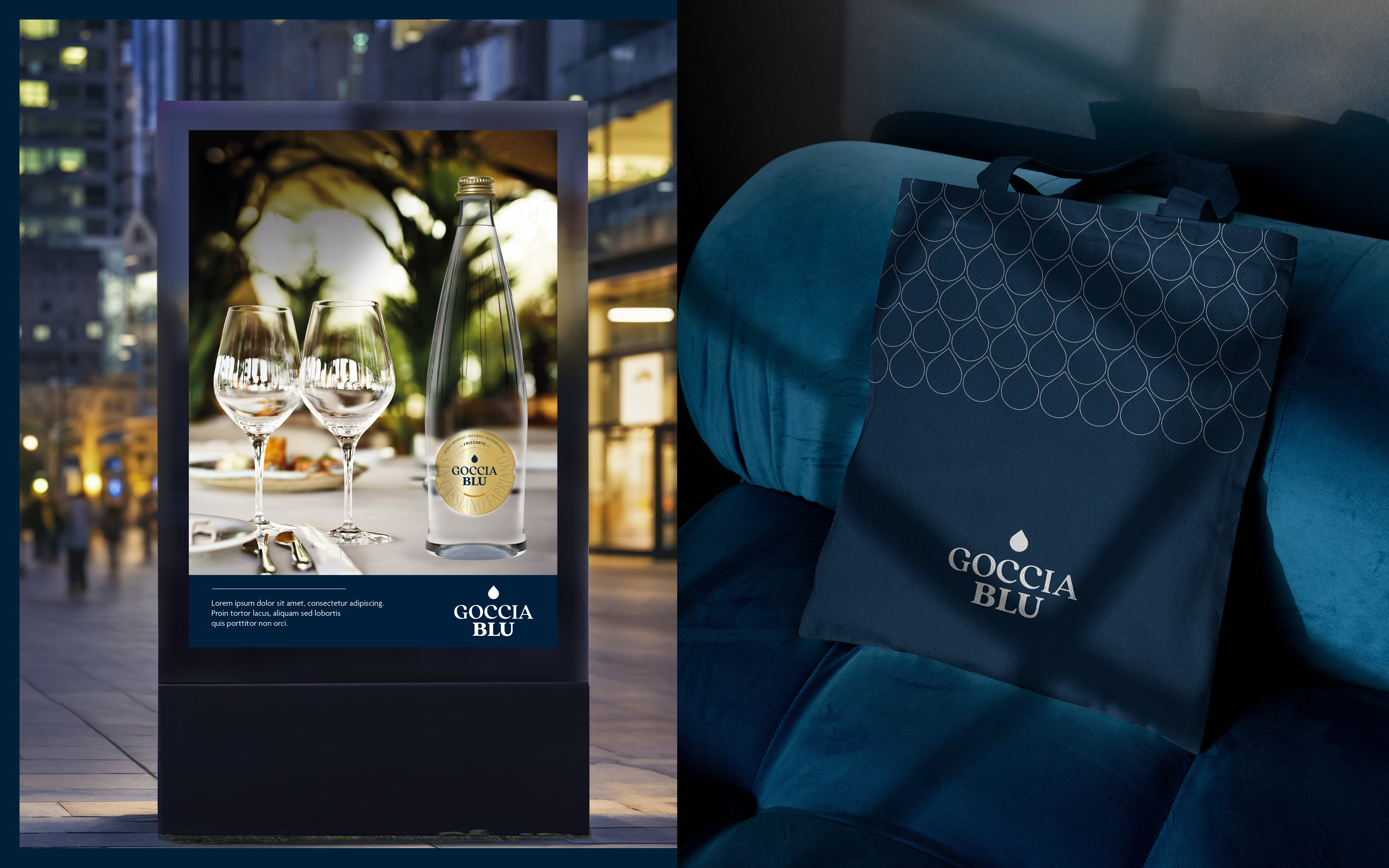
The new positioning elevates the brand’s status to pure aspirational: Gocciablu has become a lifestyle choice, defining and qualifying those who make it. It is a detail that identifies places and contexts, adding further class and sophistication. An iconic element that distinguishes and expresses the personality of those who choose it, while uniting aesthetic form and substance. Gocciablu is the thirst to stand out, it is style in drinking, for those who will not settle.
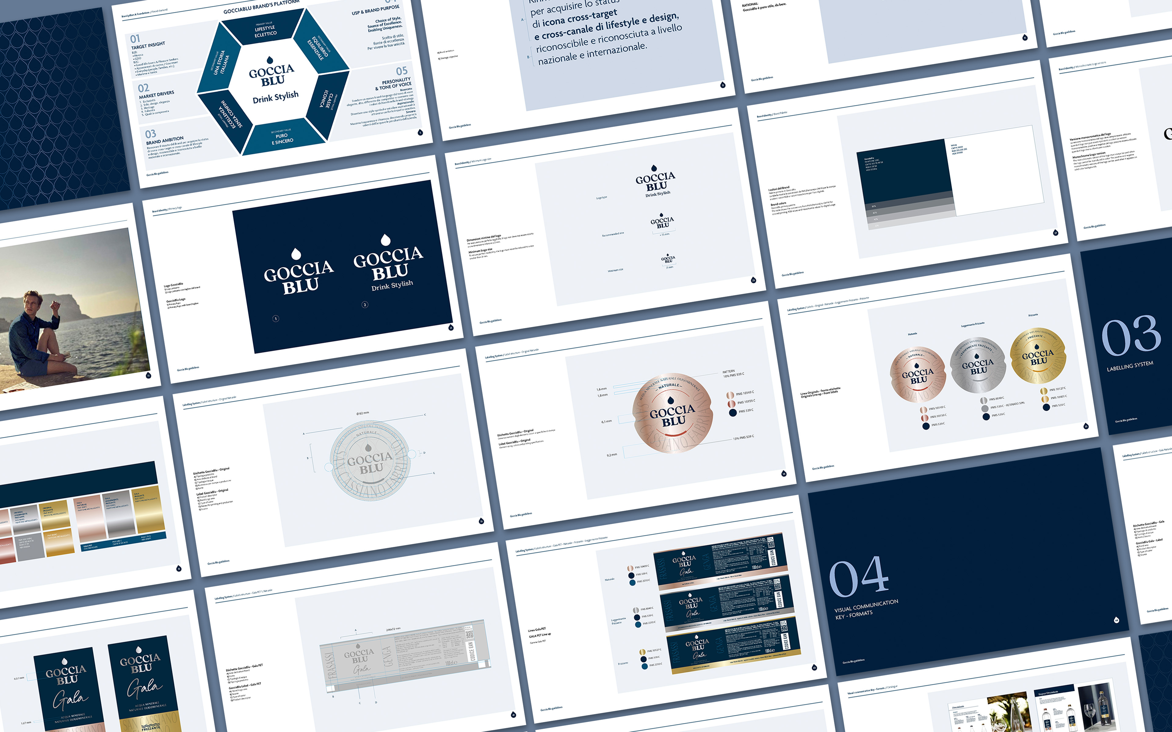
This strategic path has involved the total revamp of the Brand with its pillars, its look and feel, and its packaging system to renew, modernize, increase the consumer’s perception.
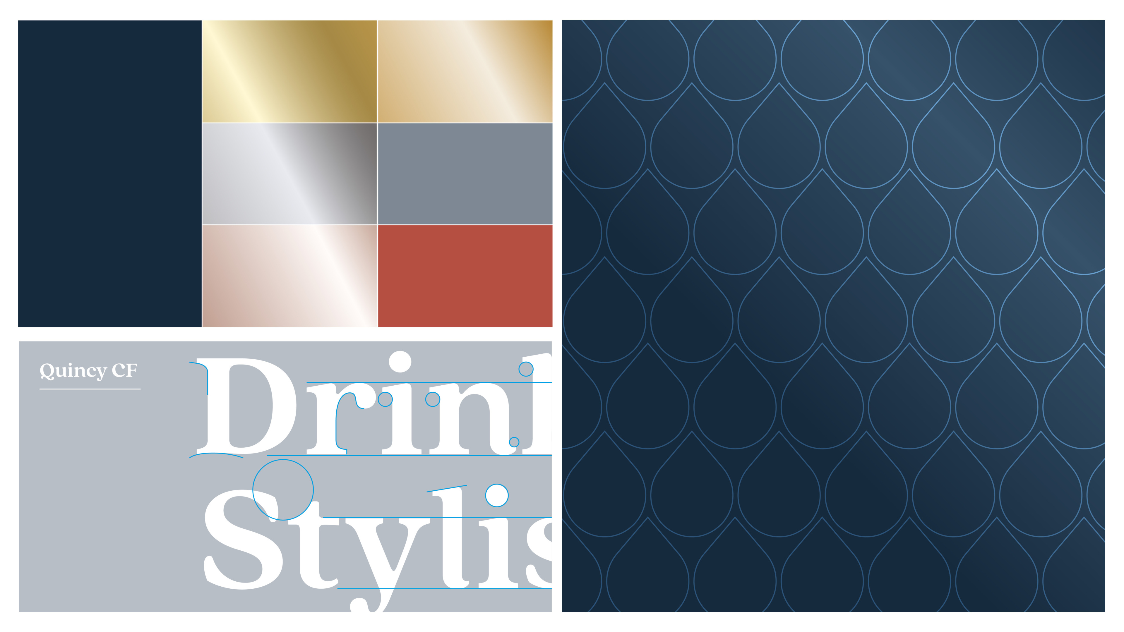
NEW BRAND IDENTITY
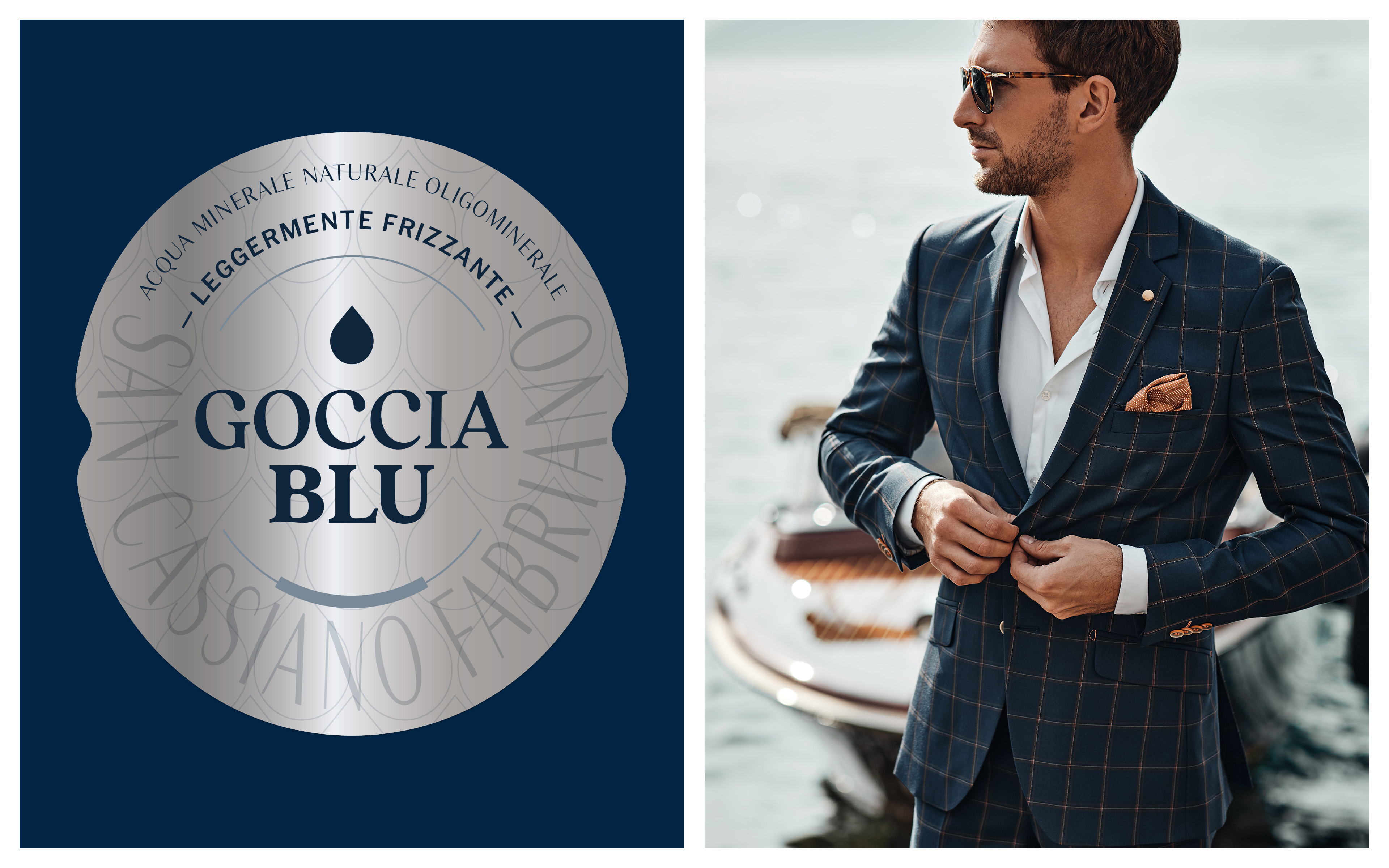
The renewed Gocciablu’s identity features a logo with a timeless and refinedtypography sustained with the new brand-line and call-to-action “Drink Stylish” to directly address to the targets while stating the aspirational nature of the Brand.
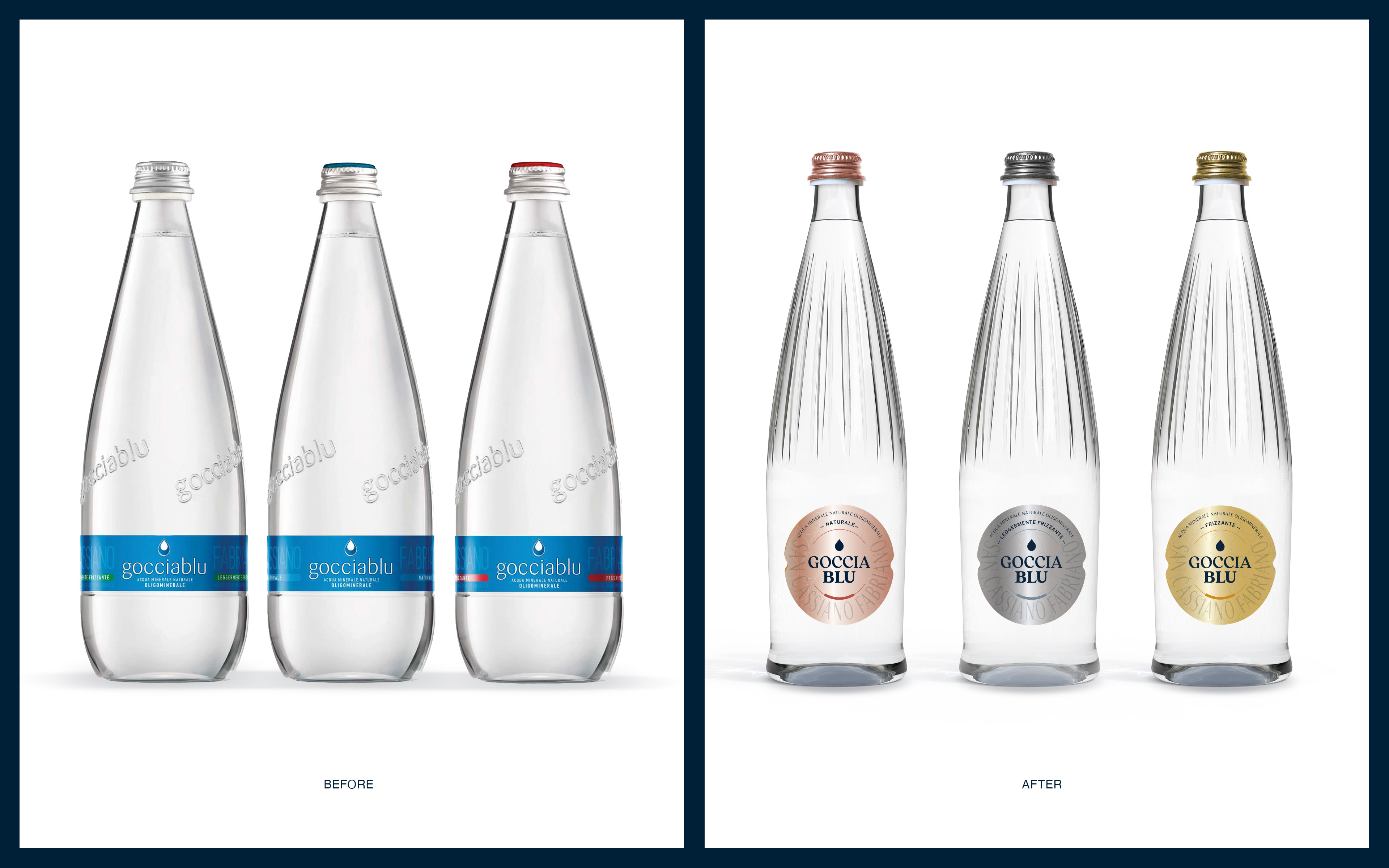
NEW PACKAGING IDENTITY
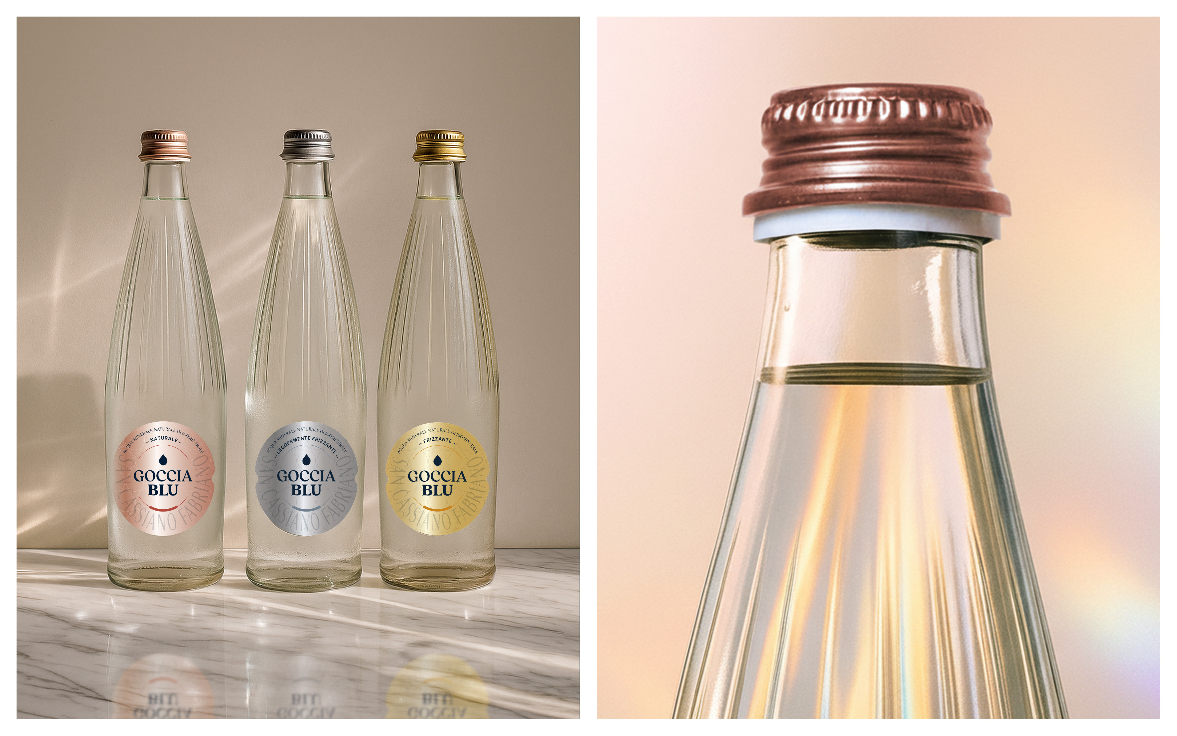
A new structural design of the bottle, inspired by a soft, slender and light neoclassical style, blends seamlessly with a new labeling design, leveraging the nobility of metallic colors (Copper, Silver, and Gold) and precious finishes, creating a strong impact and recognition through the circular shape of the label on the “Original” premium range.
About the project
Client
Togni SpA
Year
2025
Industry