Sperlari
Renewing a historic Italian brand, enhancing its leadership in the nougat segment.
Our Strategists and Designers collaborated with Sperlari’s Marketing Team to redefine Sperlari’s Seasonal range centered on nougats as a true icon of Italian confectionery.
Strategic Objectives
- Reinforce leadership and top-of-mind positioning, elevating perceived quality and value.
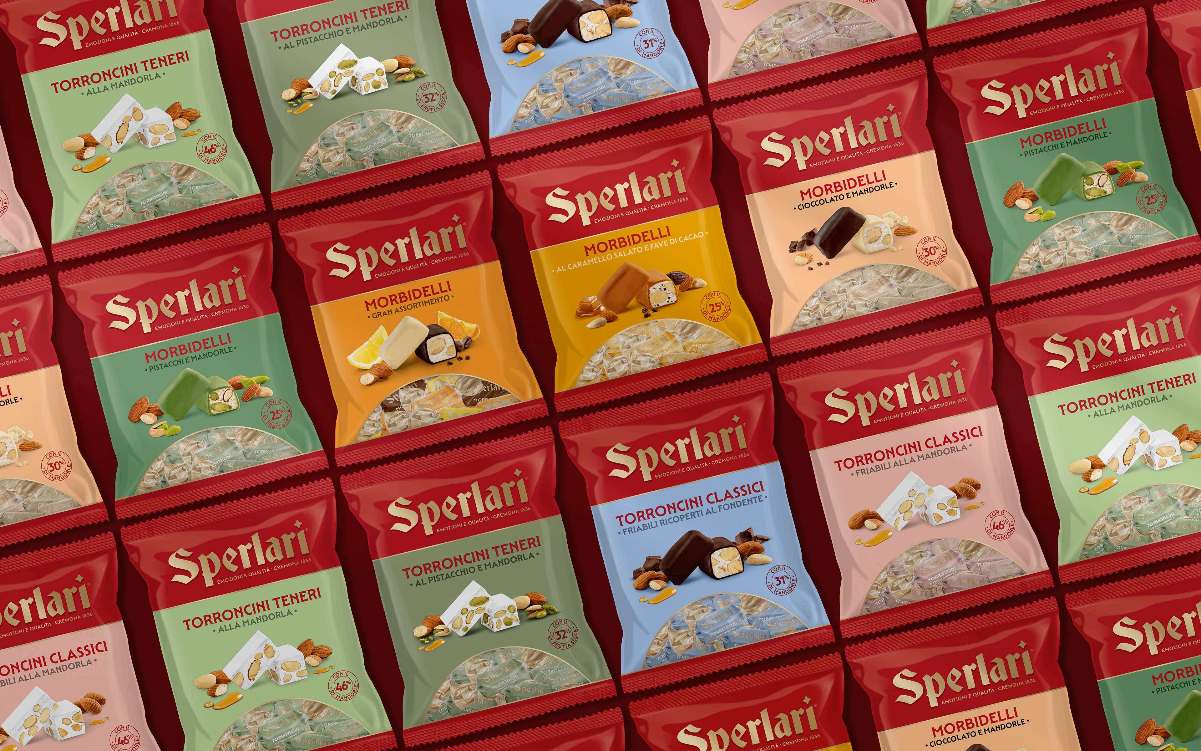
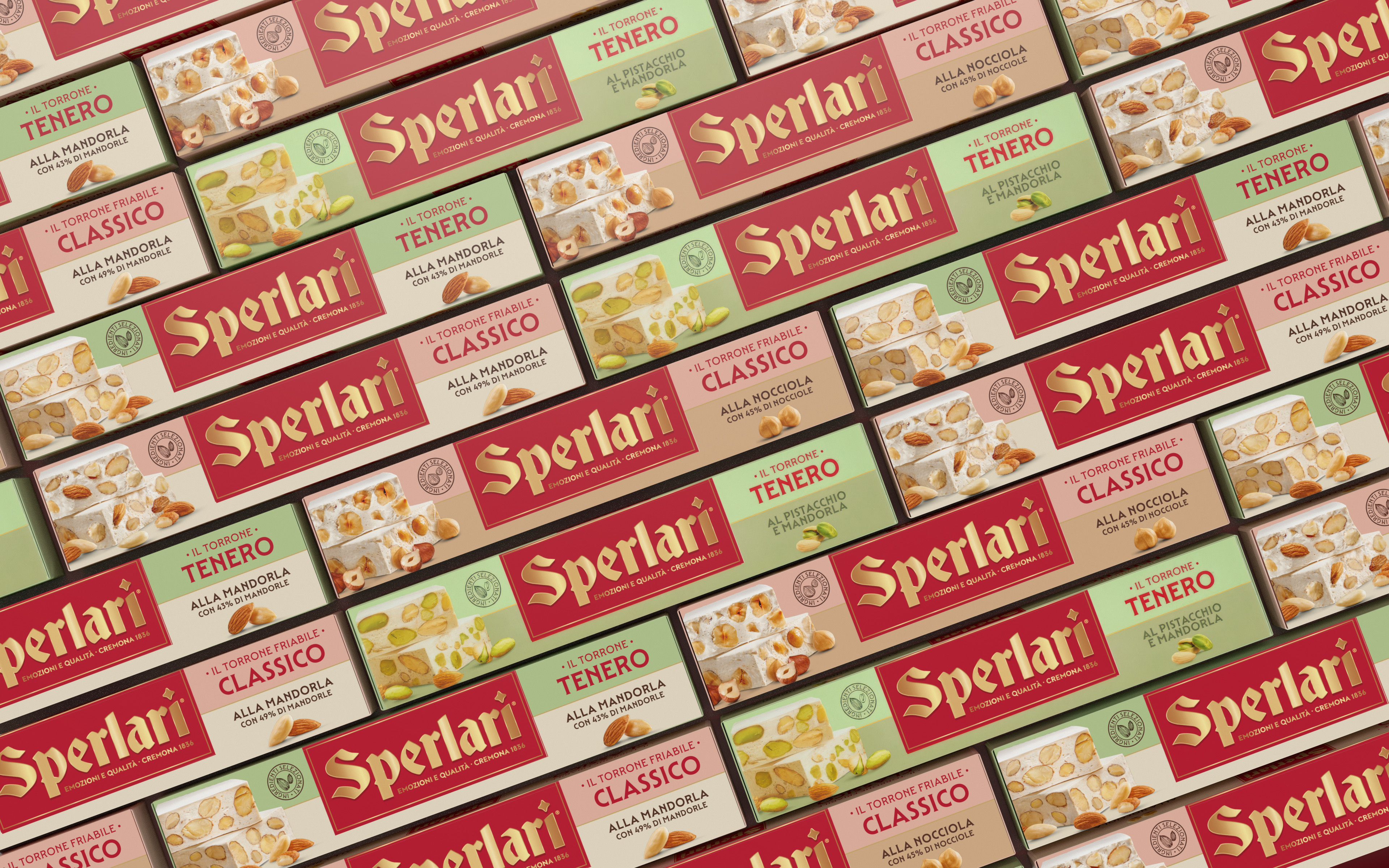
- Rationalize and reorganize the extensive portfolio by dividing it into clear sub-ranges (Classic Nougats vs. Soft; Chocolate-Covered; Torroncini; Morbidelli) to avoid overlap, and to facilitate the introduction of innovations and NPDs.
- Rebuild a clear and elegant cross-packaging system ensuring extendibility and intuitive navigation.
- Express taste, richness, and seasonal warmth through design, celebrating the generous festive spirit of the Christmas period.
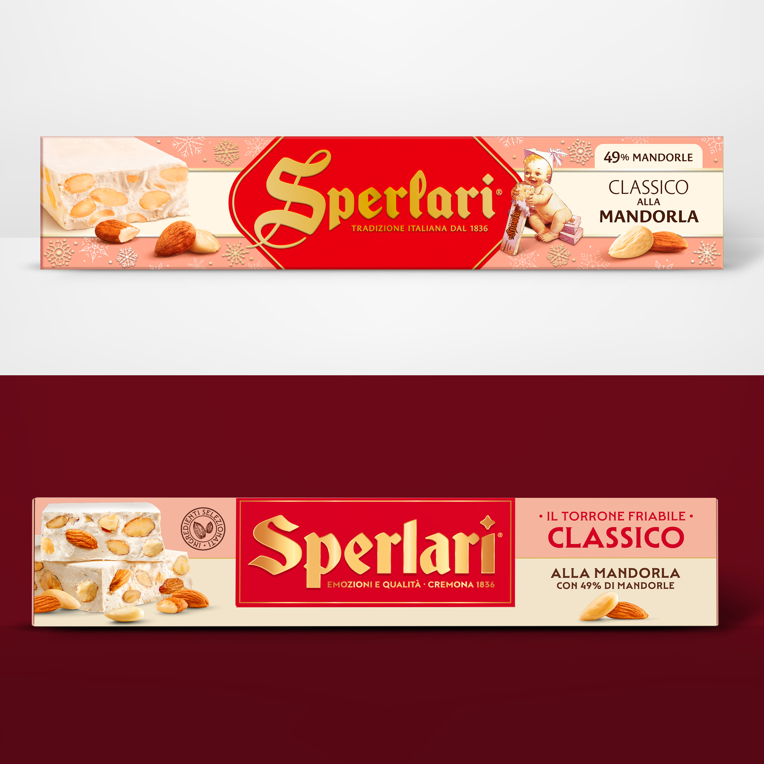
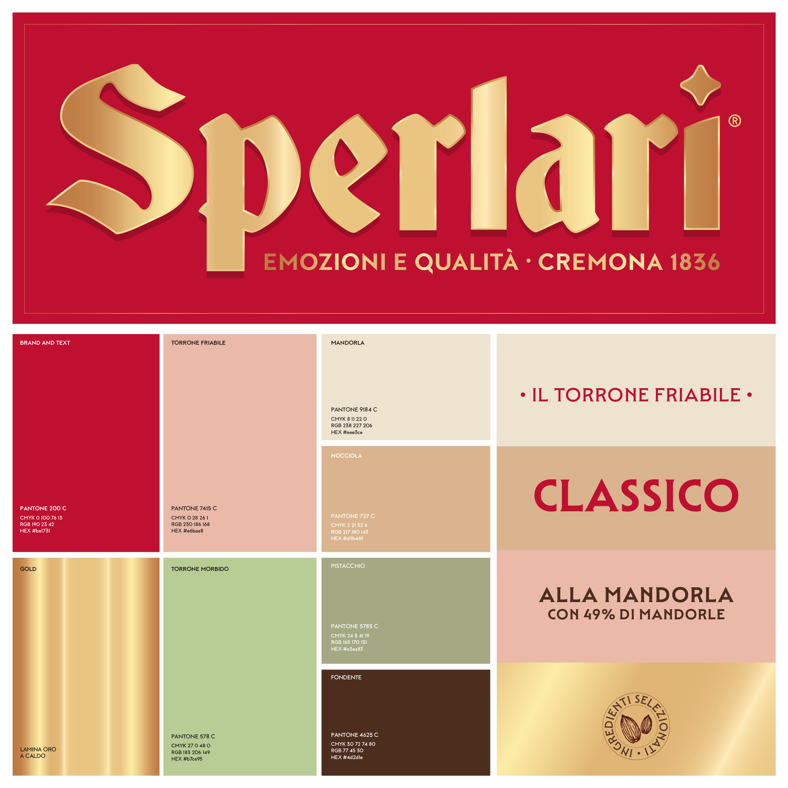
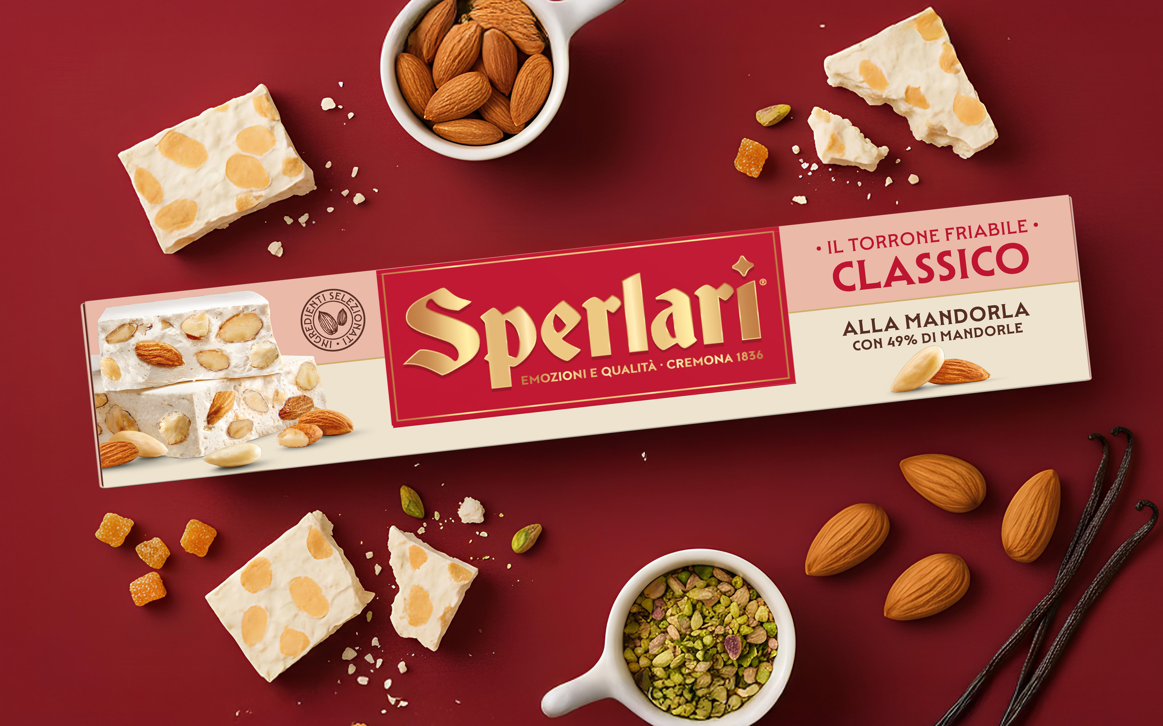
Packaging Identity & System
The new nougats packaging system merges emotional and rational dimensions (heritage and modernity, indulgence and clarity) through:
- A bold logo presence to ensure consistency and strong shelf visibility while reaffirming the brand’s heritage and its promise Emozioni e Qualità – Cremona 1836.
- A clear packaging system and modularity that allows differentiation across products and SKUs (Classico vs. Friabile vs. Ricoperto).
- Premium festive cues, using precious tones and refined details to elevate the overall proposition.
- A renewed product depiction that enhances appetite-appeal, authenticity and the perception of rich, satisfying taste.
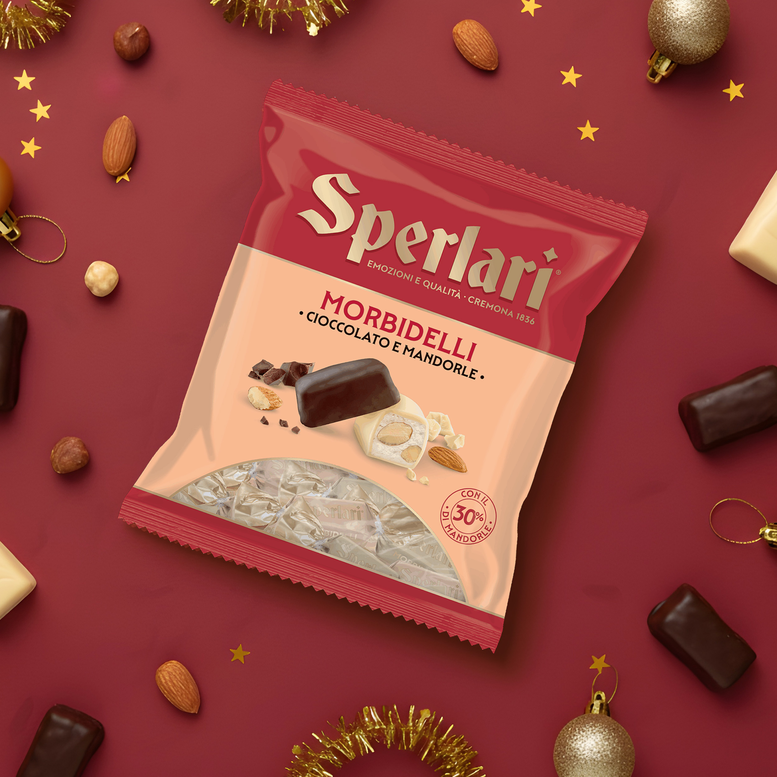
TORRONCINI & MORBIDELLI
Torroncini and Morbidelli represent the bite-sized version of the classic nougat bars (Tenero; Friabile; Ricoperti), offered in a variety of flavors and combinations for small, shareable moments of everyday pleasure.
The packaging system maintains clear coherence with the bar range, adopting a vertical format and further simplifying the front-of-pack layout into three key areas:
- Strong Brand Block: the Sperlari logo extends almost edge to edge, highlighted on a red tag.
- Flavor Zone: positioned at the centre to drive appetite appeal, featuring a dedicated color code along with the product name and descriptor.
- A transparent window: allowing immediate visibility of the bites’ size and quantity.
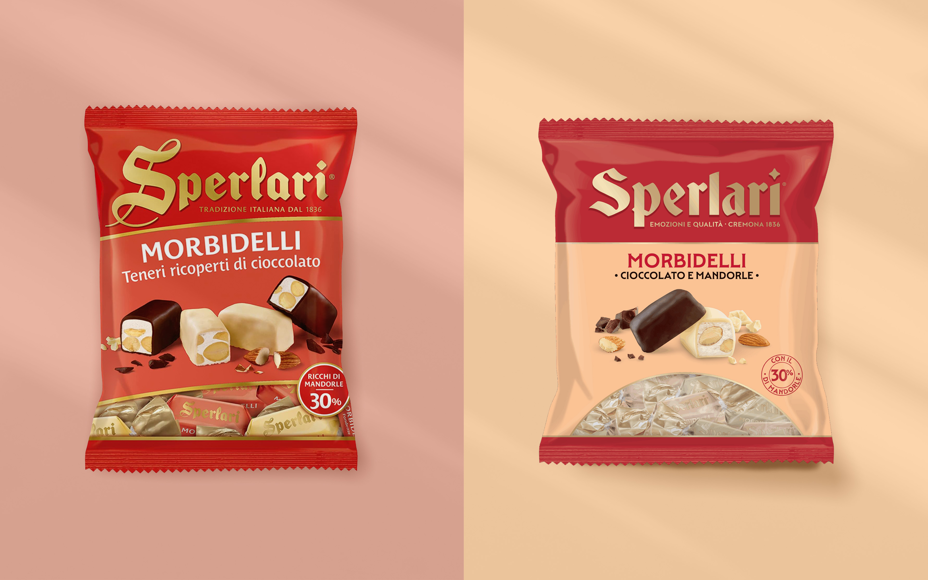
The result is a system that strengthens brand recognition and equity while making the seasonal offer instantly desirable: a perfect balance between Italian craftsmanship and contemporary design attitude.
With this powerful redesign, Sperlari affirms its USP—Enriching Emotions—transforming the nougat category into a vibrant and relevant expression of contemporary Italian excellence, and reaffirming the brand as the benchmark for Italian nougats in the seasonal confectionery market.
About the project
Client
Sperlari S.p.A.
Year
2025
Expertise