Sperlari
Renewing an iconic italian love-Brand for tomorrow

Our brand strategists and brand designers partnered with Sperlari’s marketing team to relaunch this leading name and hero-brand in the Italian confectionery industry, a Company with nearly two centuries of heritage. Together, we co-created and co-designed Sperlari’s future pathway combining brand assessment and analysis, a new brand positioning, a reorganization of the brand portfolio and product architecture.
Brand Positioning & Portfolio Optimization
To reinforce Sperlari leadership and expand its presence in the nougat segment, a unified cross-category positioning was defined.
The two brand’s complementary souls:
1. Seasonal Specialties—such as nougats, hazelnut chocolates, and bites
2. Year-Round Offerings like candies
were embodied in a dual approach that ultimately drives top-of-mind awareness among consumers.

At the same time, the team streamlined the product portfolio to reduce SKU overlaps and make the range easier to navigate, ensuring a more coherent and efficient brand experience by introducing two key brand assets:
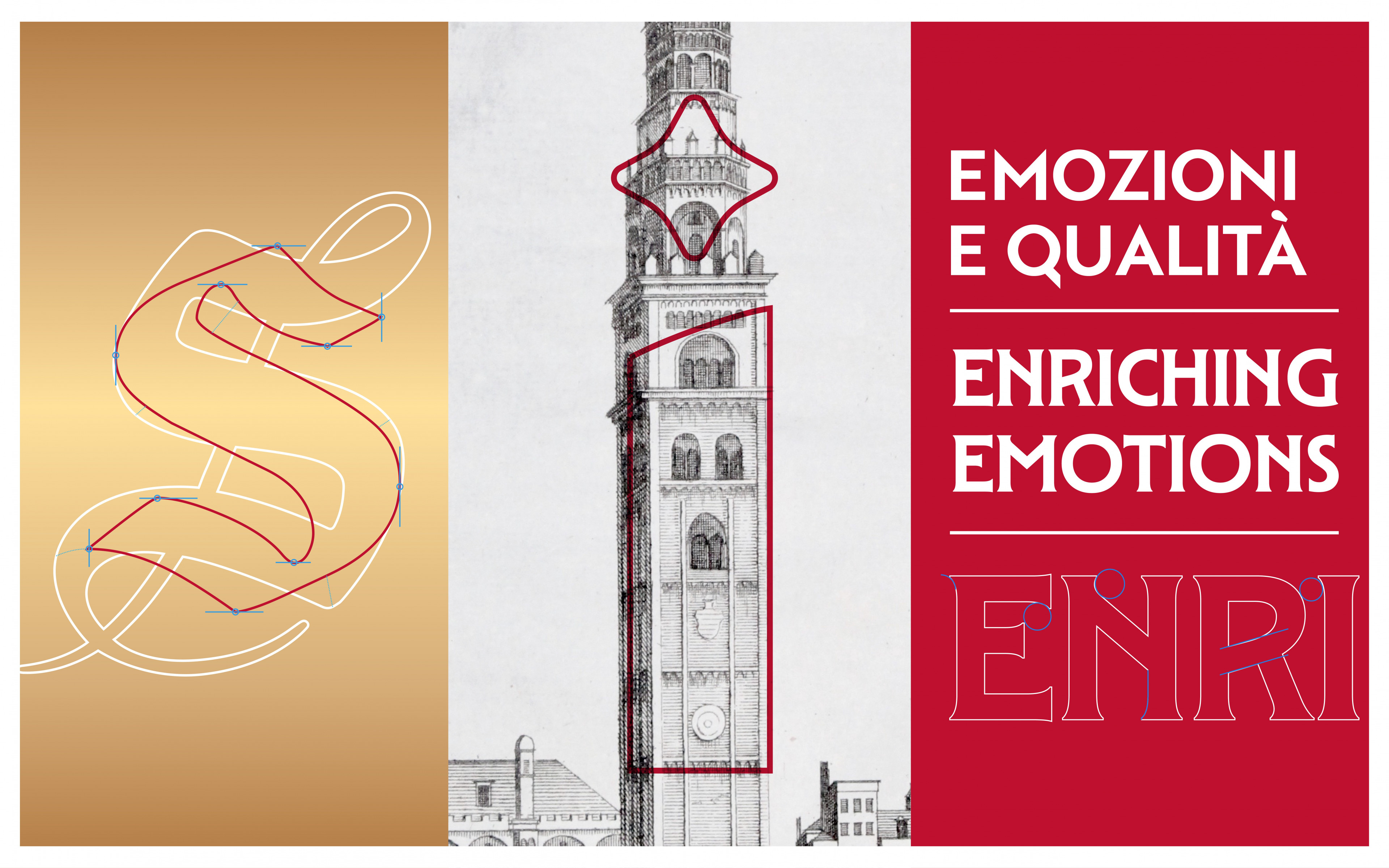
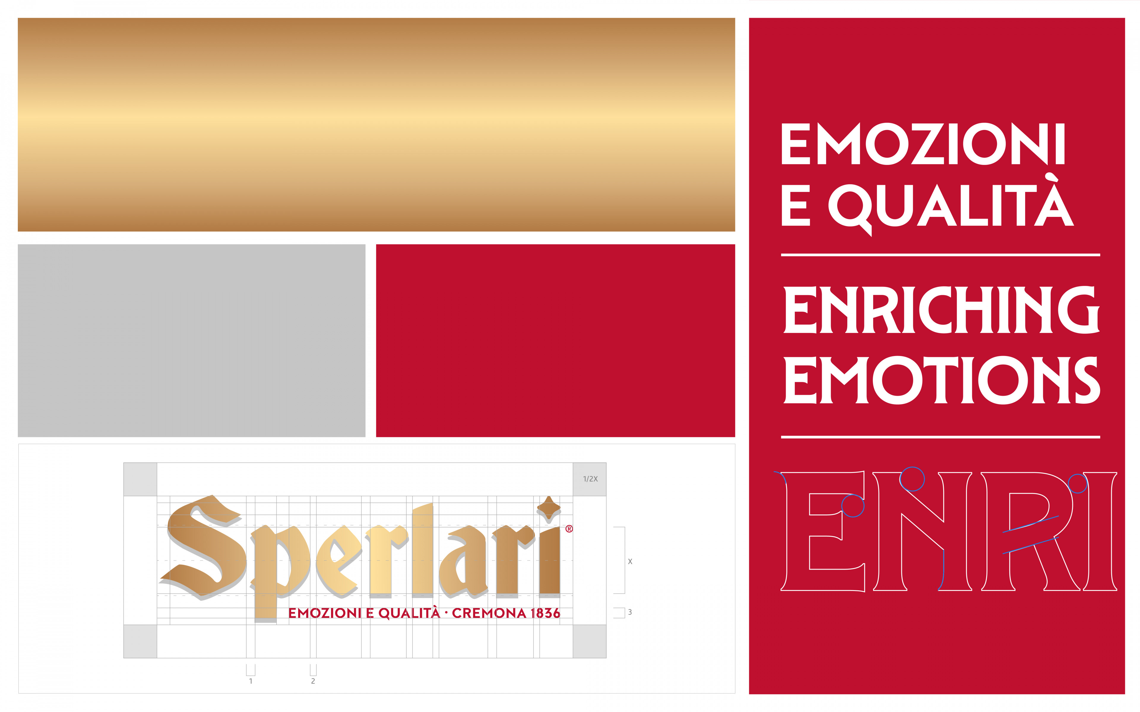
1. A new unique selling proposition: “Enriching Emotions.” this message captures the richness of our flavor range and the many meaningful moments in which the brand can play a role—making every experience more memorable.
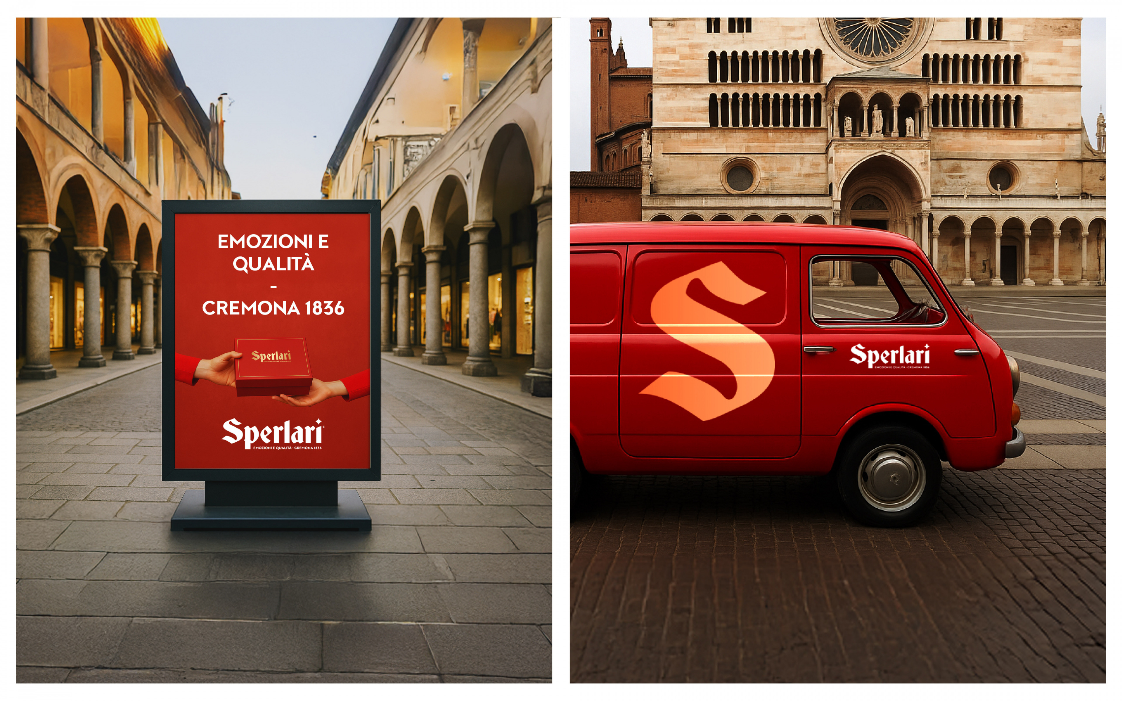
2. A new brand line: “Emozioni e Qualità – Cremona 1836.” a signature line consistently expressed across all touchpoints, reinforcing three core pillars of the brand:
- Emotions, representing the joy of sharing and savoring Sperlari products
- Quality, as a non-negotiable promise embedded in every offer
- Cremona 1836, a proud declaration of the Company’s heritage, craftsmanship, and enduring legacy
“With Sperlari, it all started with trust — and grew into a bold, shared vision. Together, we reimagined the brand from the inside out: streamlining the offer, unlocking new growth potential, and crafting a vibrant identity that feels fresh yet rooted in tradition. A smarter, cleaner packaging system now guides consumers through the range with ease — and sets the stage for what’s next.”
Michele Favaretto
Strategy & Brand Design Director
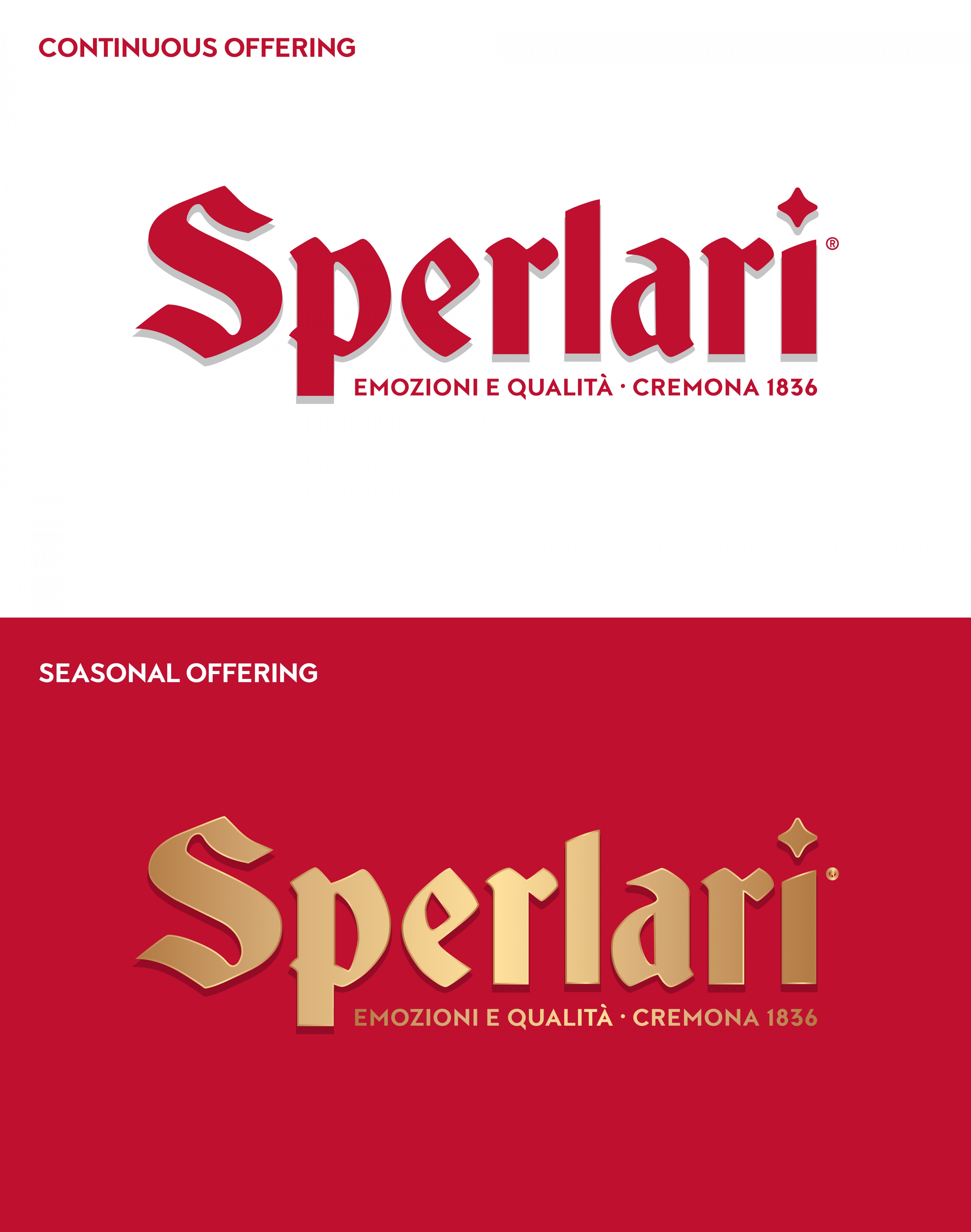
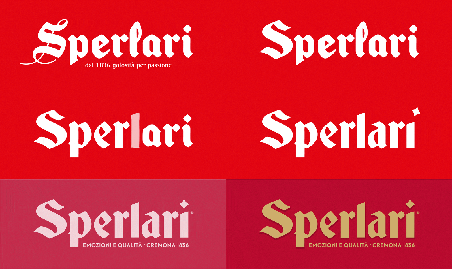
The renewed identity features an evolved logo that honors the brand’s heritage, combining refined, iconic, and bold typography.
The design is specifically tailored to reflect the brand’s two core ranges: gold on a red background for the seasonal offerings, and red on a white background for the continuous range.
This approach confirms the flexibility and consistency of the offer, while also guiding the brand to maintain two dedicated strategies — differentiated yet complementary — for each product range. To mark this differentiation, greater emphasis has been placed on the distinctions in colors, materials, and finishes (CMF), reflecting the variety of contexts, usage occasions, and target audiences.
About the project
Client
Sperlari S.p.A.
Year
2025
Expertise